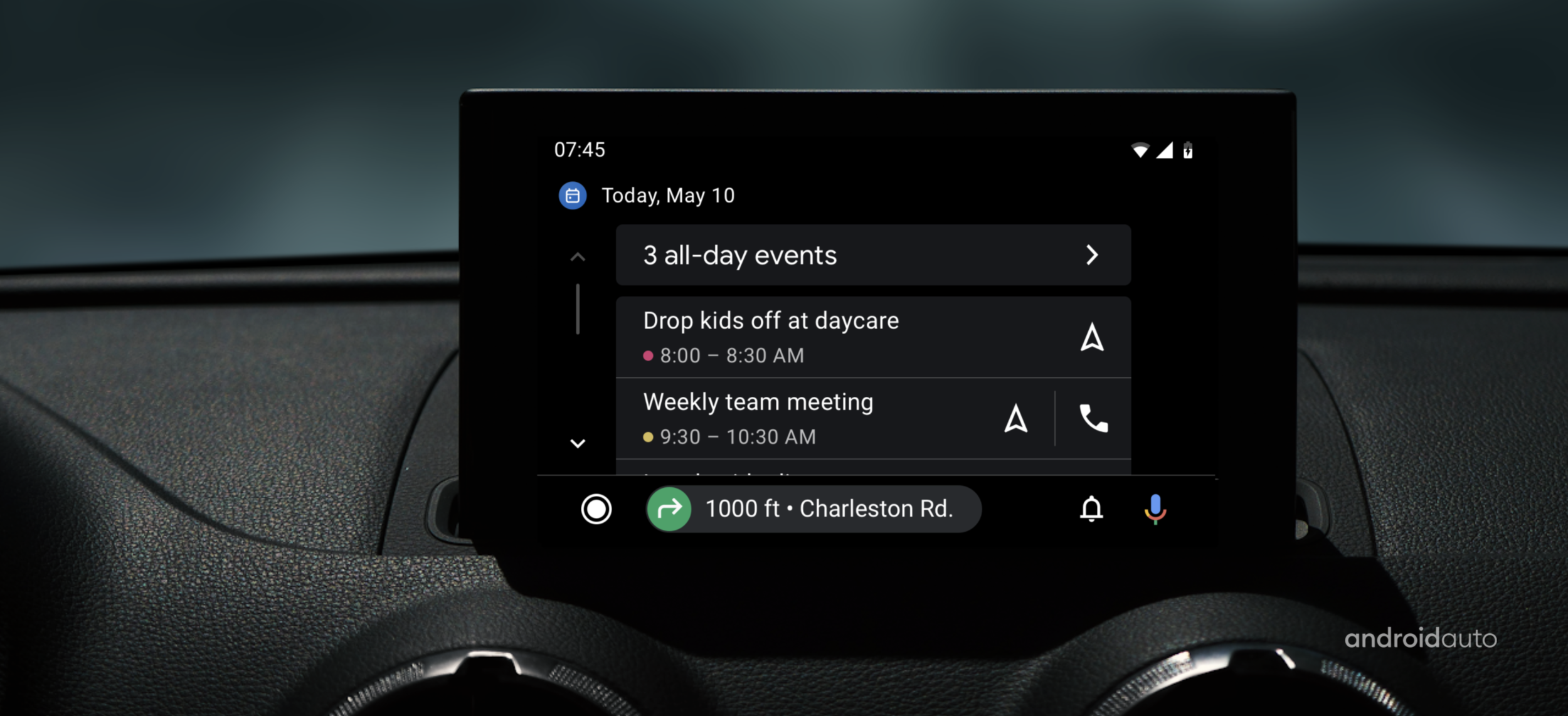
calendar app
for android auto
Project: Integrate Android phone calendars to Android Auto. Press link
Problem statement: Instead of having to use either phones, drivers wanted to access their events and take relevant actions such as navigating to a location or call into a meeting, on their car head unit. Auto team needed to create an app that could take users phone calendar and enable a safe and seamless car app.
My role and responsibilities: I led the design track from definition to launch. Collaborated with product manager on product definition and with designers/researchers/engineers on design direction and execution.
Lack of calendar integration has been a pain point. Understanding where to start, which features to bring over and optimize for car usage was a big unknown. I helped the team gather knowledge, form early hypotheses, test with users and iterate on approach. Resulting in a well accepted product that is still growing to include various new features.
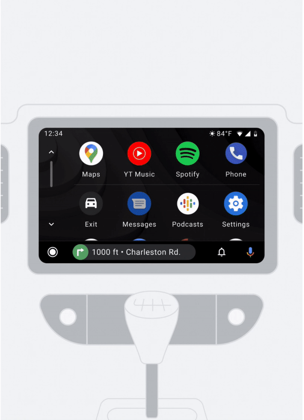
Messaging apps
for android auto
Project: Enhance messaging experience on Auto. Press link
Problem statement: Integration with messaging apps have been through notifications only. This meant users were interacting with all their messages from various apps in the notification center. Creating an integrated model rather than mimicking, supporting users’ app-based mental model.
My role and responsibilities: I led the design track from definition to first phases of implementation. Collaborated with product manager on product definition and with designers/researchers/engineers on design direction and execution.
I designed and prototyped several UI patterns and flows. Collaborated with researchers to run concept evaluation and usability testing, which helped team confirm that the app based model was the right direction. We also used research as input for major decisions we were unsure on. For example, we saw that users were not interested in accessing older messages in the car, that eliminated the need for any deeper level views. Also noticed that the UI pattern first and foremost needed to be optimized for frequent use. I proposed the current flat design (no buttons) that simplified the list and made use of large tap targets.
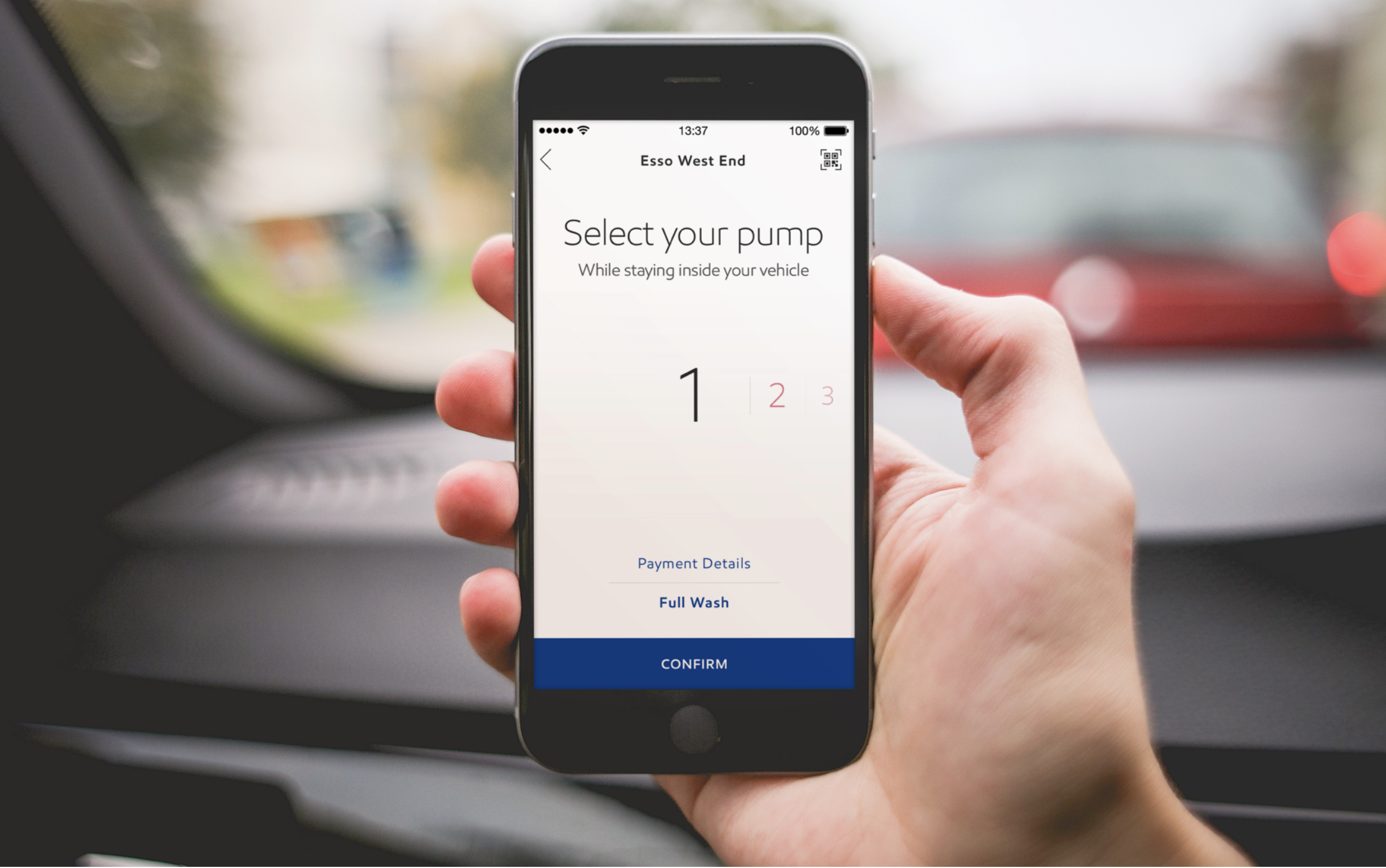
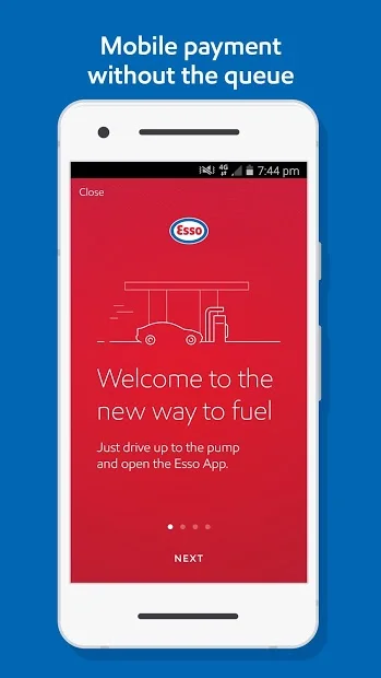
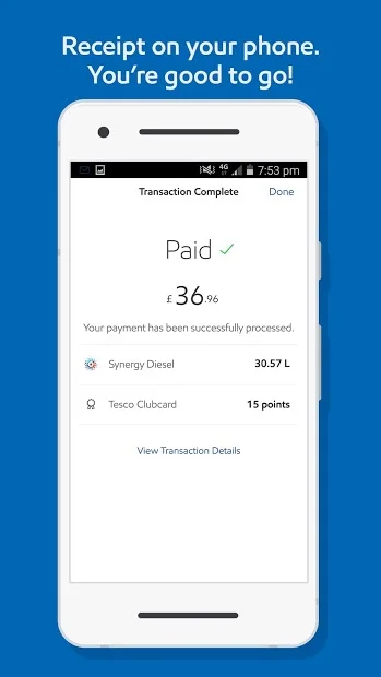
Esso fueling App
for Exxon, UK & Europe
usability testing
Development support
wireframing
functional documentation
client lead
creative lead
Usability testing, design and development support for an in-station mobile app in the UK and European market.
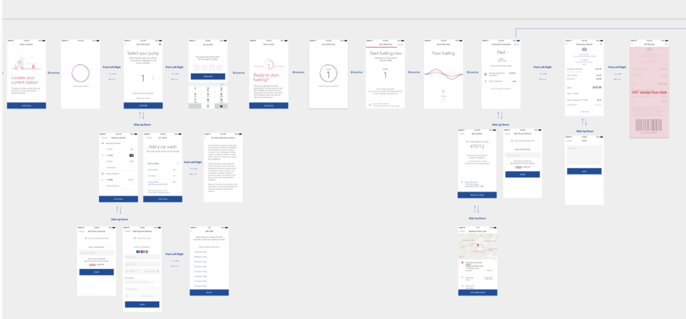
Project: A fueling app for Exxons’ Esso brand for the UK market, where queueing at petrol stations is a common daily pain point. frog Munich and London offices worked on phase 1 product discovery and strategy. This project is the 2nd phase of work where we expanded the key flows into a design system and supported development efforts for iOS and Android apps.
Process: We started with a round of concept evaluation and usability testing in the UK. After completing design enhancements and further development, we conducted a second study to validate the enhancements as well as test new flows. We also supported ongoing development efforts, taking part in daily scrum calls and communicating with development and BA teams. The other track of work was supporting design team on the client side working simultaneously.
My role and responsibilities: As the only designer on the project from frog, I led both rounds of user testing, synthesized findings and worked on design improvements with the larger team. I helped expand the initial foundational designs into a system that could cover all use cases for development. Also supported design and functionality QA, provided design direction to client design and development teams. This was a 4 month effort where I was running the day-to-day relationship with product owners and design teams.
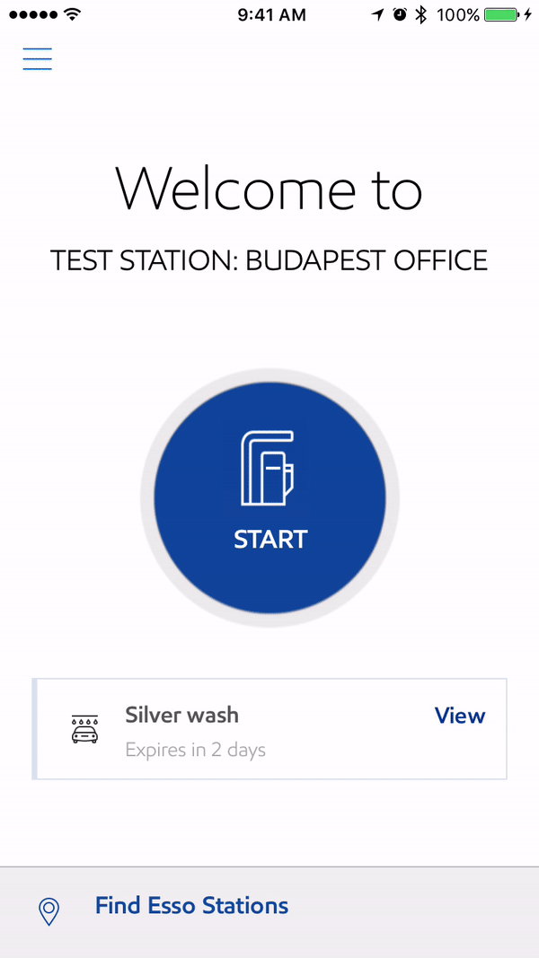
PRODUCT IN THE MARKET
Android and iOS apps are on the UK app stores. Since release Exxon also added new functionality such as PayPal payment options but kept the design intent and system.
Creator App
for momentum machines, US
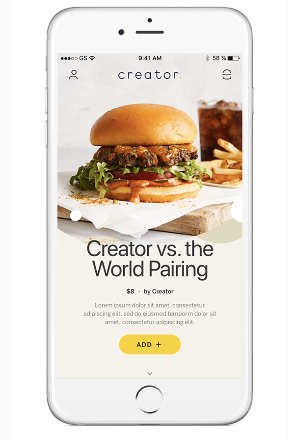
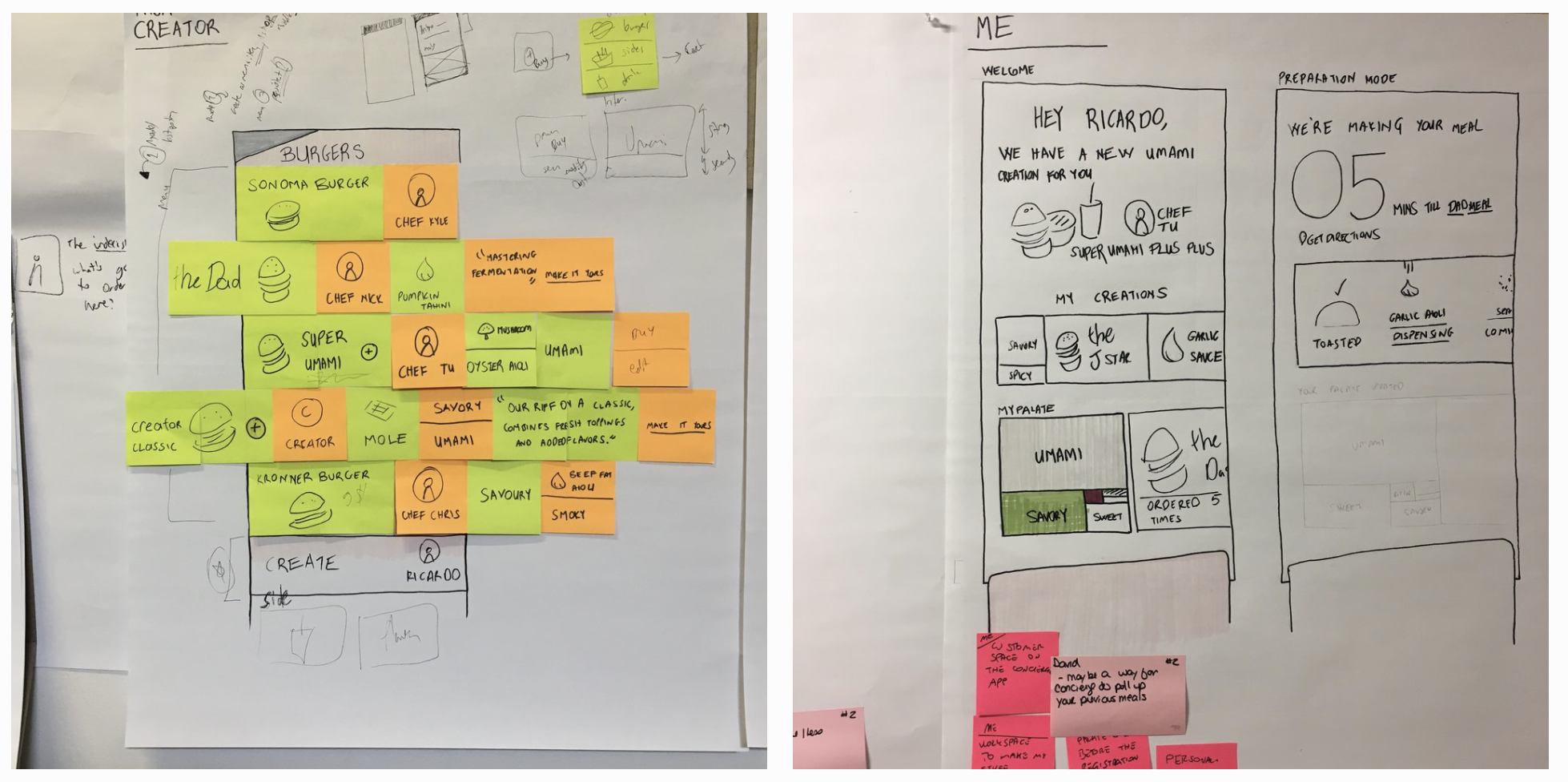
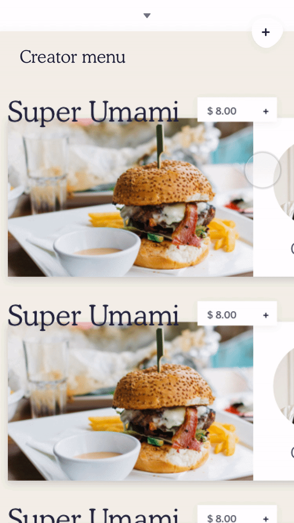
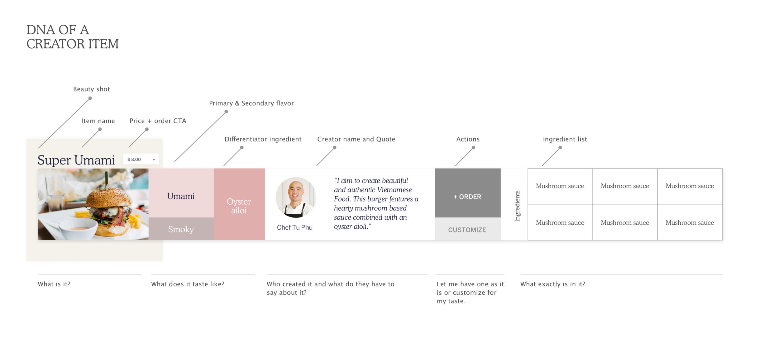
Project: End-to-end design for a new robotic restaurant’s mobile app.
Opportunity: Client wanted to give users a unique app to create precise and experimental burgers. Our challenge was to make it lovable as well as easy to use. View Creator website.
My roles and responsibilities: Collaborated with a design lead, strategist and program manager to do market research, define the concept, strategy and the execution plan. Closely collaborating with stakeholders helped iterations and quick decision making.
Highlights:
To create a strong user mental model around restaurant created menu vs. user created menu vs. cart with orders, I explored different spacial interaction models. Vertically and horizontally layering the 3 spaces. After initial testing, decided on horizontal layering; which was more familiar and easier to grasp for users.
To make menu browsing a memorable interaction (part of the brief), I played with horizontally scrolled cards that feature the chef (creator), taste profile, ingredients etc. on cards. Final product features a more traditional approach to support quick ordering and ease of use.
For burger creation, we played with various patterns for micro interactions. Precision in customization was a key goal so we gave user ability to fine-tune while still keeping ease of use in mind.