Esso fueling App
for Exxon
usability testing
Development support
wireframing
functional documentation
client lead
creative lead
Project: Usability testing, design enhancement and development support for an in-station mobile app in the UK and European market. A fueling app for Exxons’ Esso brand for the UK market, where queueing at petrol stations is a common pain point. frog Munich and London offices worked on phase 1 product discovery and strategy. This project is the second phase of work where we expanded the key flows into a full design system, supported development and gave creative direction to client design teams who were working on iOS app designs.
View in Apple app store, View in Google Play store
Process: We started this phase of work by evaluating initial designs via usability testing in the UK. As we conducted 2 rounds of usability testing and qualitative research, we shared findings in workshops with clients and development partners. Made enhancements based on findings. We also were supporting development efforts, taking part in daily scrums followed by calls to answer specific development questions. The other track of work was supporting client design team who were extending the Android designs into iOS.
My role and responsibilities: taking the initial concepts, I led usability testing, made design improvements, expanded the foundational design system to cover all use cases, conducted QA for product excellence. This was a 4 month effort where I was running the day-to-day relationship with main stakeholders, as well as their design and development teams.
project highlight
usability testing & Concept evaluation
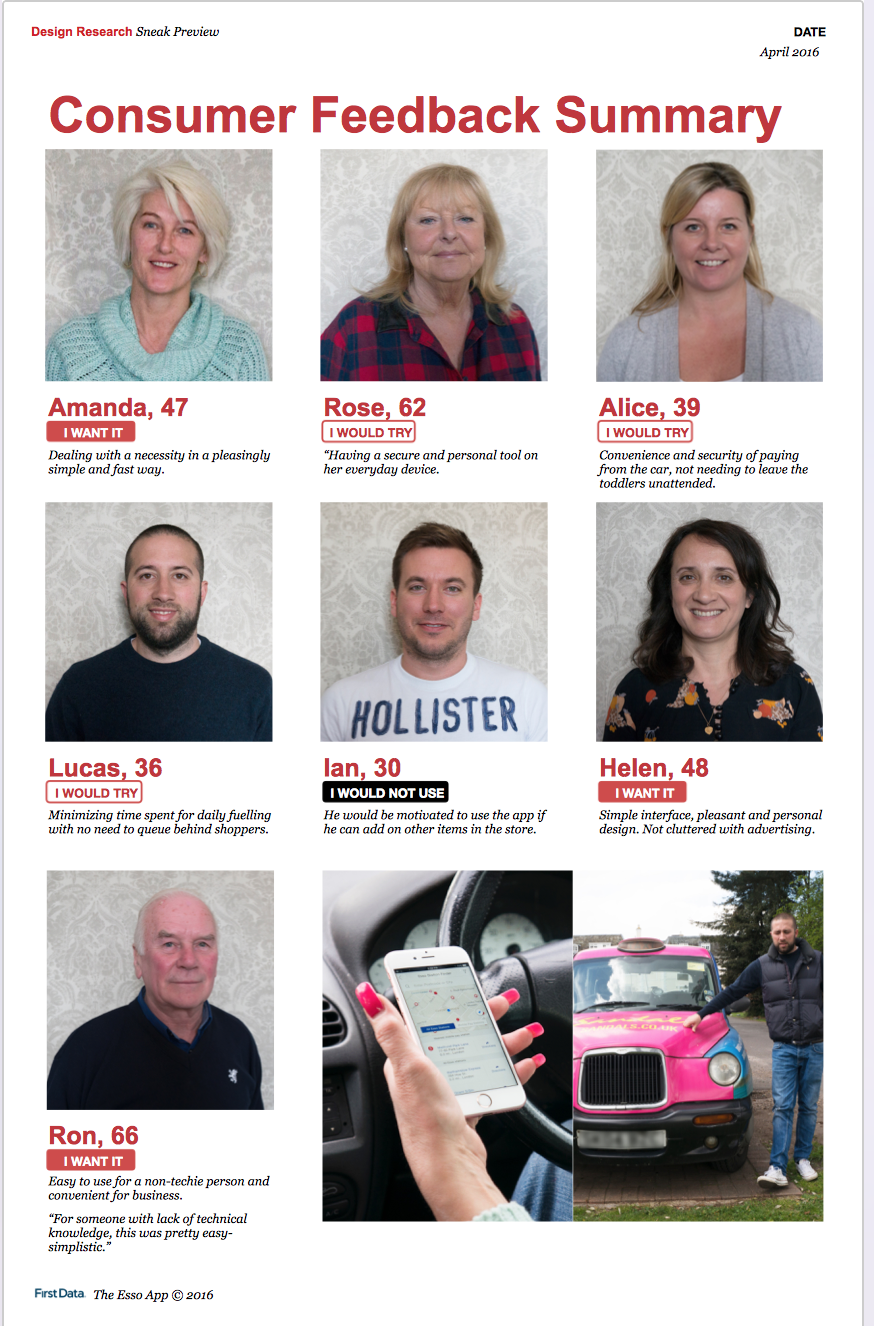
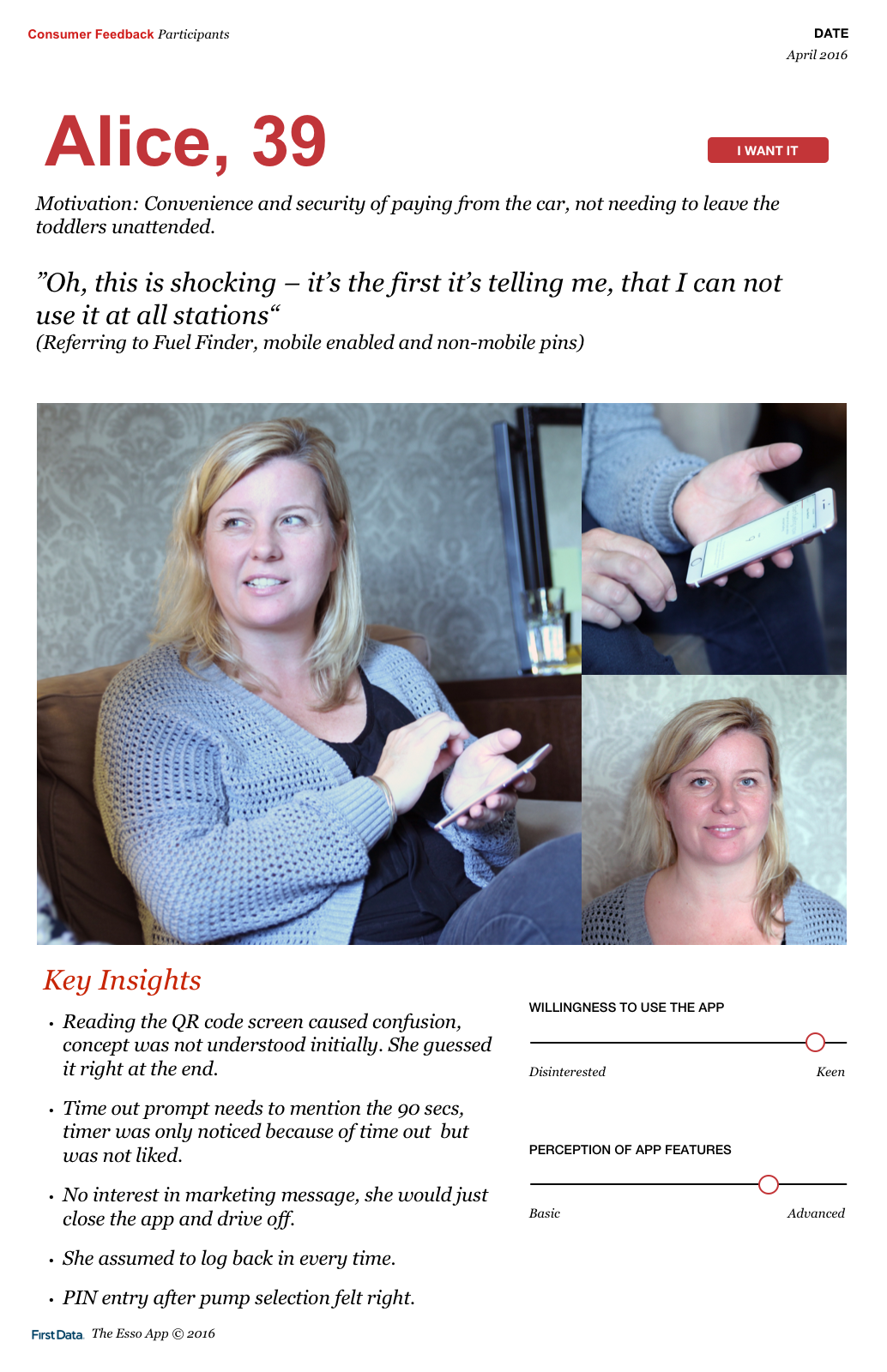
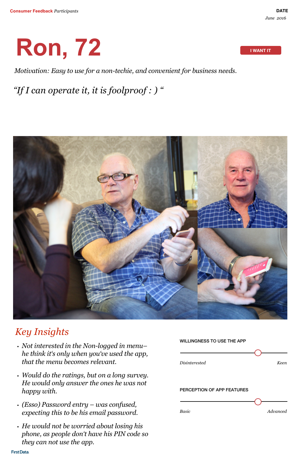
In collaboration with a program manager, I interviewed 7 participants for two rounds of concept evaluation and usability testing. Interviews took place in participants’ cars mimicking fueling behaviors.
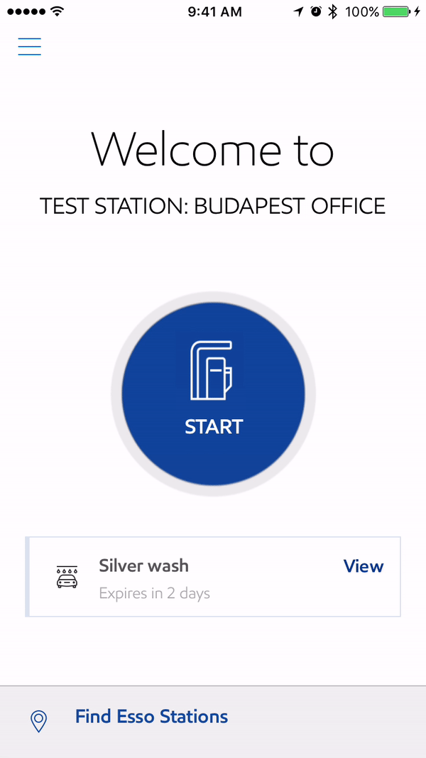
Learnings: We tested key flows for first-run experience including registration, set up and first time fueling. Looking to understand if users saw value or established trust quick enough to set up payments.
Praising easy of use and clean design, most users had acceptance. For users who found app lacking, we had discussions regarding future functionality such as add-on shopping from station. Client loved the ideas and added to backlog for future consideration.
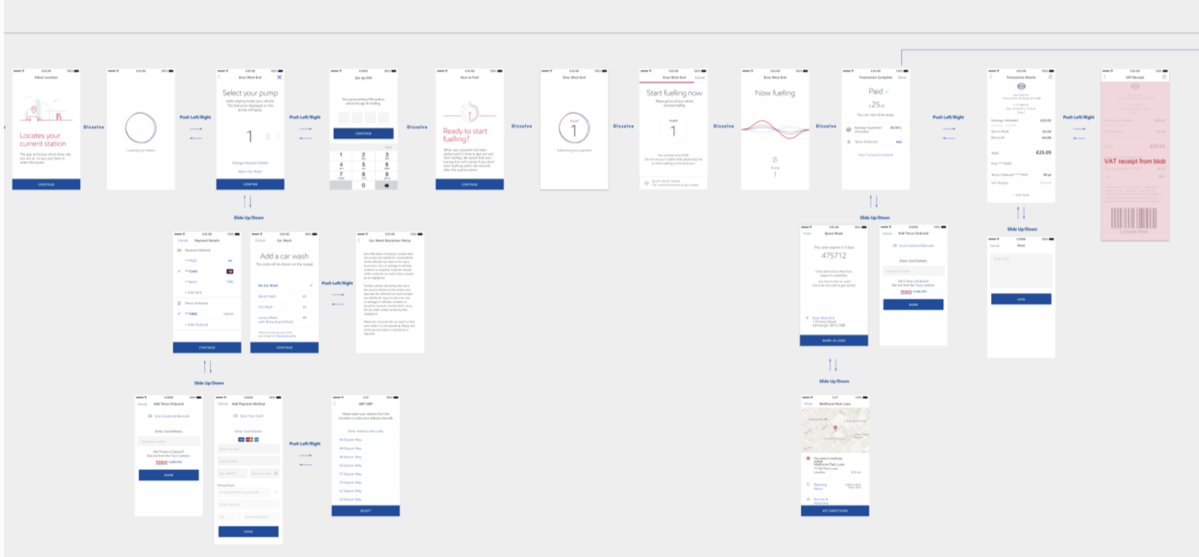
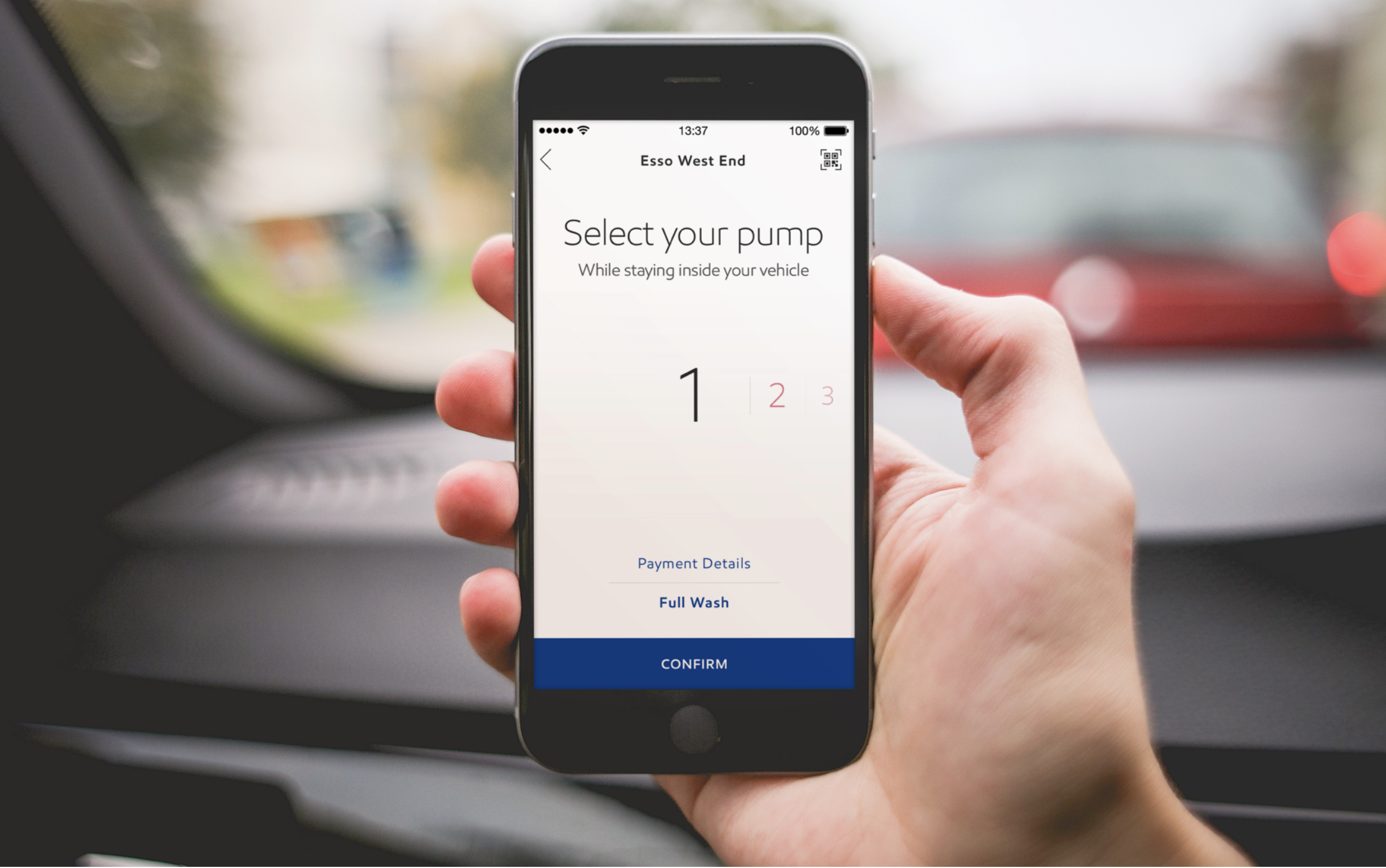
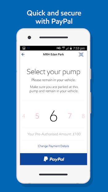
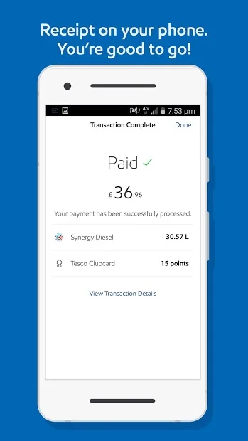
fueling flow was a big concern. It was partially user initiated - user selecting the pump they parked at, and partially system initiated - fueling state which is activated as user picks up the physical pump and start fueling. It also had to communicate to users what to do in each step.Users mostly got through the fueling flow succesfully. On round one testing, biggest issue was at the end, when users were not sure if payment was complete and if they could drive away. We addressed this by adding explicit messaging at the end to communicate payment is done and that they can drive away. On the second round, end of fueling was clearer to all participants. We also wanted to hear feedback and suggestions from users, added a last conditional step for optional survey.
Another finding was that most users were confused with or did not notice the car wash feature which was an option on the first step of fueling flow. We realized it was out of place at that moment and suggested to take it out to let users get through fueling faster.