Esso fueling App
for Exxon
Usability testing, design and development support for an in-station mobile app in the UK and European market.
Project: A fueling app for Exxons’ Esso brand for the UK market, where queueing at petrol stations is a common daily pain point. frog Munich and London offices worked on phase 1 product discovery and strategy. This project is the 2nd phase of work where we expanded the key flows into a design system and supported development efforts for iOS and Android apps.
Process: We started with a round of concept evaluation and usability testing in the UK. After completing design enhancements and further development, we conducted a second study to validate the enhancements as well as test new flows. We also supported ongoing development efforts, taking part in daily scrum calls and communicating with development and BA teams. The other track of work was supporting design team on the client side working simultaneously.
My role and responsibilities: As the only designer on the project from frog, I led both rounds of user testing, synthesized findings and worked on design improvements with the larger team. I helped expand the initial foundational designs into a system that could cover all use cases for development. Also supported design and functionality QA, provided design direction to client design and development teams. This was a 4 month effort where I was running the day-to-day relationship with product owners and design teams.
usability testing
Development support
wireframing
functional documentation
client lead
creative lead
project highlights
1. Concept evaluation & usability testing
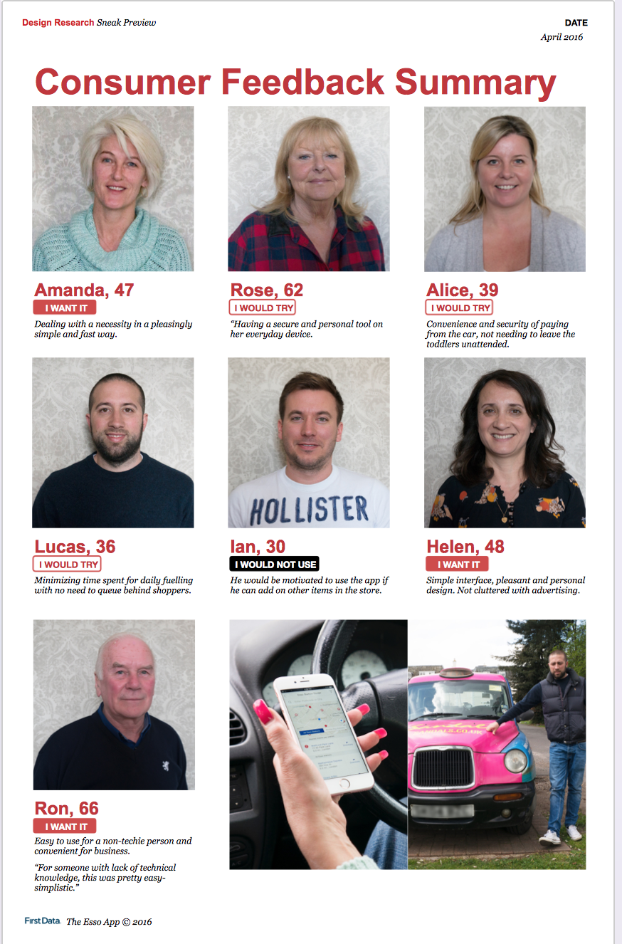
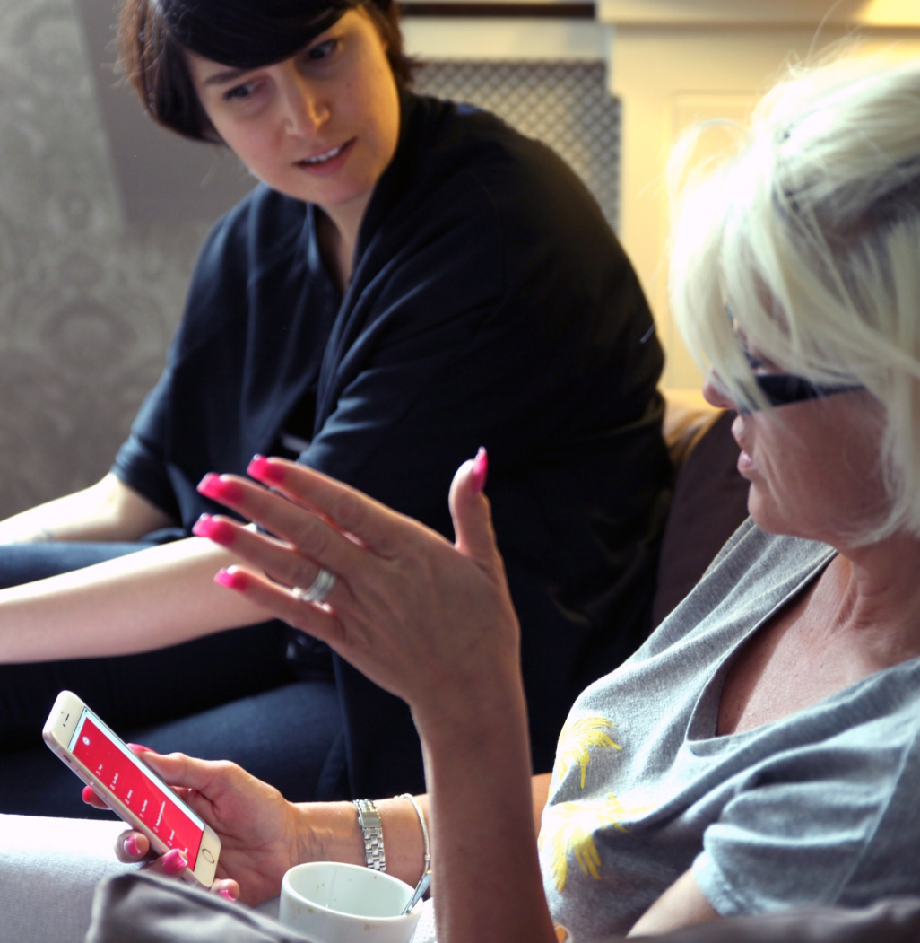
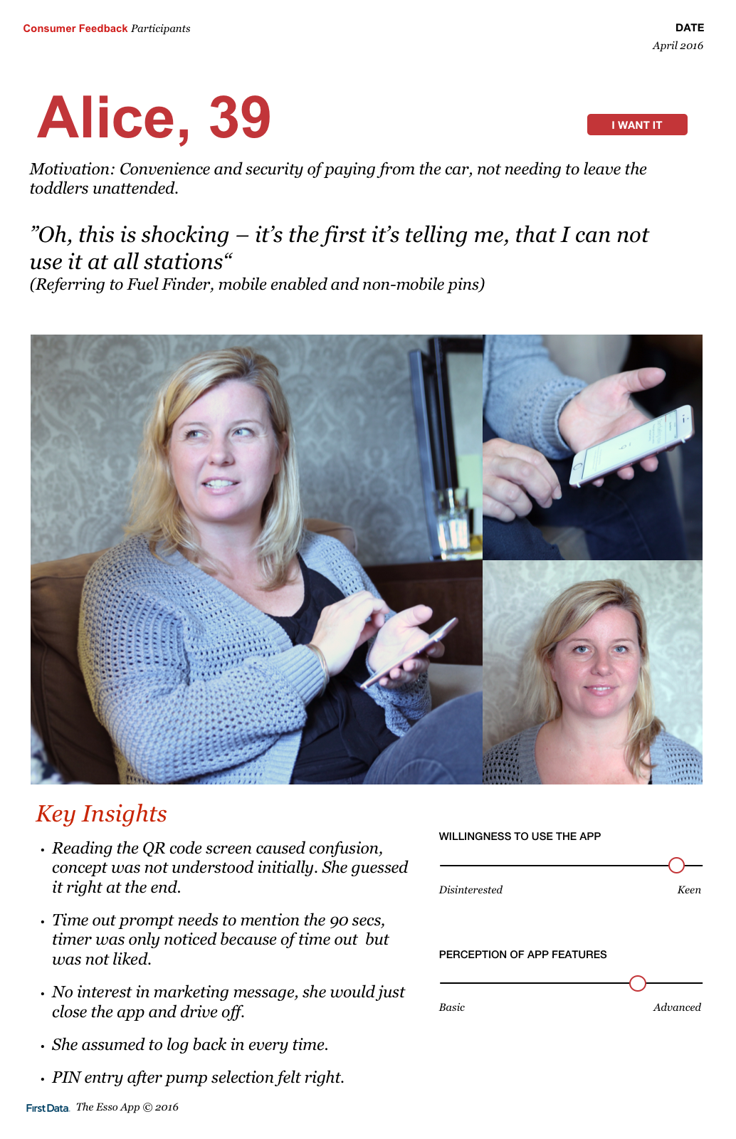
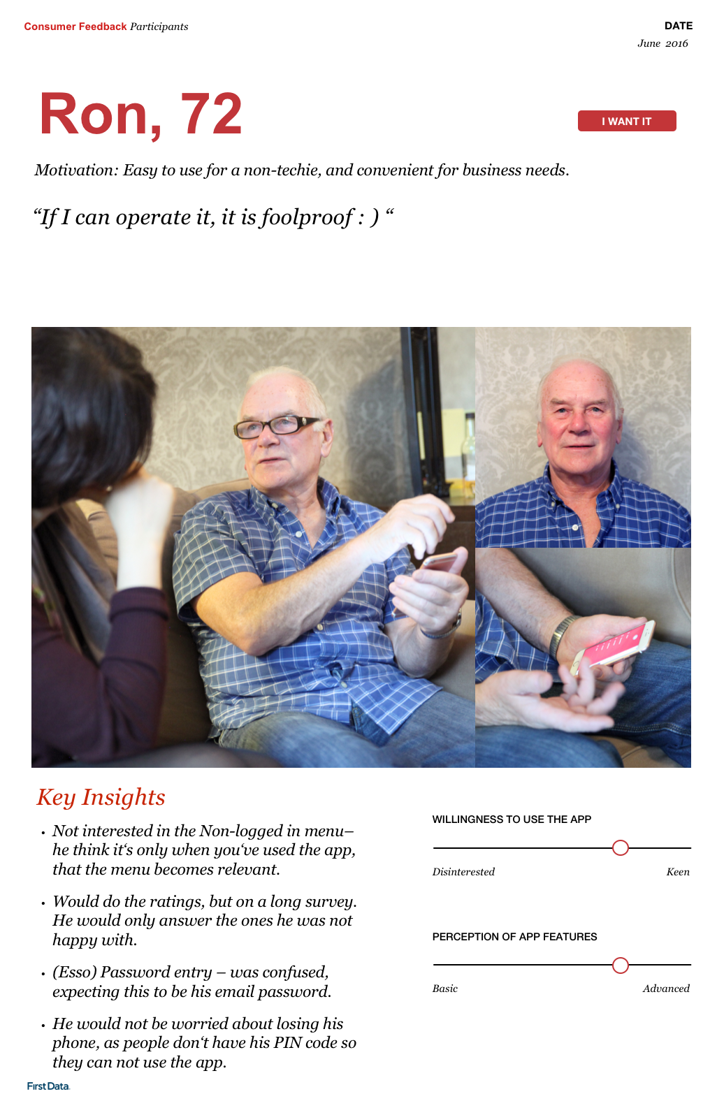
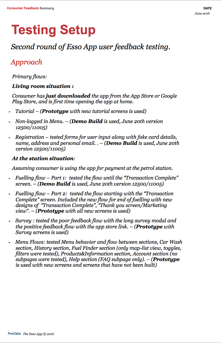
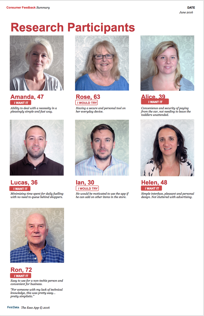
In collaboration with a program manager and a design intern, I interviewed 7 participants for two rounds of concept evaluation and usability testing. Interviews took place in participants’ cars mimicking fueling rituals, and in a living room to discuss additional topics.
Concept evaluation and learnings: We wanted to learn if users would download and use the app based on the value proposition “efficient, fast fueling without queuing”. If so, which features they loved, which were missing and which were not useful. Exxon product owners were concerned about security and wanted to know if users would trust the app enough to input payment card details.
We found that most users would give the app a chance based on the value proposition as it’d solve a huge pain point, leaving their cars to wait in long lines at the petrol station stores. Some users were not sure about this value prop alone and with them we discussed future functionality such as add-on shopping from station store. We also found out that users were comfortable inputting card info and would trust the app. This was our hypothesis all along, based on high mobile app usage and rising mobile payments in the UK market.
Usability rounds:
On the 1st round of testing, we tested the tutorial flow and the first time fueling flow.
On the 2nd round of testing, we tested the enhanced tutorial and fueling flows, also registration flow and all top level views.
We observed how easily users could get through each flow, made them talk out loud first impressions, note major and minor problems they had. We used a combination of build demos and InVision prototypes.
Some of our learnings:
Overall design: We quickly noticed how the simple app interface was non-intimidating and easy to use for users from different demographics and with varying experience with technology. This was a huge win as the design aimed at serving a wide variety of drivers.
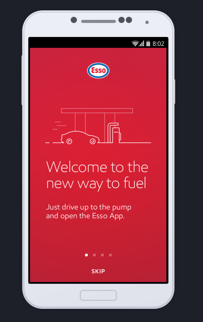
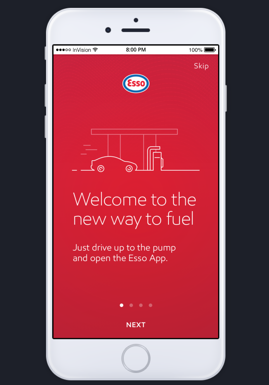
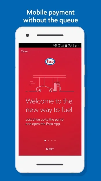
Tutorial flow: These are the educational screen flows highlighting unique app features, only shown during first time app launch.
On the 1st round of testing, most users immediately tapped the Skip CTA (design on the left). When asked why, some mentioned they do not like reading and just want to see the interface. I also hypothesized that the behavior was caused by the prominent placement of the CTA. The pagination dots were overpowered by it as well.
To enhance, we replaced the Skip CTA with the Next CTA (design on the right). This placement made the pagination dots more visible and helped users continue to the second screen. Using a familiar mobile pattern, we placed the Skip CTA on the top right.
On the 2nd round of testing, users navigated the tutorial flow easier via the Next CTA, and only skipped after viewing at least two screens.
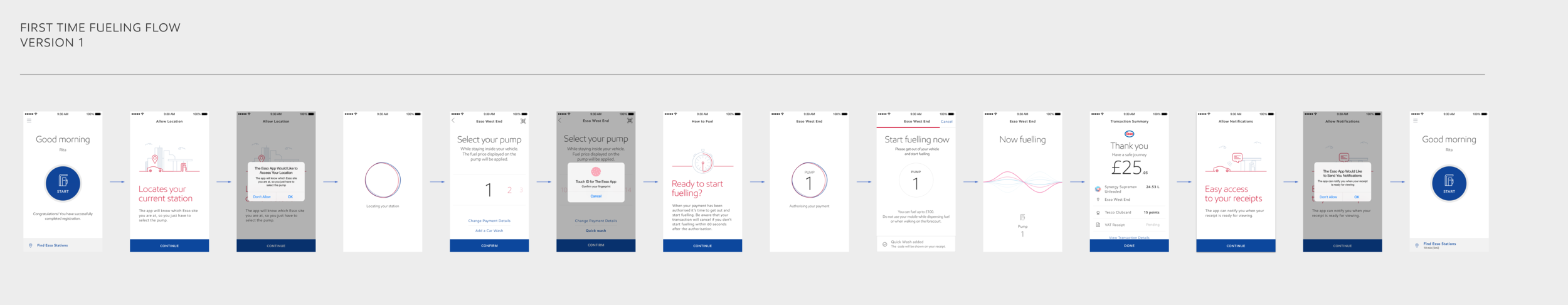
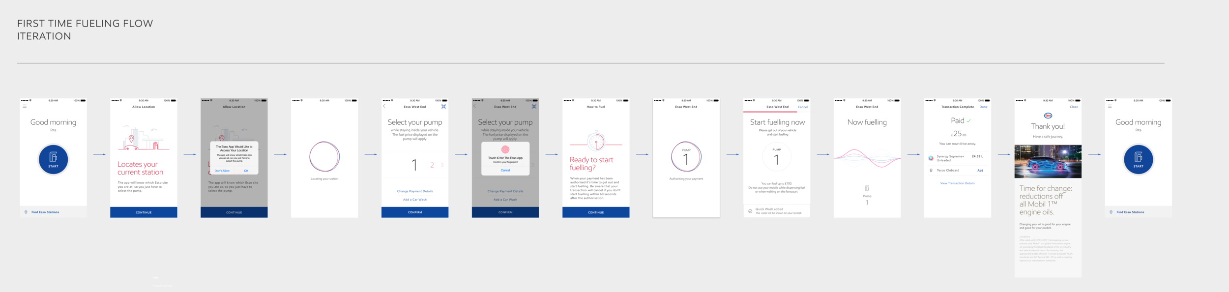
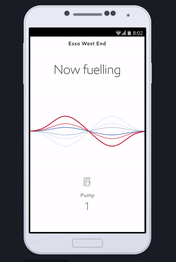
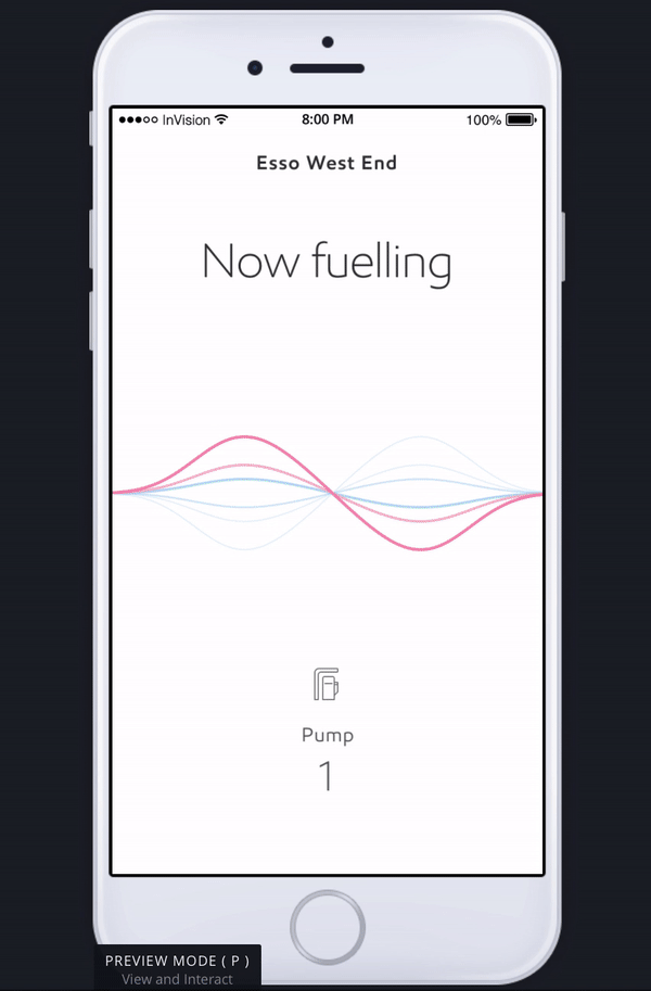
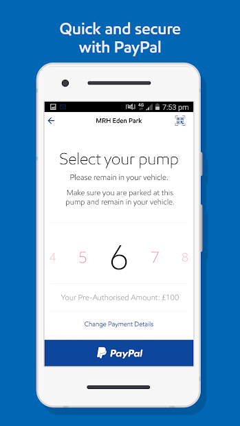
Fueling flow: This flow is the heart of the application. It is initiated from a prominent CTA on home screen. Steps are kept simple to support the primary user goal of fueling fast.
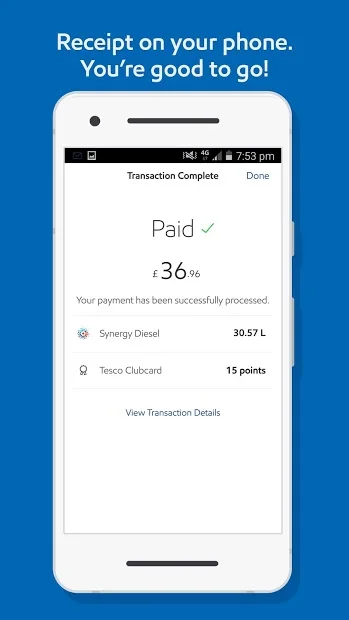
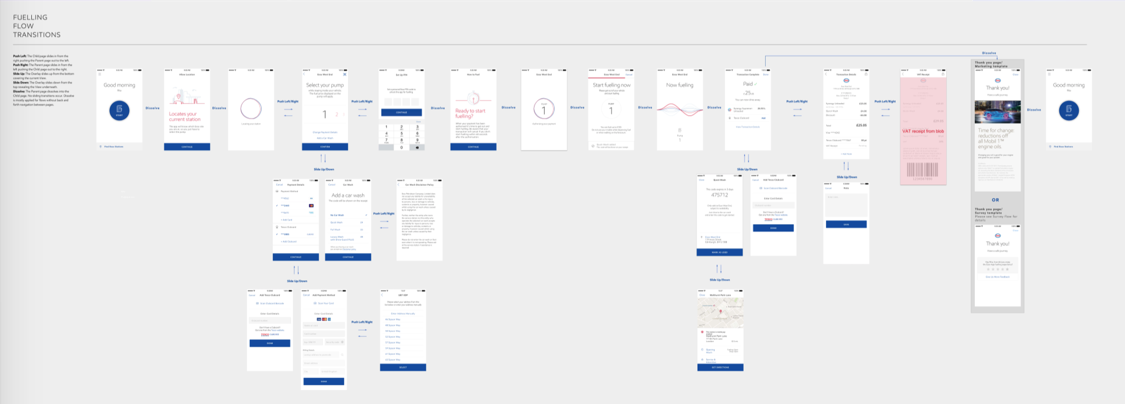
This is a complex flow as it is partially user initiated and partially system initiated. After tapping on the home screen CTA, user next selects the pump they parked at. Once pump is confirmed, app gives user 30 seconds to get out of the car and start fueling at the pump. Once user picks up the physical pump, system activates the fueling state animation. Fueling state ends when user is done with the physical pump outside the car. Flow ends on the transaction complete view surfacing details of the transaction. User taps the done CTA to exit the fueling flow.
On the 1st round of testing, users mostly got through the flow successfully. Biggest issue was at the end. When fueling was complete user’s card was charged with the final price, system loaded the transaction complete screen with the prominent price and thank you message. But users were not sure if payment was complete, so most of them wondered if they could drive away. While tapping on the done CTA, they thought they were making the payment. (Design on the left)
To enhance, we addressed the last step design. First, added explicit messaging “paid“ to communicate that the payment is done and a checkmark sign indicating completion visually. Second, for the done CTA instead of the full-width primary button style, we used the pattern from the tutorial flow and placed the CTA on the top right.
On the 2nd round of testing, end of fueling was clearer to all participants. They immediately noticed the paid message and checkmark, said they’d be comfortable driving away as they knew payment was successful. (Design on the right)
2. Expanding to a system and documenting design intent
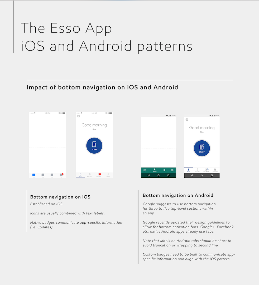
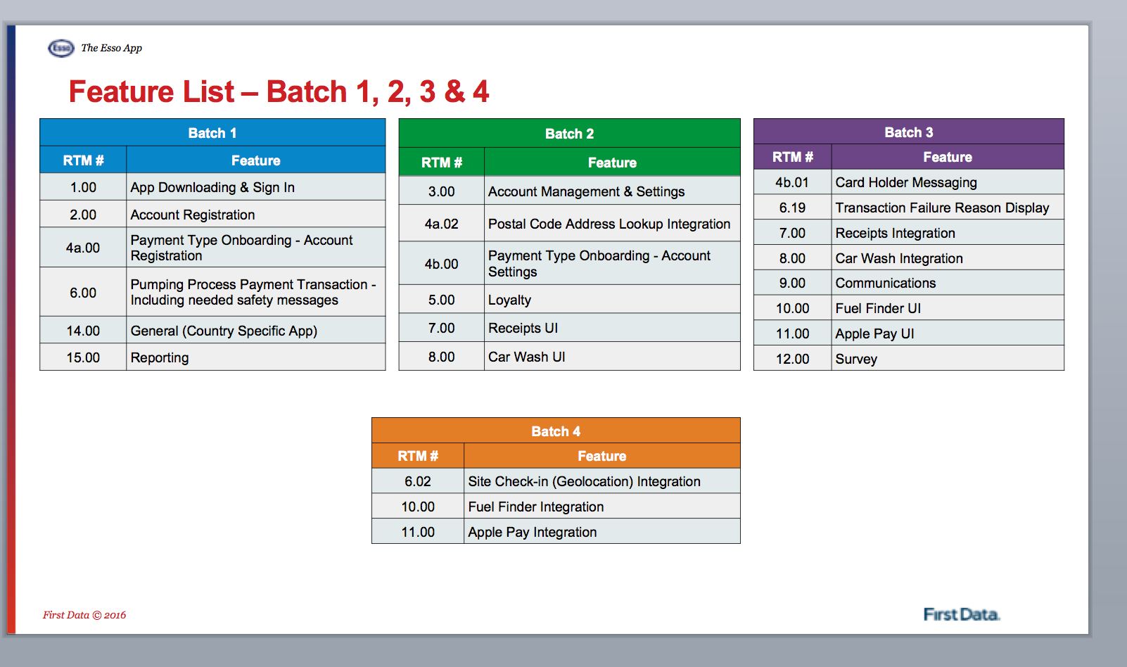
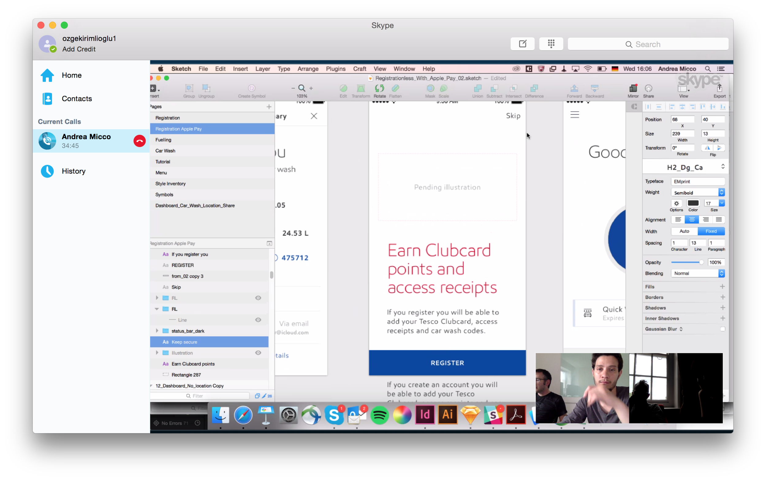
During phase one, frog team has established key flows and an initial design language. Before we kicked off phase 2, Exxon started building the Android and iOS apps. I worked on expanding the initial designs to support both iOS and Android platforms, support all use cases and deliver both apps to market.
Platform agnostic design: To expand the system to both platforms and make feasible choices for design and development process, I constantly reviewed platform specific guidelines and best practices. We only made changes to UI when platforms demanded and if we thought users would be unfamiliar with a pattern on one of the platforms. For example to validate the use of navigation drawer on iOS, I created InVision prototypes, did market research, documented pros and cons to critique with the team and conducted user testing.
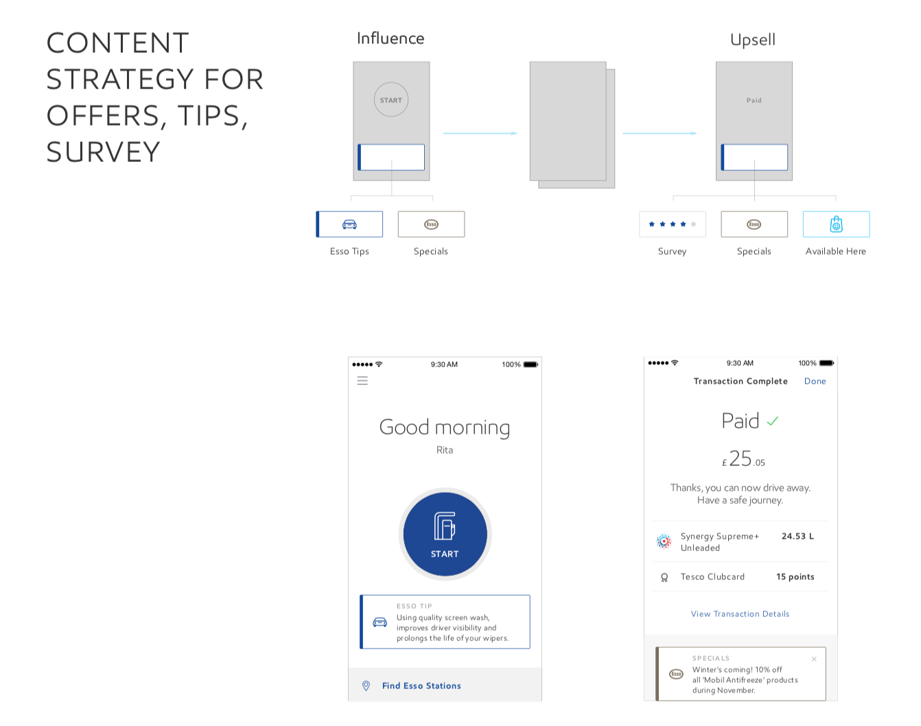
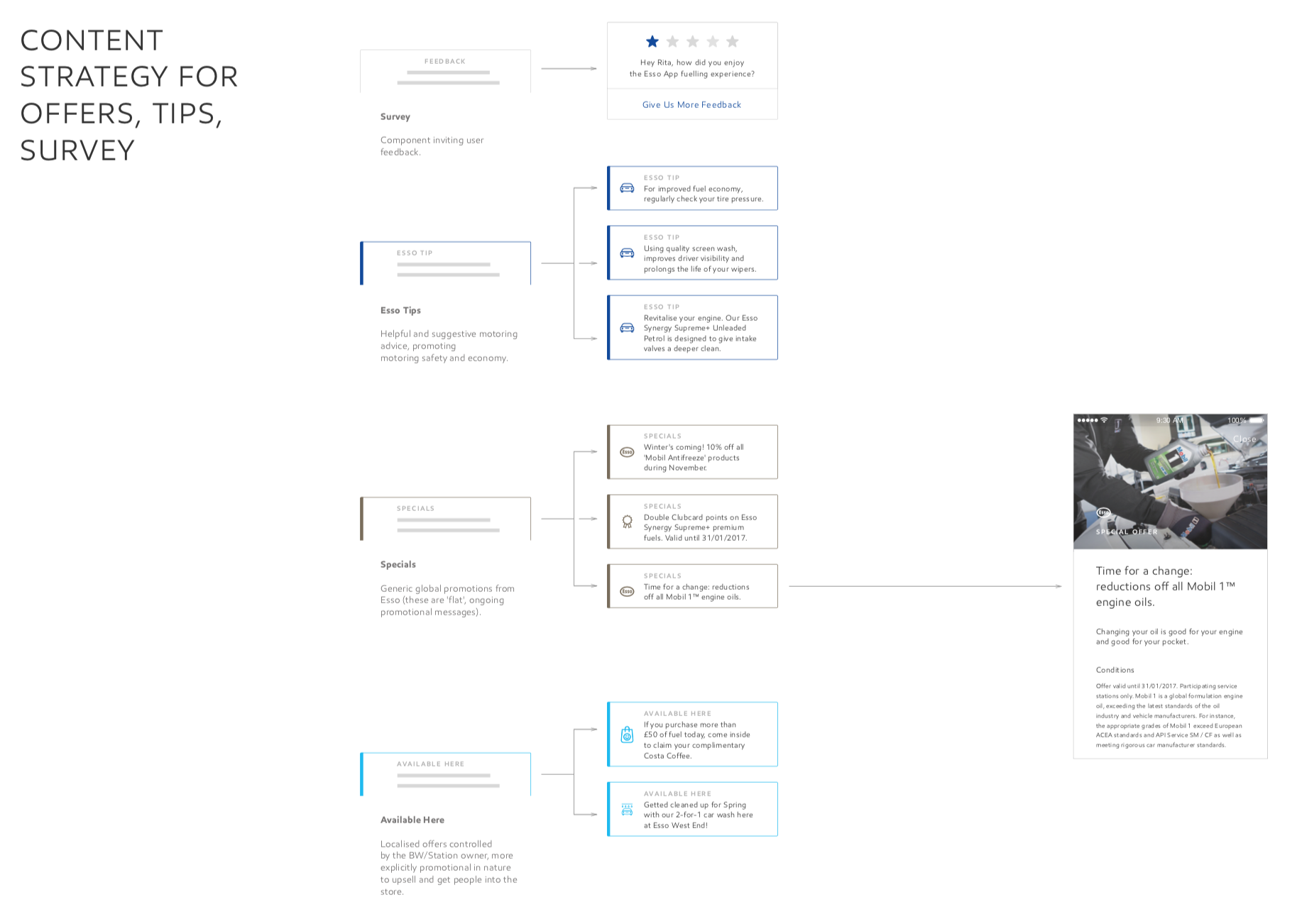
Evolving product and content strategy: To enable success of the product, we considered usage and content over time.
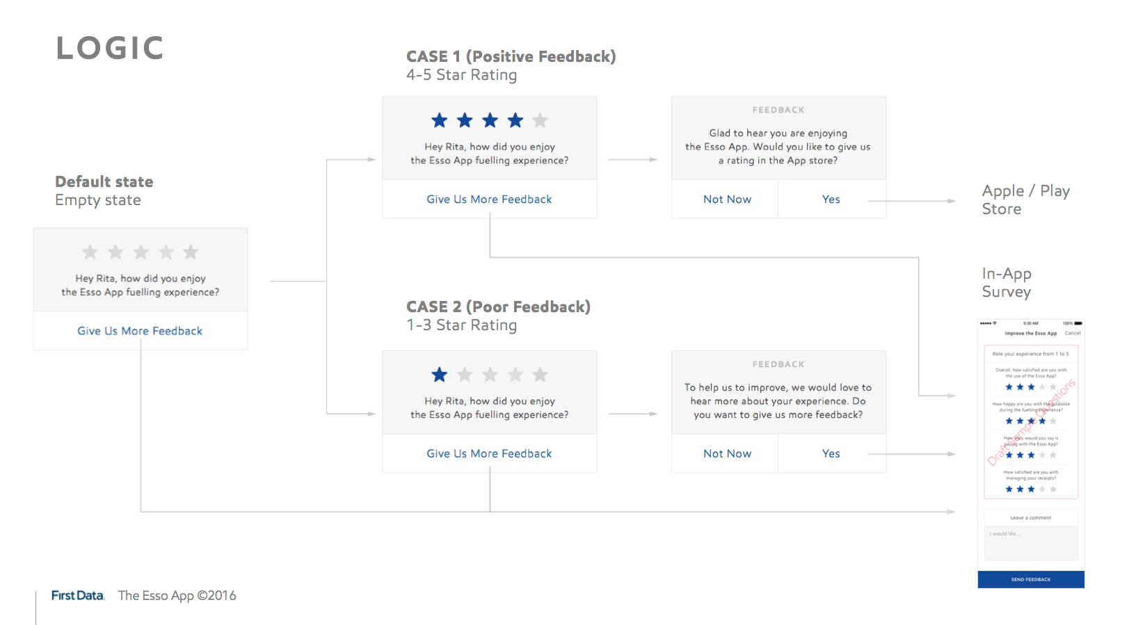
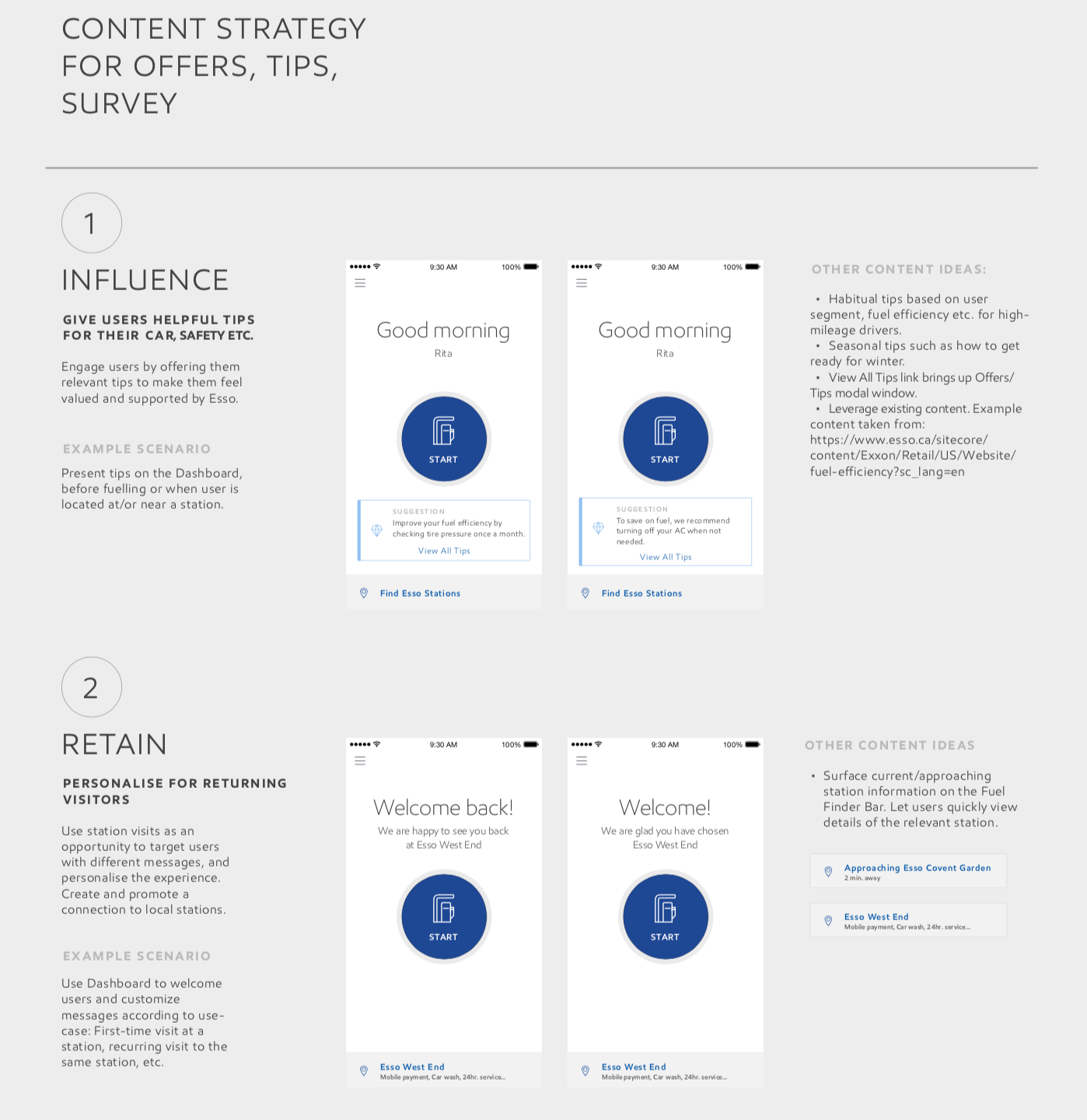
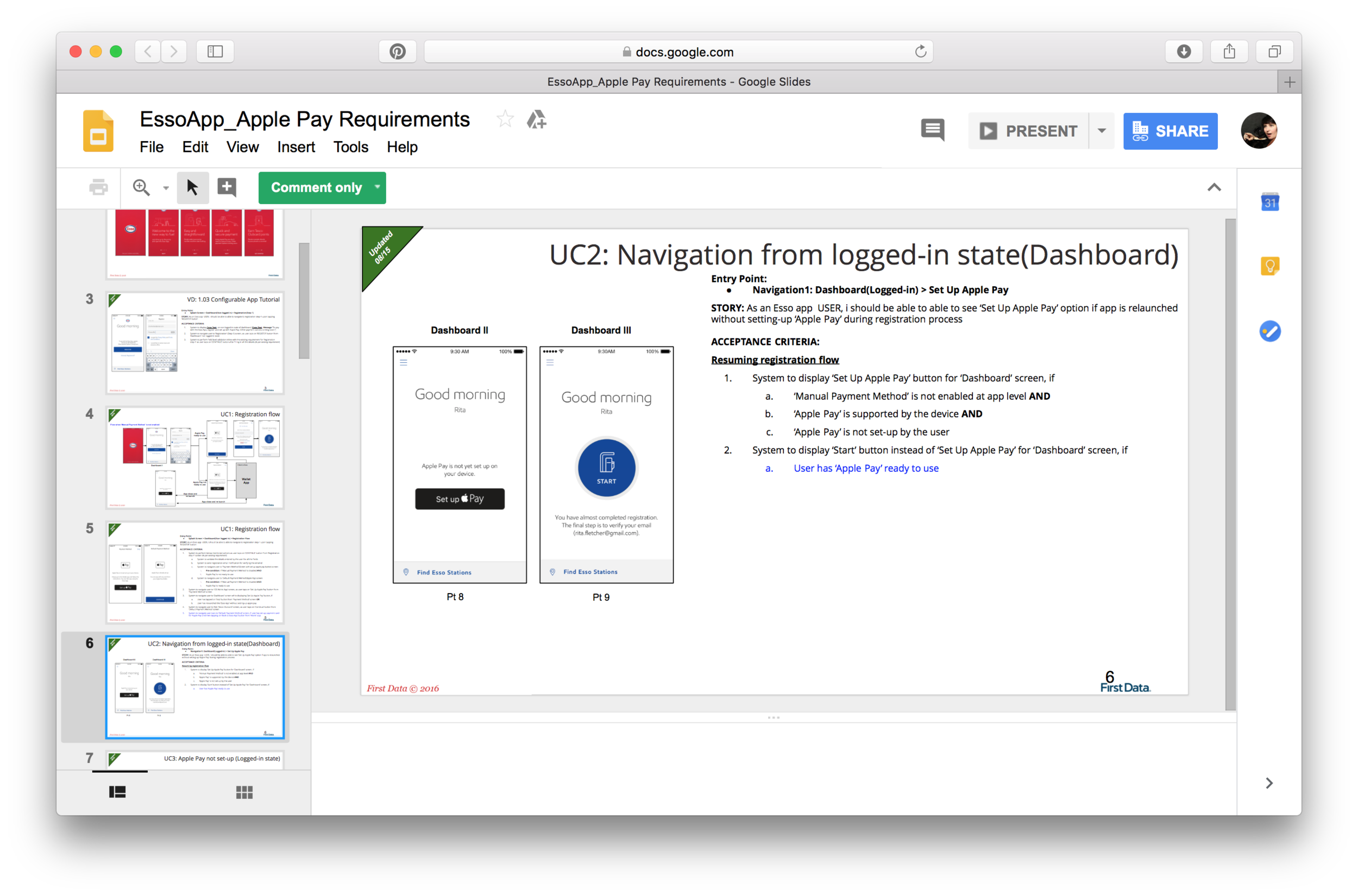
We worked on creating a content strategy that would help Exxon product owners hit their business goals and provide value to users. We designed a system of dynamic and personalized content cards that surface marketing, loyalty and educational content considering user context and behavior.
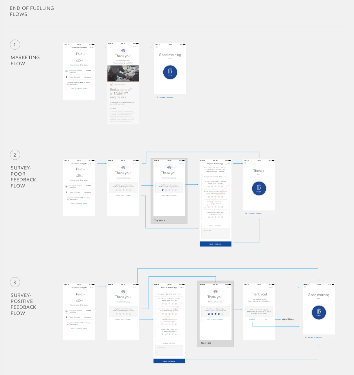
After initial design work when starting to implement the dynamic card system, we iterated on the initial thinking. Instead of placing cards down below the transaction complete screen, we added a final screen that contained conditional content: after the 1st time fueling it thanked users and showed Exxon marketing content, after 2nd time fueling it surfaced the survey card and asked users for feedback.
3. supporting development process
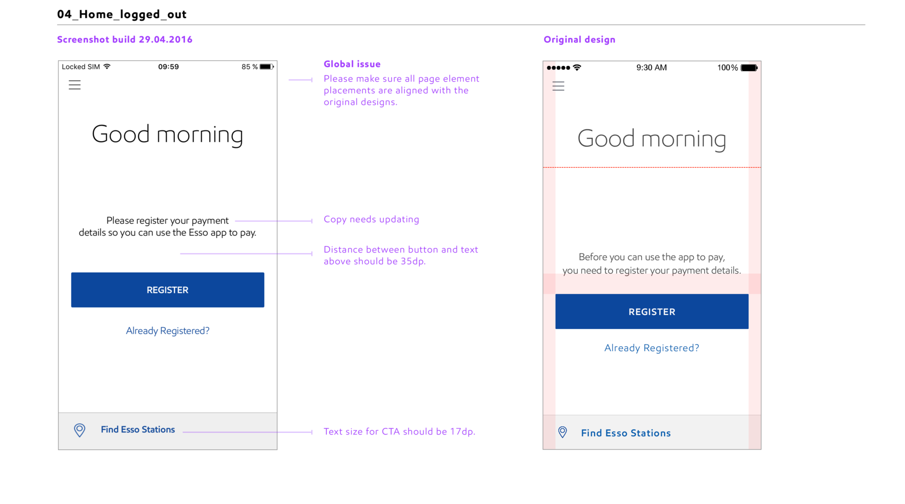
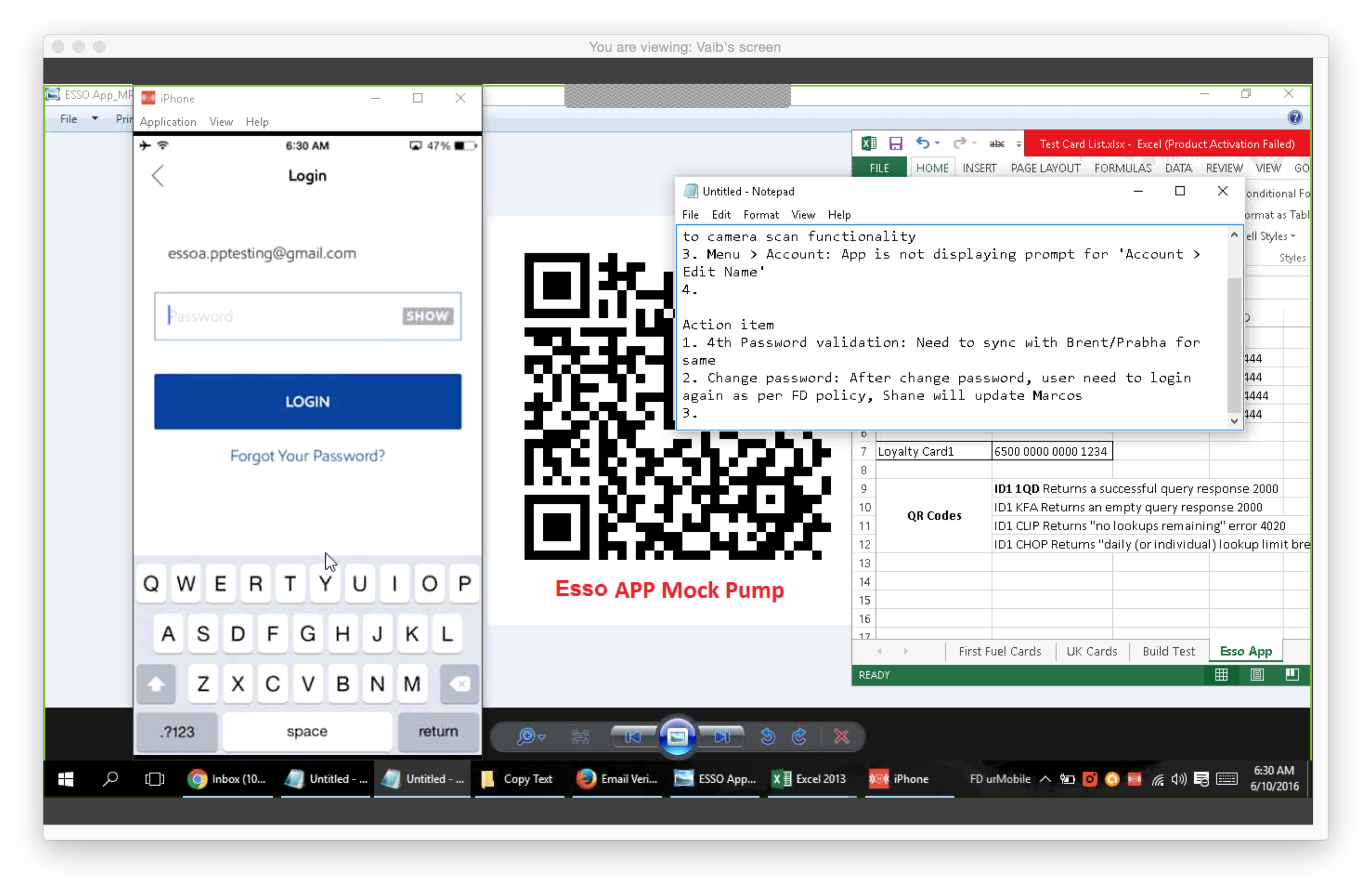
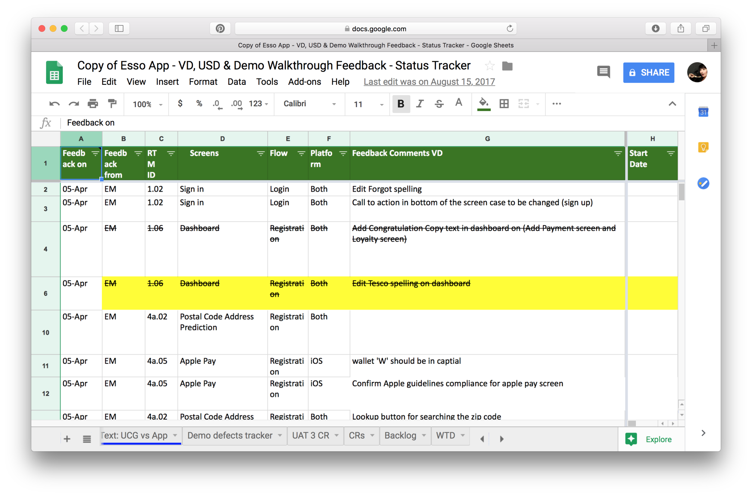
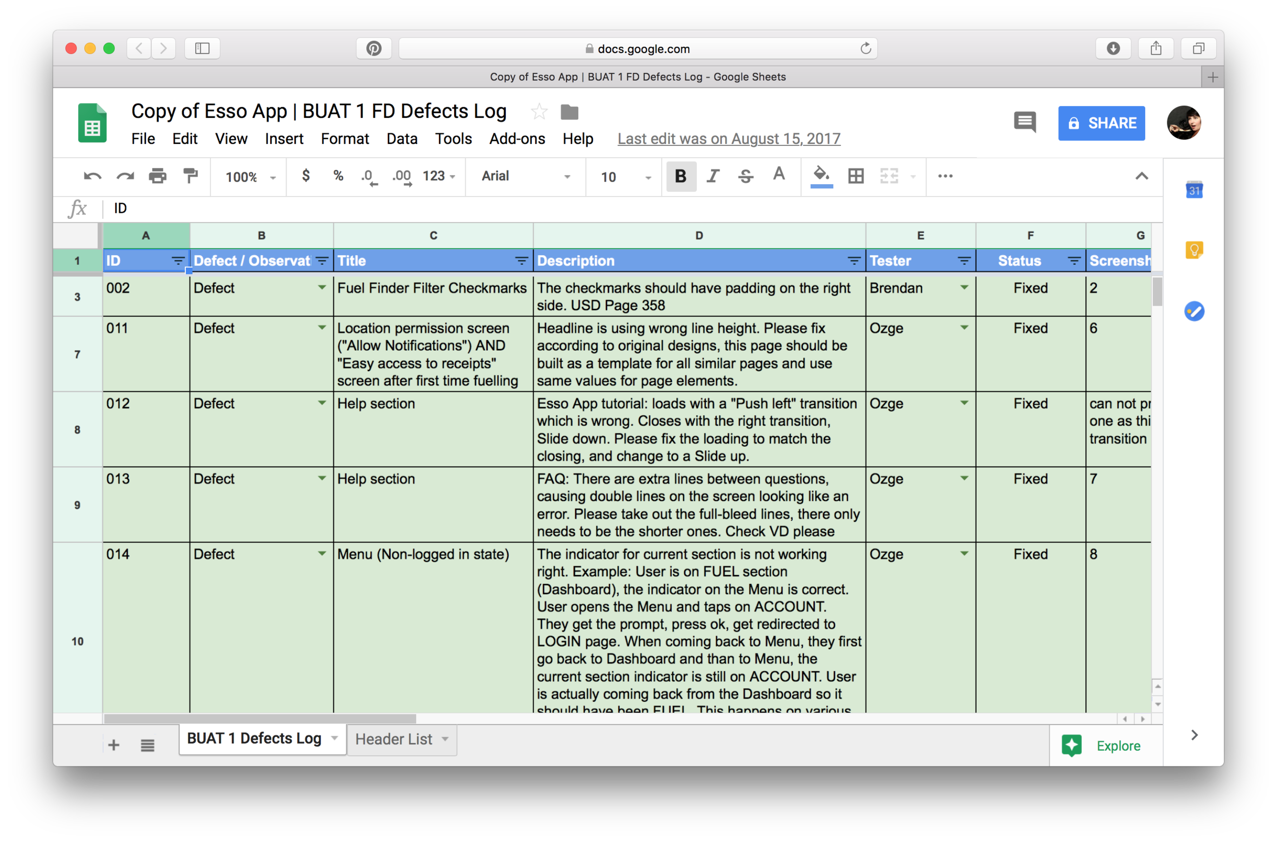
To support development we took part in daily calls, did visual and functional QA, documented and tracked defects.
My biggest challenge was understanding and working with the different goals of all teams involved. BAs wanted to create detailed documentation to ensure build was accurate. Developers, already working on build, wanted quick answers. Product owners had to make sure the design was implemented right but also needed to ship the product on time…
We took on more of a hands on approach and worked with BAs to help document the system thoroughly, which at times meant 10 hour calls. In parallel, we also had regular calls with developers where we asked and answered questions. During these calls, myself and a design technologist partner from frog, often ideated on the spot with developers to find the most feasible answer that was also the right one for our users.
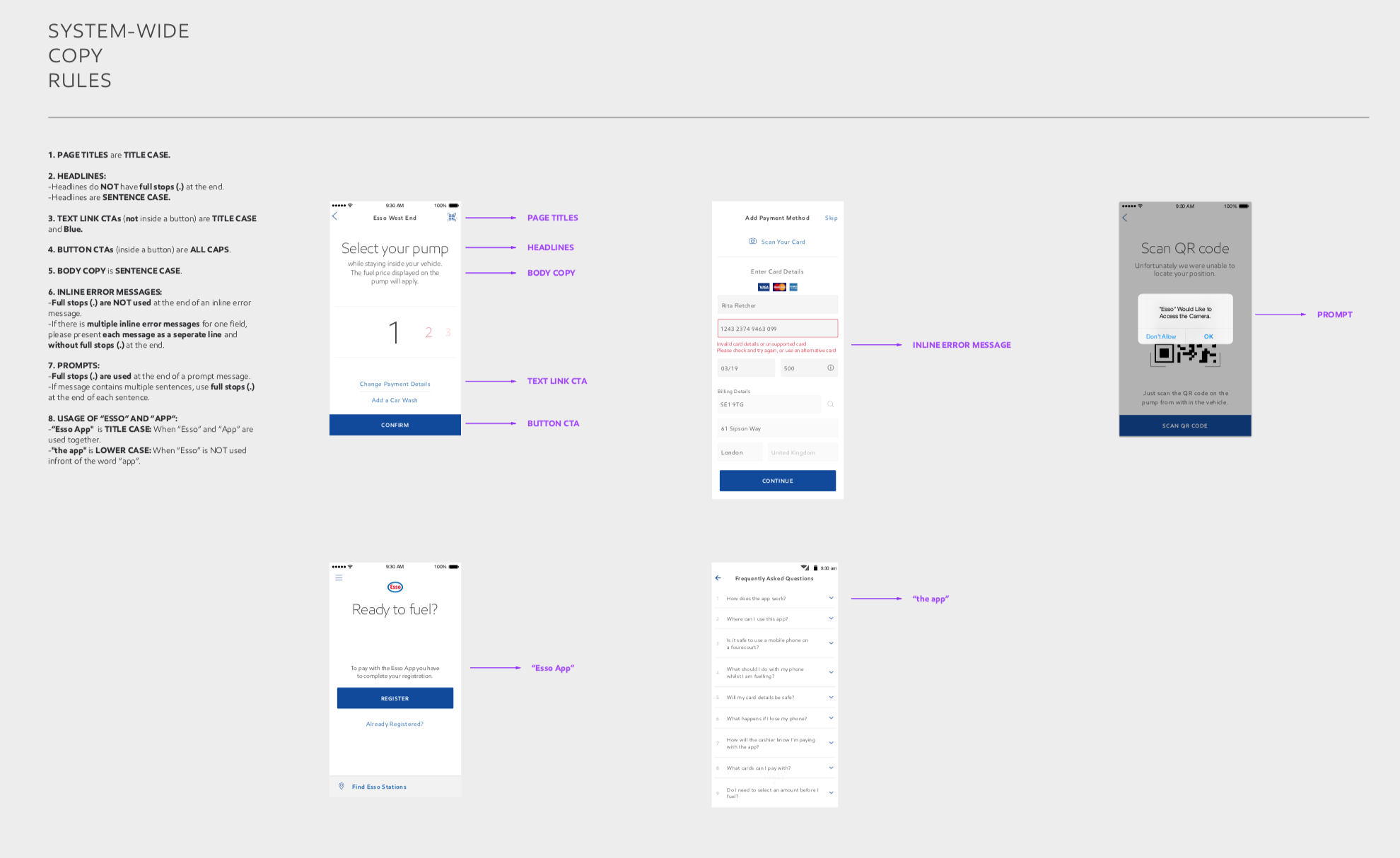
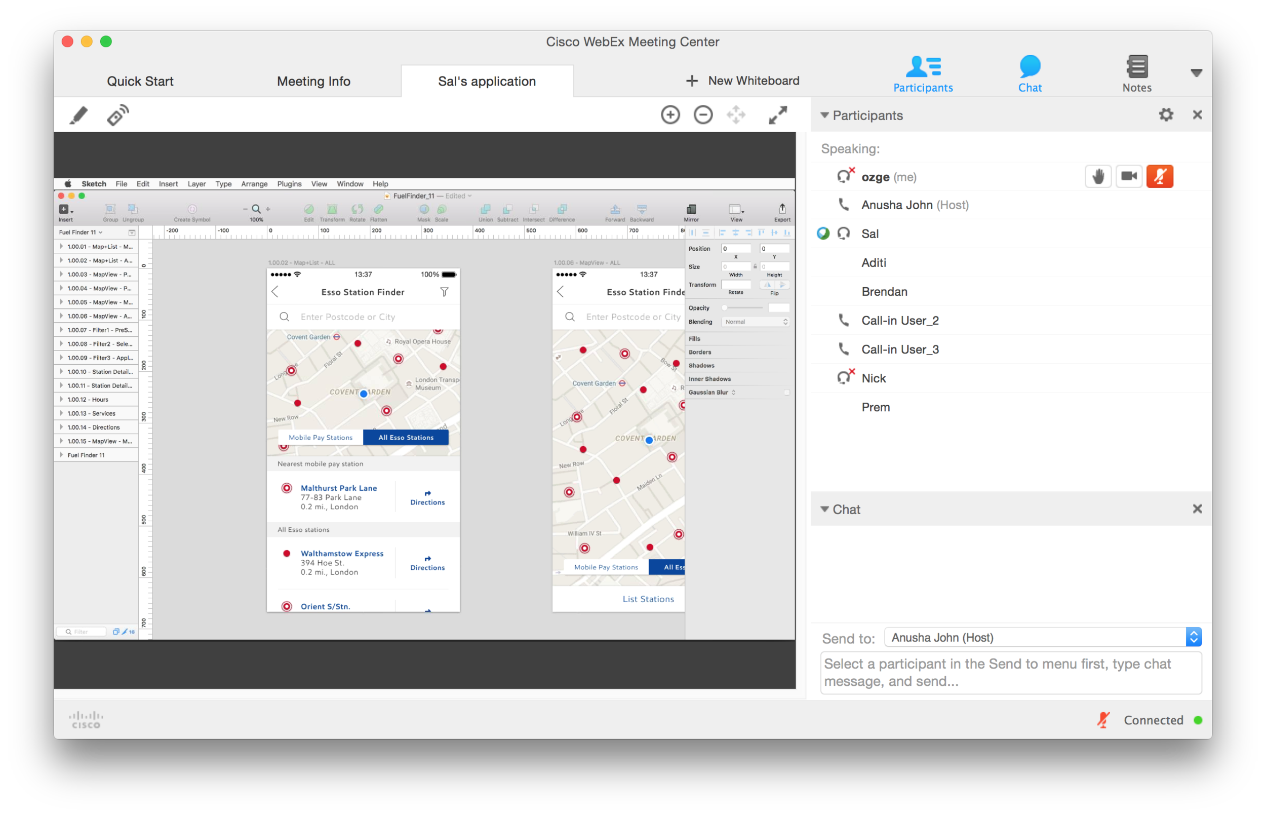
Documenting for BAs, development and design teams: I was working with a variety of teams and work was constantly evolving. It was a challenge to make sure everyone was aligned and development efforts were spent on creating the best user experience. I created many InVision prototypes to present to design teams and product owners. Yet, teams were remote and I realized InVision was not the best form of documentation for development teams offshore. I created screen flows, adding details such as the transitions etc. This straightforward form of documentation made communication with the development team easier.
4. day-to-day client management & creative direction for partner design teams
We were working with a team of designers on the client side who were working on expanding designs to Android. I was the day-to-day creative lead having daily design sessions, sharing screens and ideating with this team.
I was also the day-to-day client lead. Built a good relationship with the product owners through frequent calls, some open, hard and honest conversations about capabilities, pushing them to build the best possible user experience.