Dinero Express Android App
for Banco Azteca
Project Overview
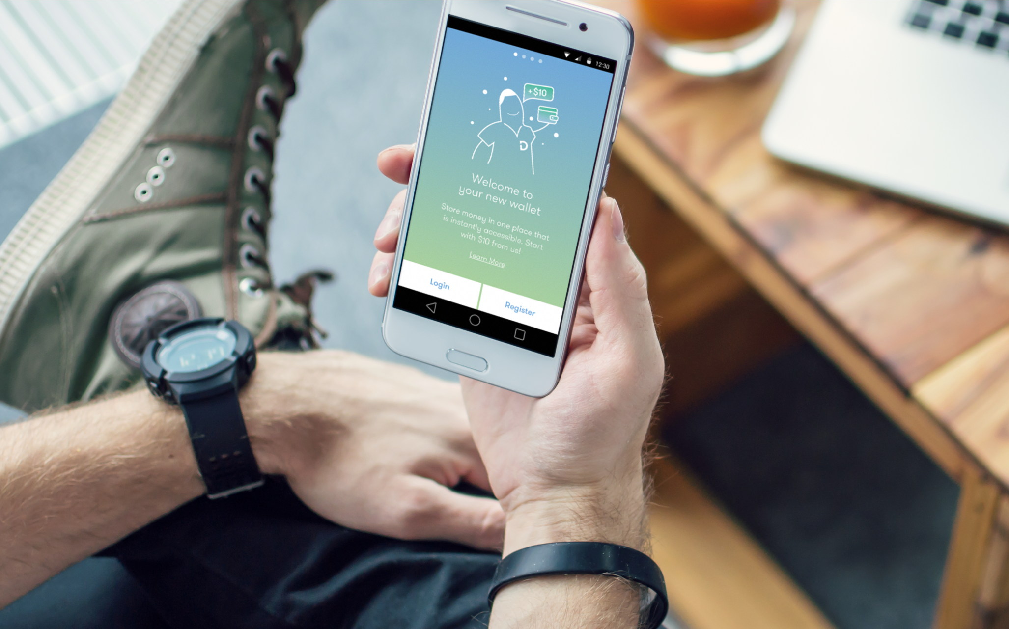
DEX is a financial money movement product for the largely unbanked population of Mexico. Over the course of 10 weeks, frog worked with one of the largest bank in Mexico, Banco Azteca’s Dinero Express division to help them transform from supporting its customers in brick and mortar stores to becoming the ultimate digital money movement platform.
App store link: https://itunes.apple.com/mx/app/dinero-express/id1370199634?mt=8
3 key Learnings to talk about
Project activities over time and the 3 areas i will highlight in this case study.
- How to be flexible in the field
- How to make the product culturally relevant by using research
- Importance of design documentation for inexperienced clients
1. how to Be flexible in the field
Research activities
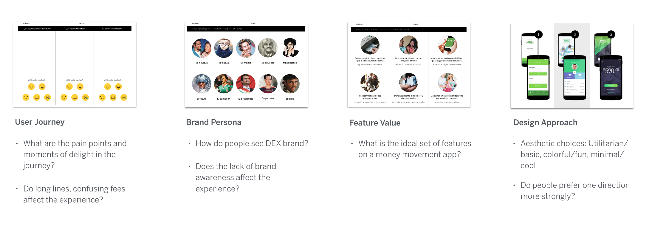
We started planning for 5 days of intercepts in stores on two Mexico city locations. We would be doing customer intercepts, no recruitment ahead of time. During prep week, getting to know the client, we had some early hypothesis. we shaped our research activities with participants around those hypothesis:
Problems such as long lines are big pain points in the user journey. we designed a simple 3 step before-during-after journey of sending/receicing money.
DEX is a service/ofefring under banco azteca bank, which is placed inside the elektra superstores -like a mexican target or a walmart. this confusing structure seemed to make the DEX brand suffer. we wanted to see if that affected the experience.
Few wanted to hear which feature sets people preferred in a financial app,
Design aesthetics, we did 3 quick exercises of utilitarian, colorful and more premium looking intercase. wanted to see if here was an obvious choice.
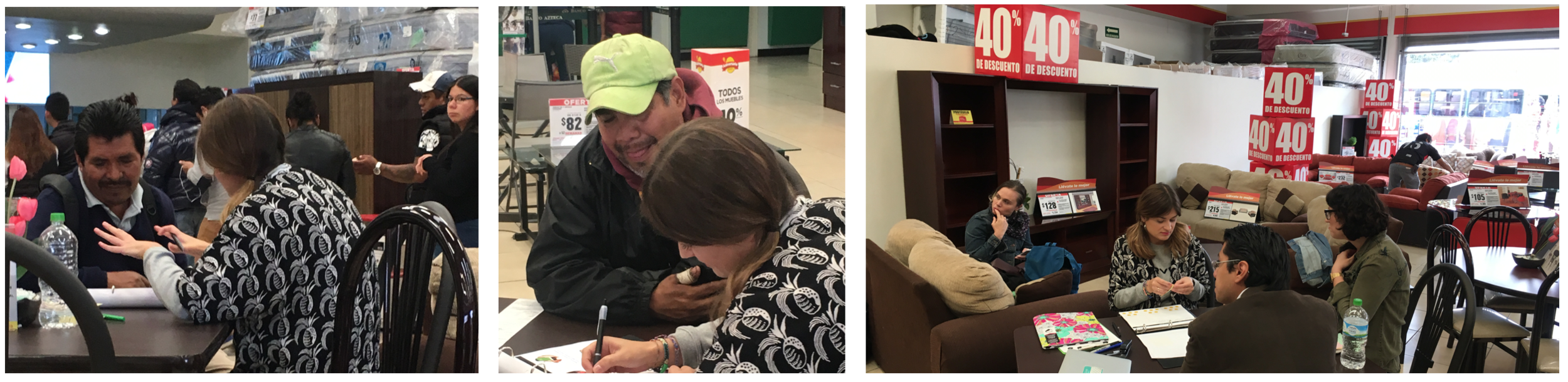
The Field
the field was a bit of a disaster. we ere interviewing people amongst piles of mattresses and on furniture sets on 40 percent sale. people were suspicious, said they’d not give their atm pins or have photos taken. did not want to leave the line even if we hold their spot. the ones we got, we did not get far with. very low literacy, low digital savviness.
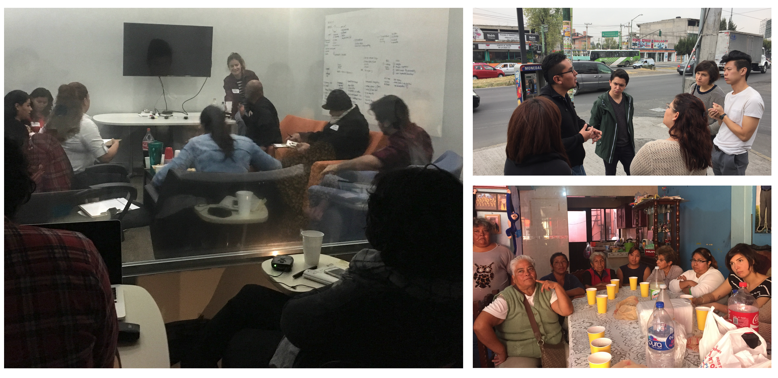
The New Plan
Focus groups: mexican facilitator, people felt more comfortable, calmer environment. others sharing financial details... it’s a very e social culture in mexico, people did not sway each other as they might here. they were better recruited. more literate and responsive.
Antropological tour: pretending to be students. understanding the lower middle class better, having tamales with them in a very uncontrolled unstructured setting in their home. understanding how our target market lower middle class actually lives.
2.How to make the product culturally relevant by using research
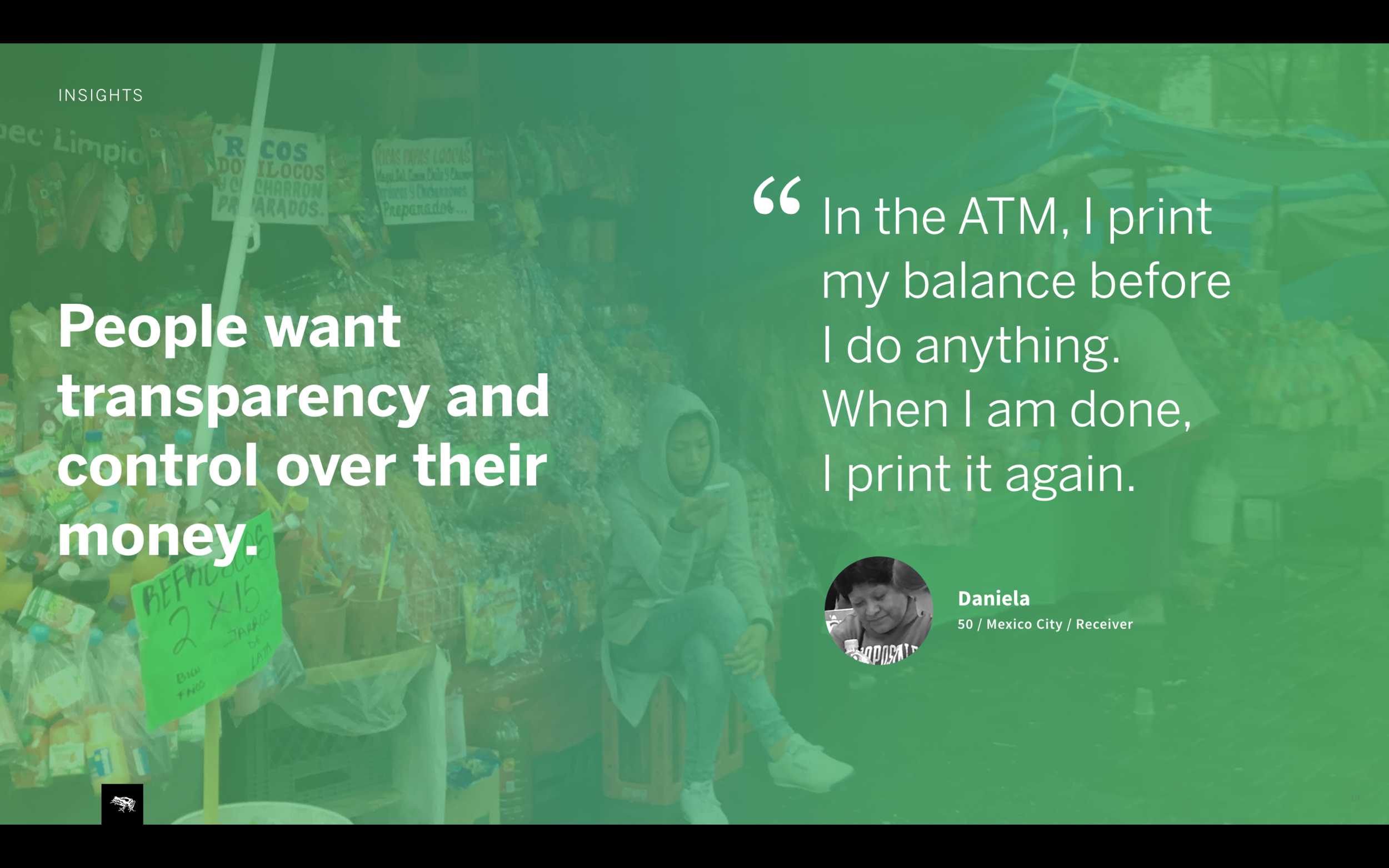
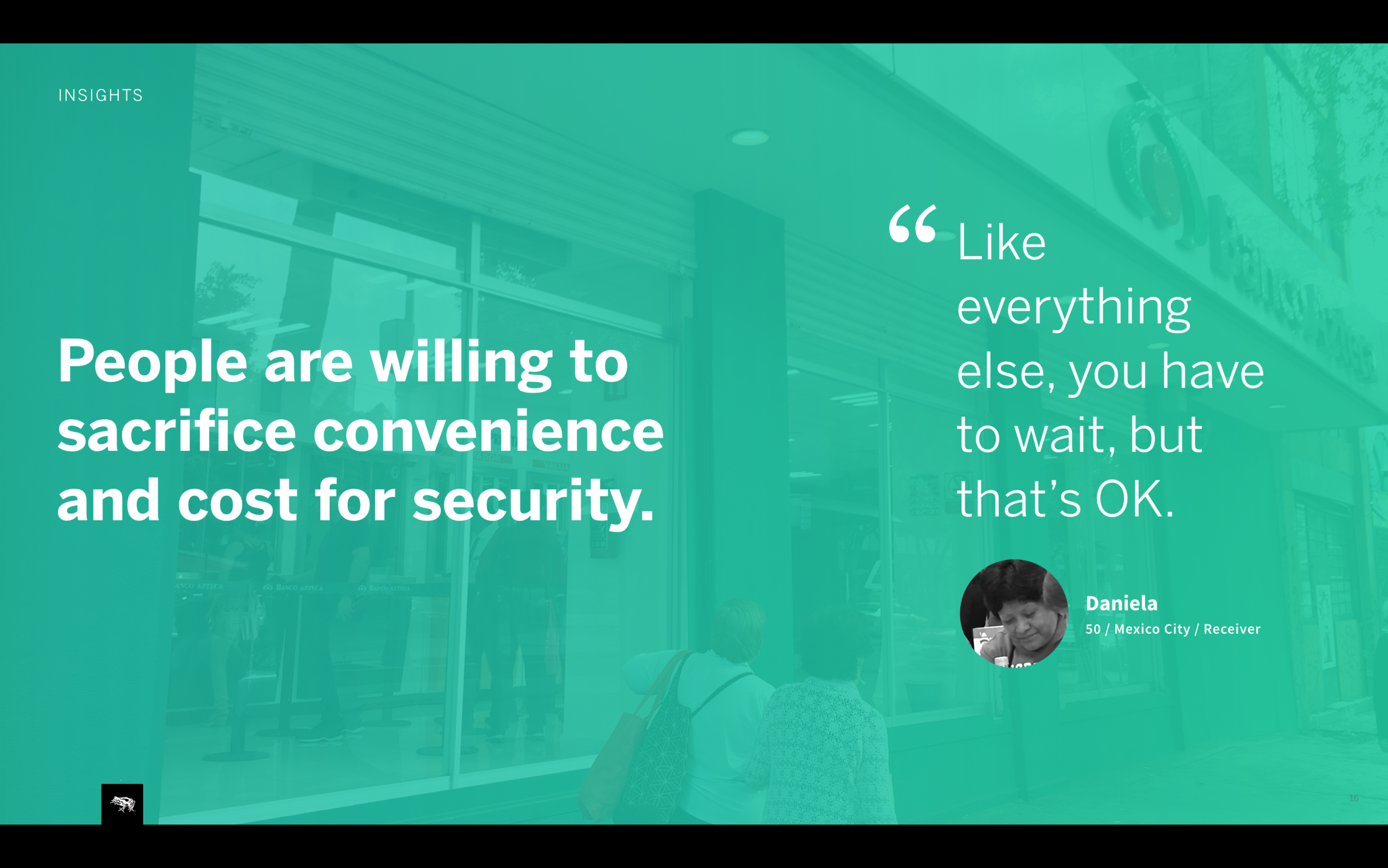
People willing to sacrifice… Broke our early hypothesis. noone cared about the line. line and the fees were worth it if the money got to their loved ones securely and on time.
Money is beyond me, my close family, money is for my community. i might send it to a friends’ kid in college in Honduras or my daughter with 3 kids in Puebla. this was a very different and endearing.
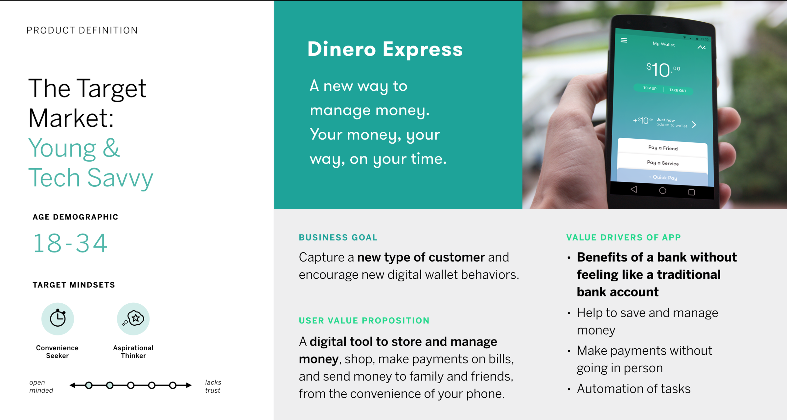
Product definition with target audience, business goals and value proposition.
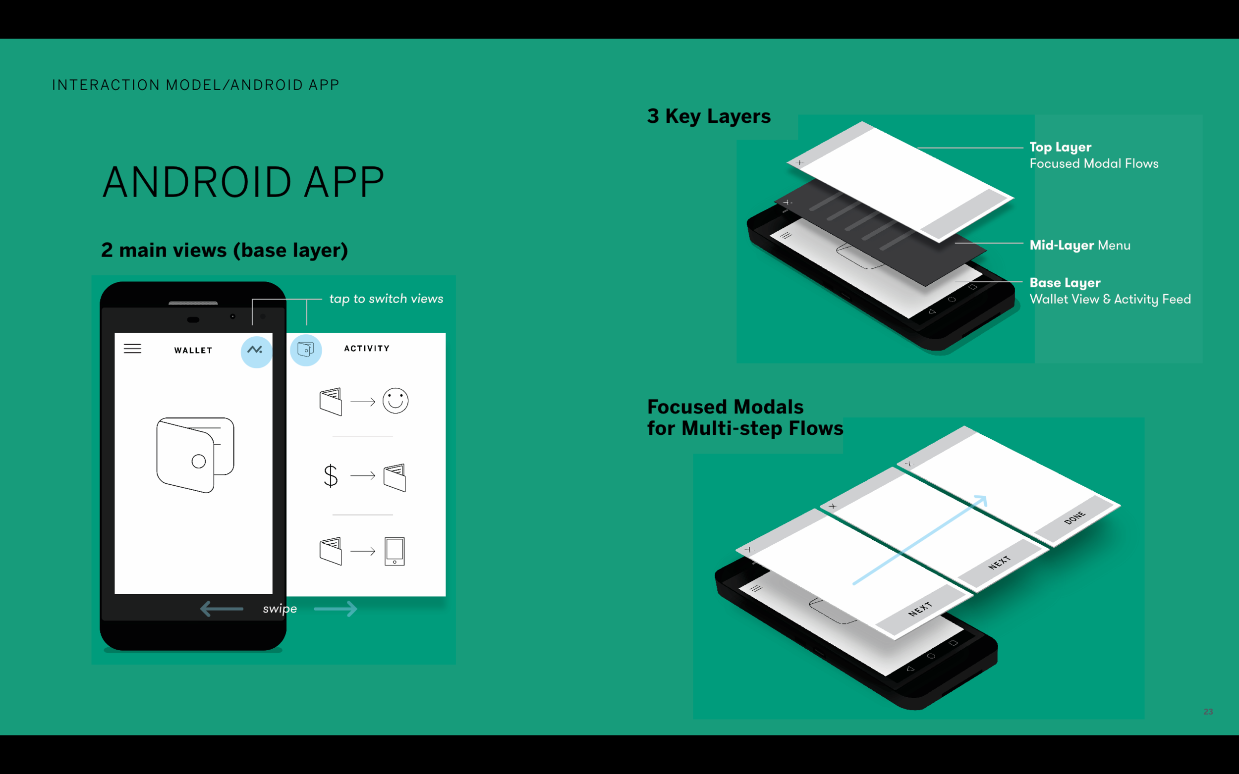
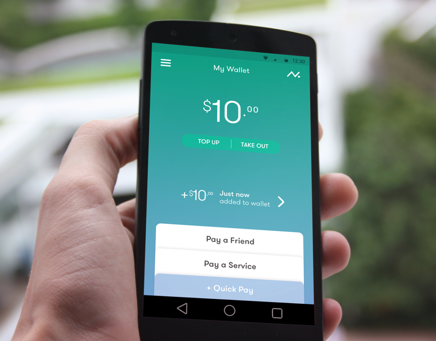
Interaction model diagram
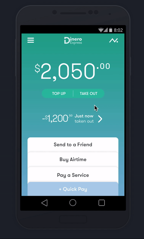
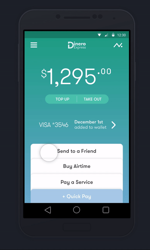
Interaction model is shaped around main user NEEDS. Our base layer has two views, when user launches they see the wallet and one tap away is the activity which provides the much needed transparency. wallet, providing need for control, holds the key actions that are launched on the focused modal layer. all transaction occur on modals, start and end on the wallet. all changes get reflected back on the base layer.
Menu is a navigation drawer which holds less used sections like settings, store finder.
a few ways the interface is accommodating the primary user needs & goals
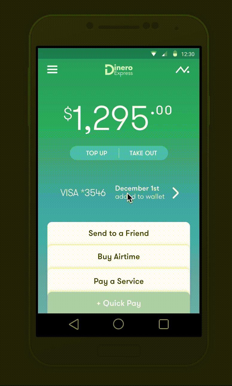
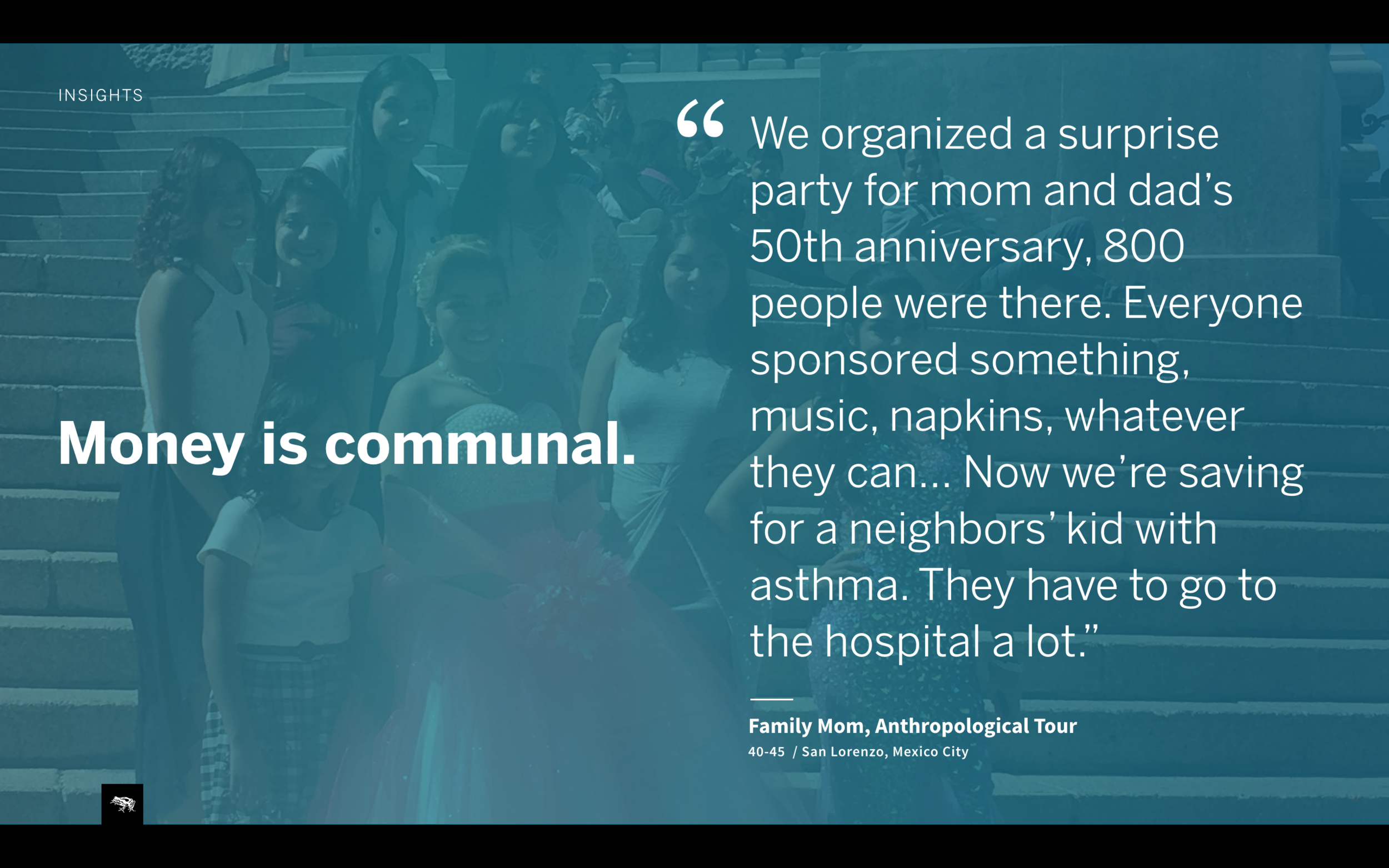
building trust by providing transparency
Wallet balance and last transaction is first thing user sees, letting them know their money is safe and secure.
Activity feed holds the details, receipts and exchanges with users’ community.
hand holding
for first time
use
First time screens give clarity to an unfamiliar experience, helping user feel at ease to continue.
total control over key actions
Progressive forms guide users through the process, one step at a time.
“Send to a Friend” featured as the first action, celebrates the communal aspect of money.
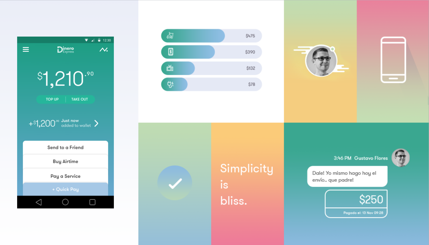
Visual design
Tries to tap on certain emotions of the user, tries to be inviting with bright color palette and soothing with the minimal elements. the smooth gradients are intending to be calming.
3. Importance of documentation especially when you’re working with a client thats new to mobile development.
To me documentation is key to any product, app or physical product doe snot matter. you have to document design intent and functionality well-enough. and it depends on the team that’s receiving it. Our client had a v1 app they were working on with a 3rd party company. there was no documentation other than a pdf of screens… 3rd party could not finish development and noone could pick it up… client lost time and money.
So we had to make sure v2 had a chance to exist. I will not go through it but mention how we approached it. i can send it along for anyone sho likes reading documentation. Structuring the documentation is important. rather than jumping to hero flow functional documentation we started with structural elements, int model, application map, all main views. you saw that activity is in wireframes only…
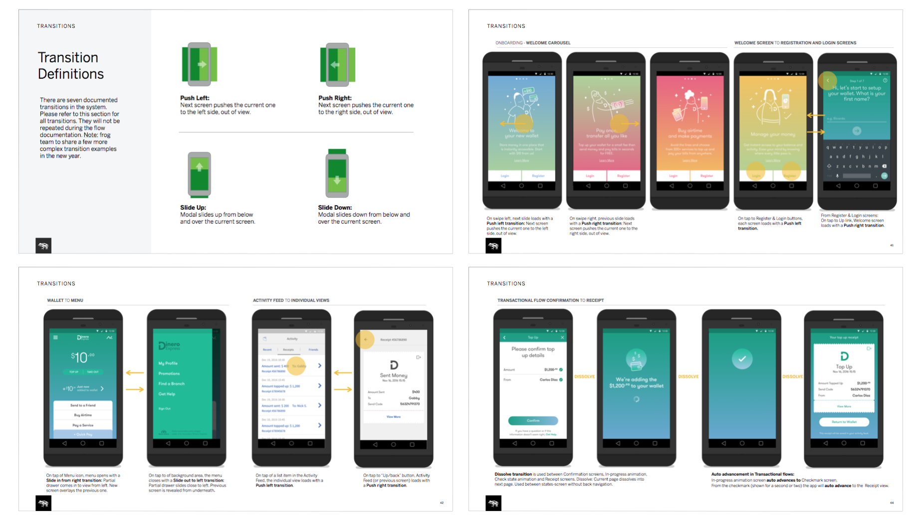
How it behaves is the functional documentation of hero flows, even tough we do hero flows, still have to set the foundation so— first talk about structure. than get into functional documentation of user actions and the system. Very important to any mobile app project is how the interface moves.
Here you see some more detail of the actual documentation, starting by defining the transitions and than documenting it in the actual interface flow. One thing to note for transition, is our very conscious choice to keep them basic, off the shelf android ones. we knew client was building an internal team who may or may not be experienced with app development. so we went with what could be achieved rather than what needed heavy customization.
We wanted to make damn sure it’s gonna be built this time…
Conclusion
MENTION RESPONSIVE HERE...
Which is a good transition to the end… as both projects in last phases of development hopefully will be tested soon. We also nudged them with new fee structures, they liked but wanted to test it first…
Hardest part: not understanding the language, having to have it translated. i’d love to know it without interpretation of a translator.
What you’d change: usability testing of the concept or the foundational designs before all the ui work, especially the second phase.