DEX Responsive Web
for Banco azteca
Responsive web project to expand mobile app designs for a Central American bank.
Project: After completing the first phase of design for DEX Android app, Banco Azteca, one of the leading banks in Central America, asked us to design the responsive web platform. During this phase we used the design language established for the app and created a responsive system.
Process: We kick started the project by working with clients closely to establish a responsive design strategy. We decided to design all key screens and flows across 3 breakpoints to establish the responsive system.
My role and responsibilities: I worked with another interaction designer and two visual designers, on the responsive design strategy. We knew from first hand research that users mostly had less sophisticated mobile phones and a lot of them had only public laptops for web viewing. We decided to mirror primary functionality between all breakpoints.
As I’ve led the interaction design track of work for the Android app design (see DEX case study on Depth section) and as we did not have more research in scope, I was responsible to guide new team members to understand user context in Mexico: How people used the service, their emotional needs, the business decisions we had to support and why. I also helped plan and run the design sprints.
Responsive strategy
PROTOTYPING
WIREFRAMING
FUNCTIONAL DOCUMENTATION
project highlightS
1. System design: Expanding from mobile app to responsive web
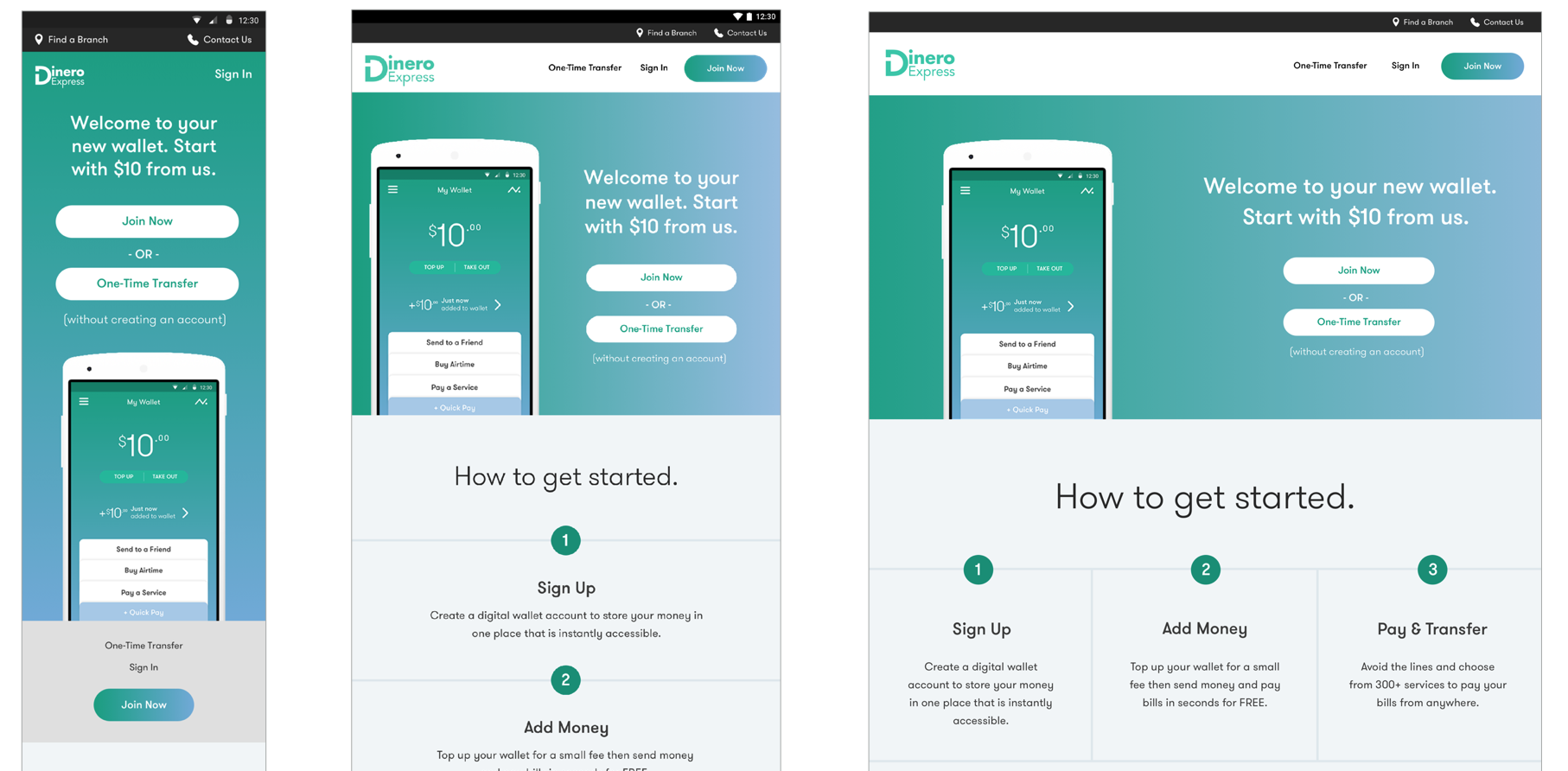
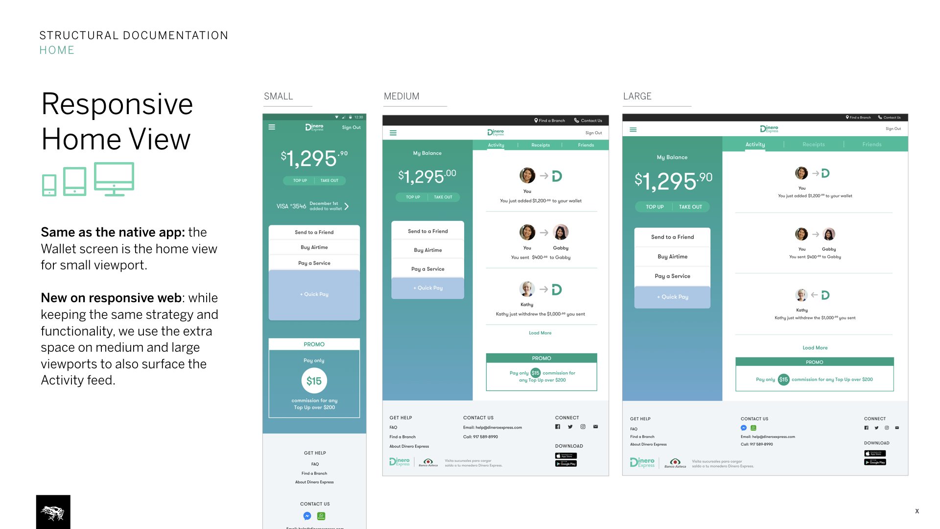
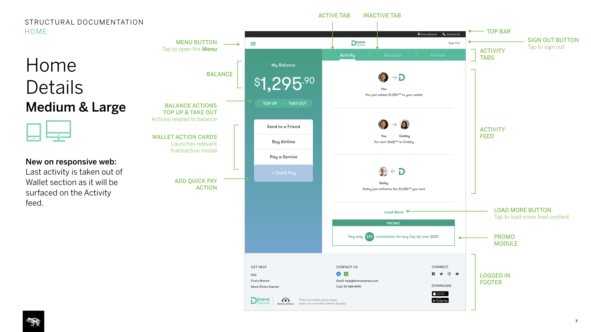
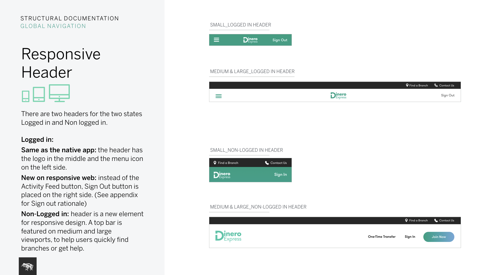
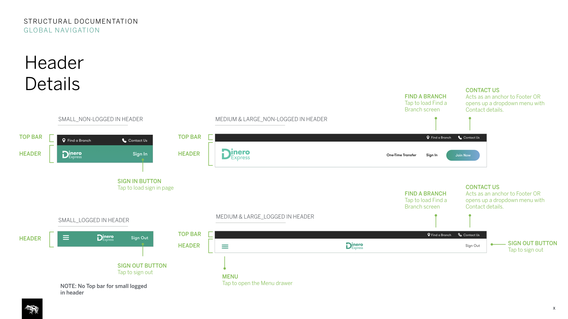
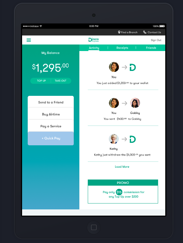
We used our existing design language and digital wallet concept from the Android app. While expanding the system into responsive web, we considered advantages of more space n larger breakpoints and disadvantages of lacking native functionality.
Taking advantage of space on larger breakpoints, we combined the home (wallet) view with the second main view (activity feed). On mobile breakpoint keeping the view very similar to app, we made the view scrollable so users could view promos and the footer. We also adjusted the kept in mind the continuous work flows we’d had to support: sending money on mobile app, seeing the same transaction on your activity feed on desktop etc.
2. Further documentation
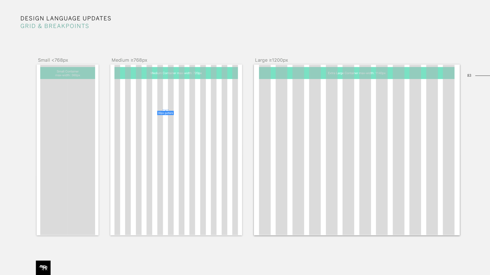
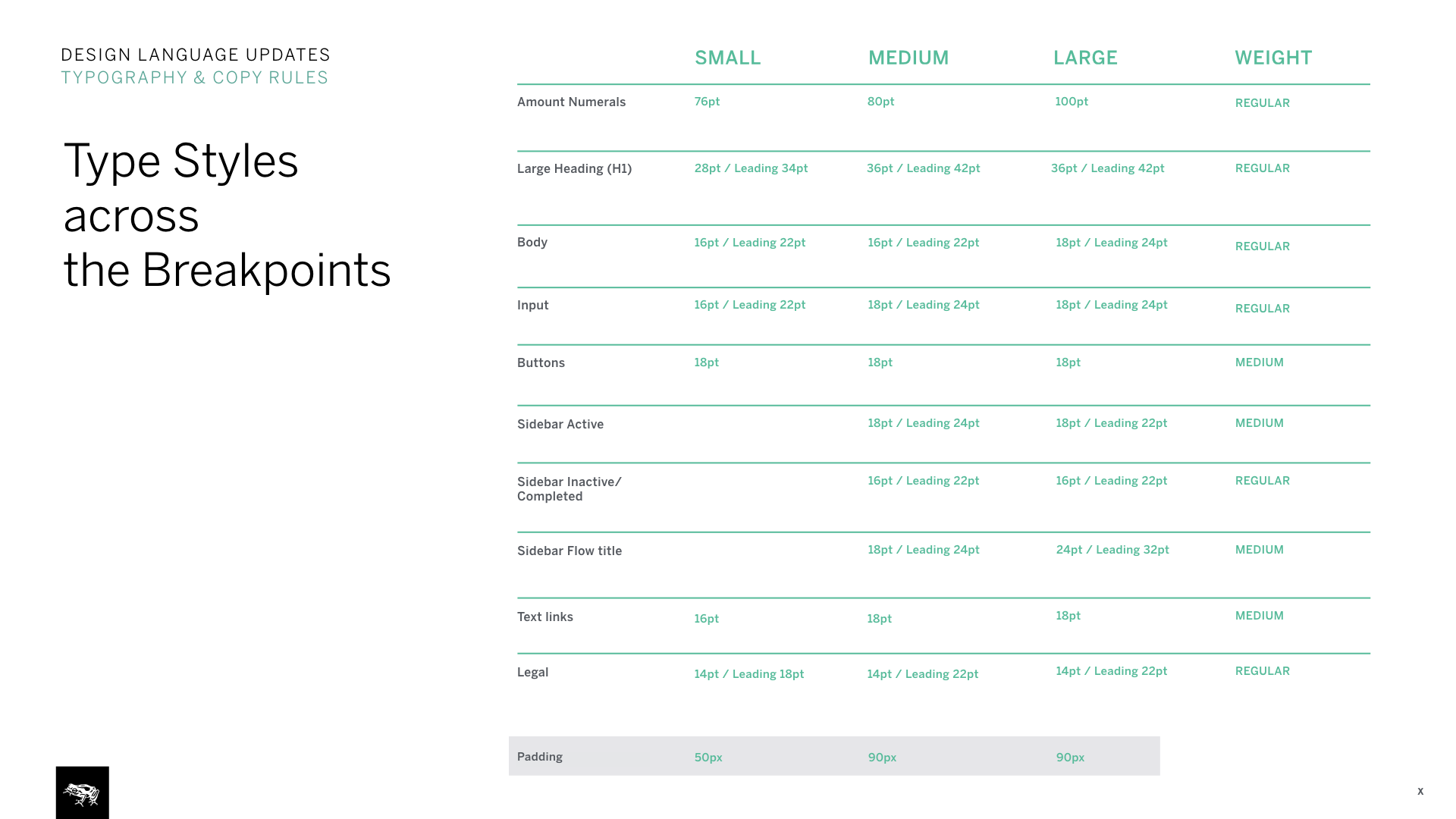
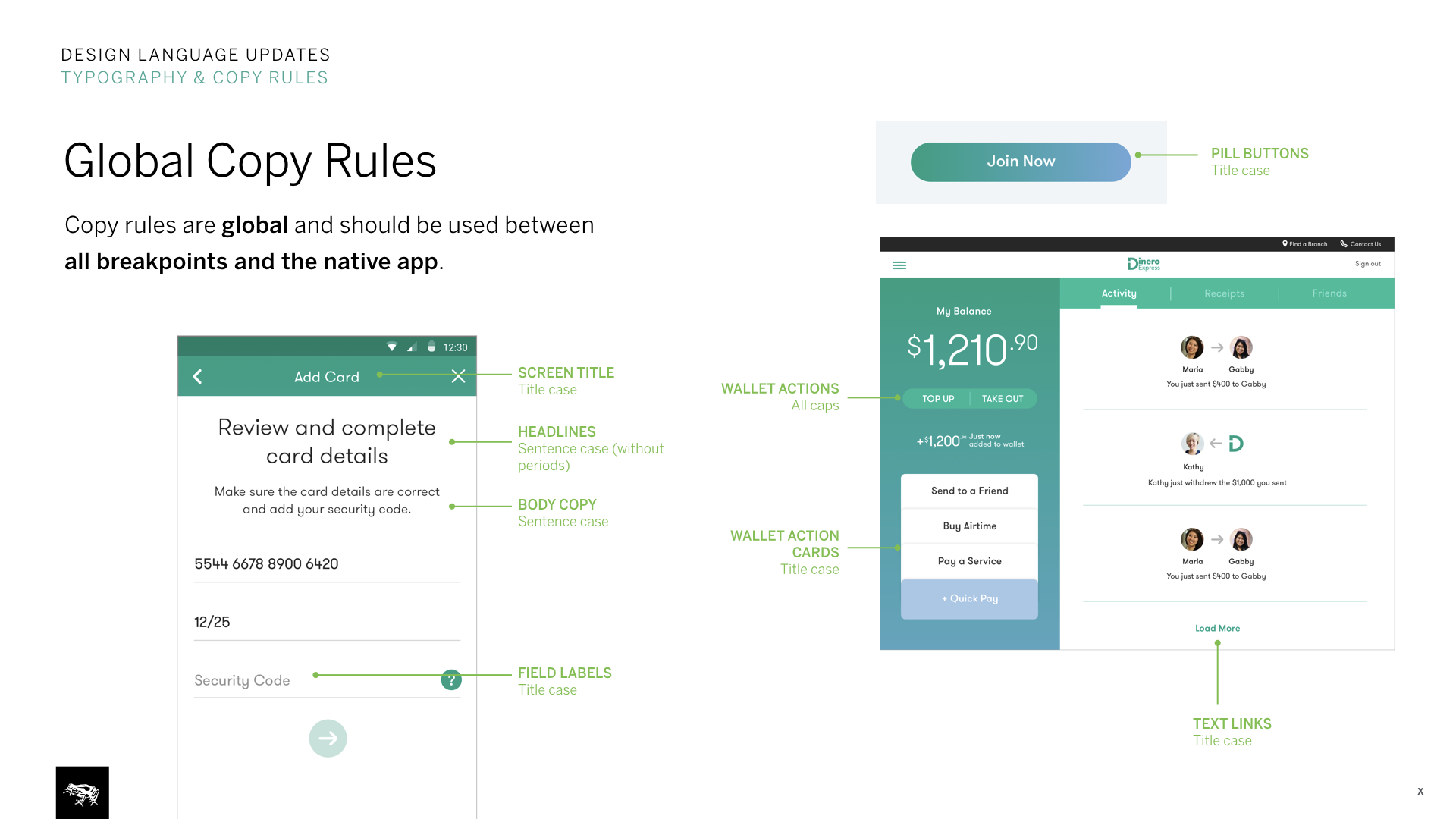
This was also a chance to expand on our design intent and global system documentation. We documented grid system and global rules such as copy rules, type styles etc.
We also took advantage of working within the same system and made adjustments to Android app as well. Such as adding brief instructions to the receipt view to better inform users at the end of each transactional flows.
3. InVision prototypes
To quickly communicate user flows and show how designs & flows scale between breakpoints, we used InVision prototypes. Example flow, Send to a friend:
Large: https://invis.io/PQBU9QKA5
Medium: https://invis.io/UNBW0BWF5
Small: https://invis.io/PABUIZ33H
Password: MONEY1