DEX app and responsive web
Enabling money movement for the unbanked population
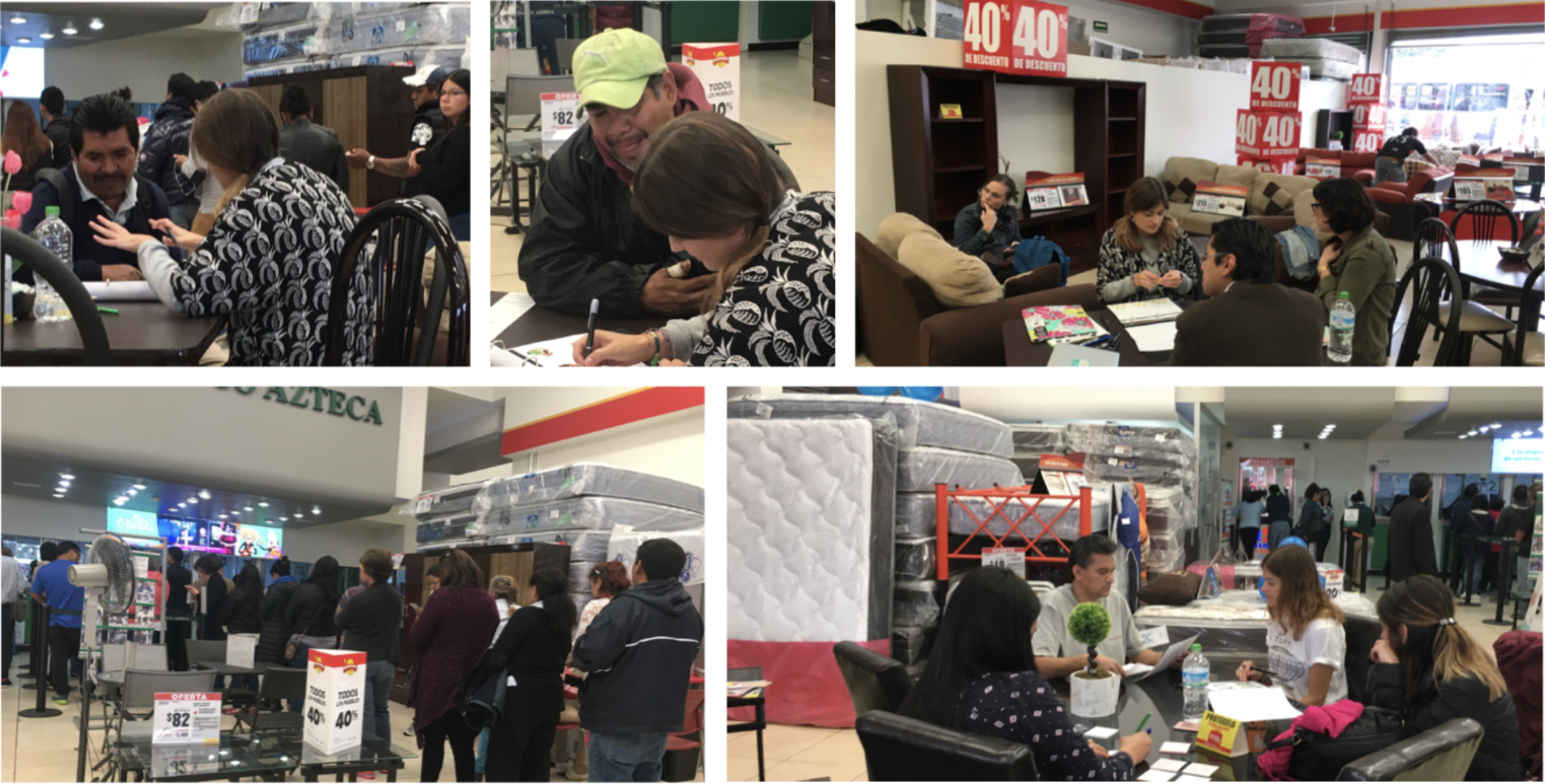
for banco azteca, Central America
user research
product strategy
Concept design
prototyping
functional documentation
Final product
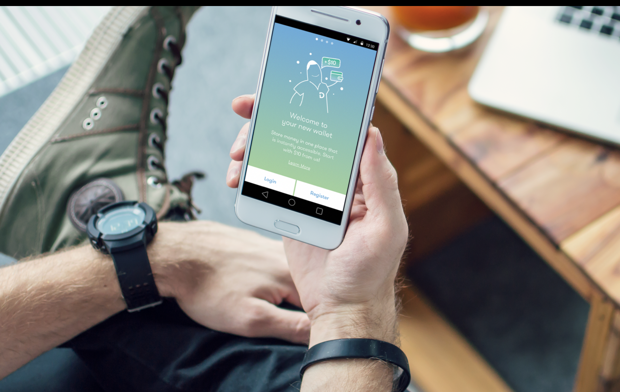
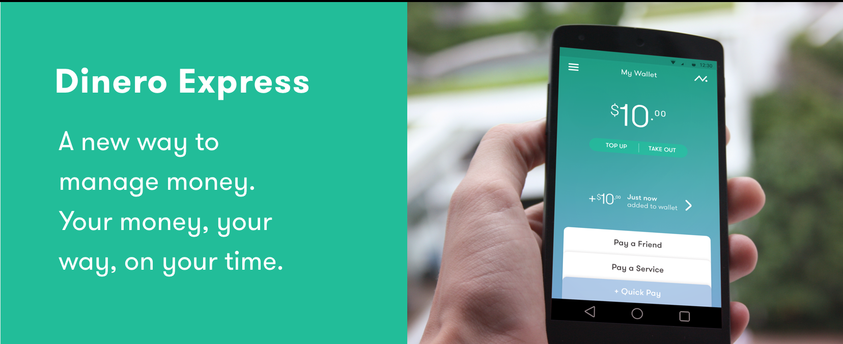
DEX, a secure and personal digital wallet featuring balance and latest transactions alongside your key actions. Google play link, Apple app store link.
Opportunity and problem
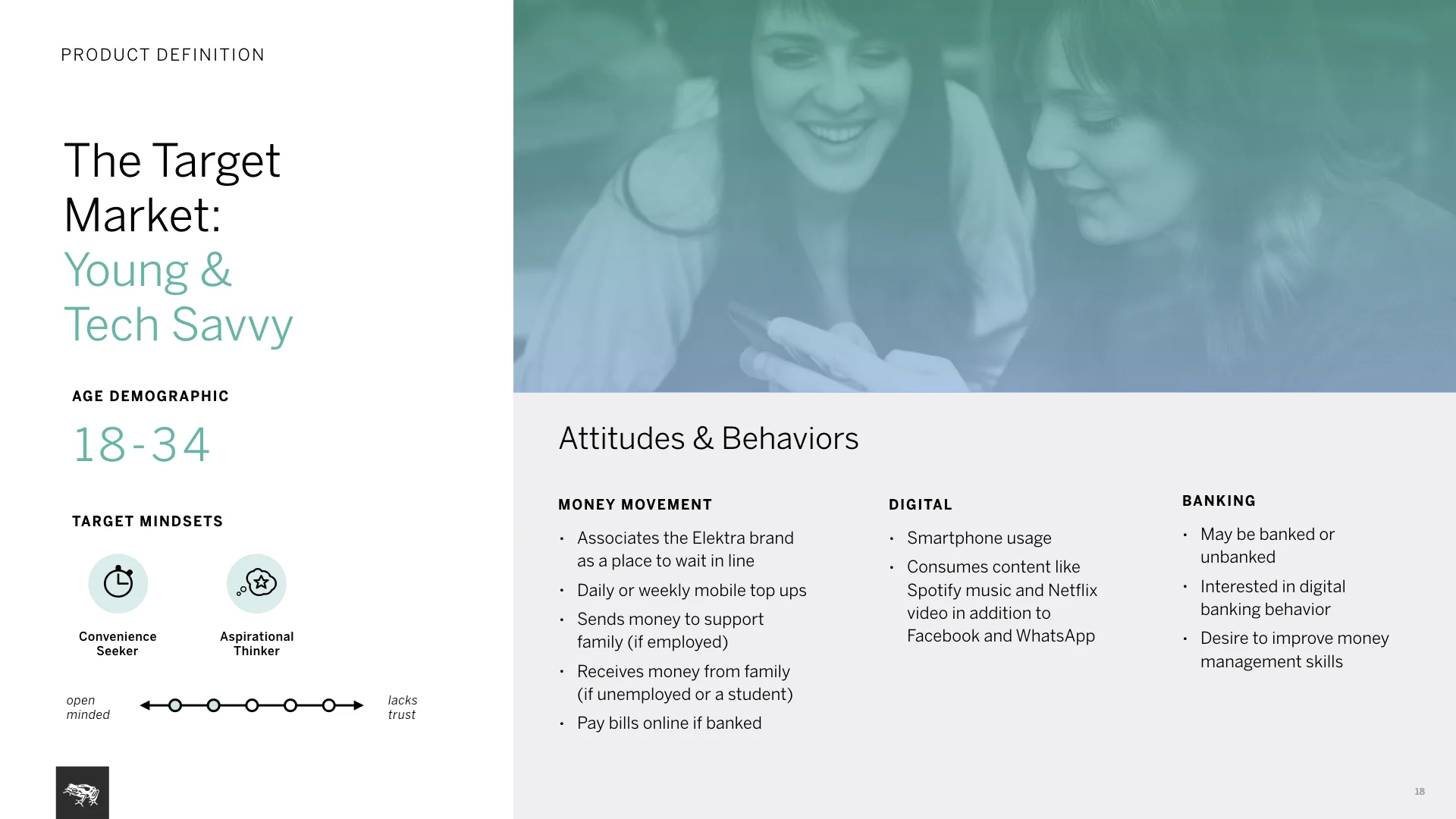
Dinero Express (DEX) Banco Azteca’s (is one of the largest banks in Central America) money movement division. They were falling behind and not attracting younger generation of users with their brick and mortar model. DEX believed customer satisfaction and brand loyalty were affected by the limited store infrastructure; they wanted digital to simply extend store infrastructure. To come up with a product strategy, we needed to understand users and business needs in this new market.
My role and responsibilities
I worked in a small team with creatives, researchers and strategists. I led the interaction design track, participating in research phase, owning product concepts and detailed designs.
Process highlights:
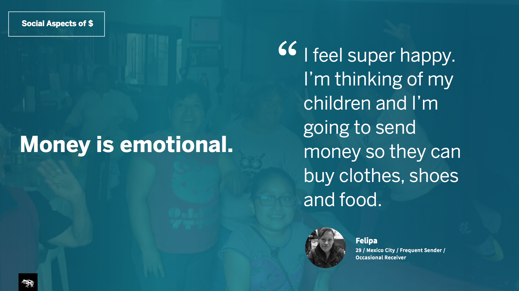
Research: As soon as we were in the field, we realized initial hypothesis was off. People did not care about the long lines but accepted them as “just something you have to do”. They primarily cared about the money they were sending getting to their families/friends fast and securely. There was major mistrust in institutions which we did not expect.
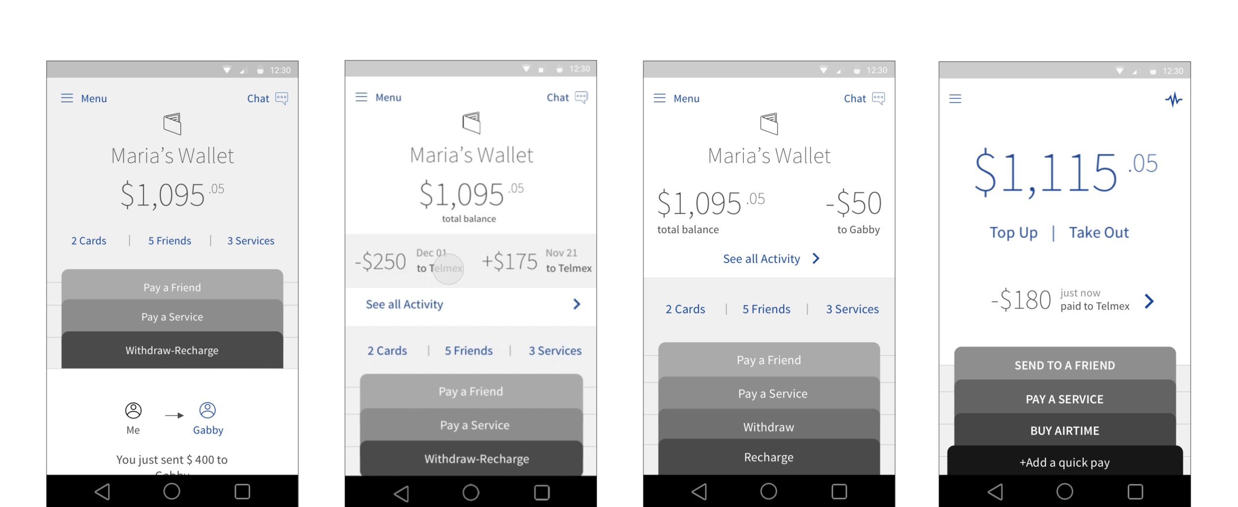
Based on user insights we emphasized emotional and social aspects of money in the product strategy. Proposed a digital personal wallet that emphasized safety of users’ balance and clearly showed successful money movement with family/friends.
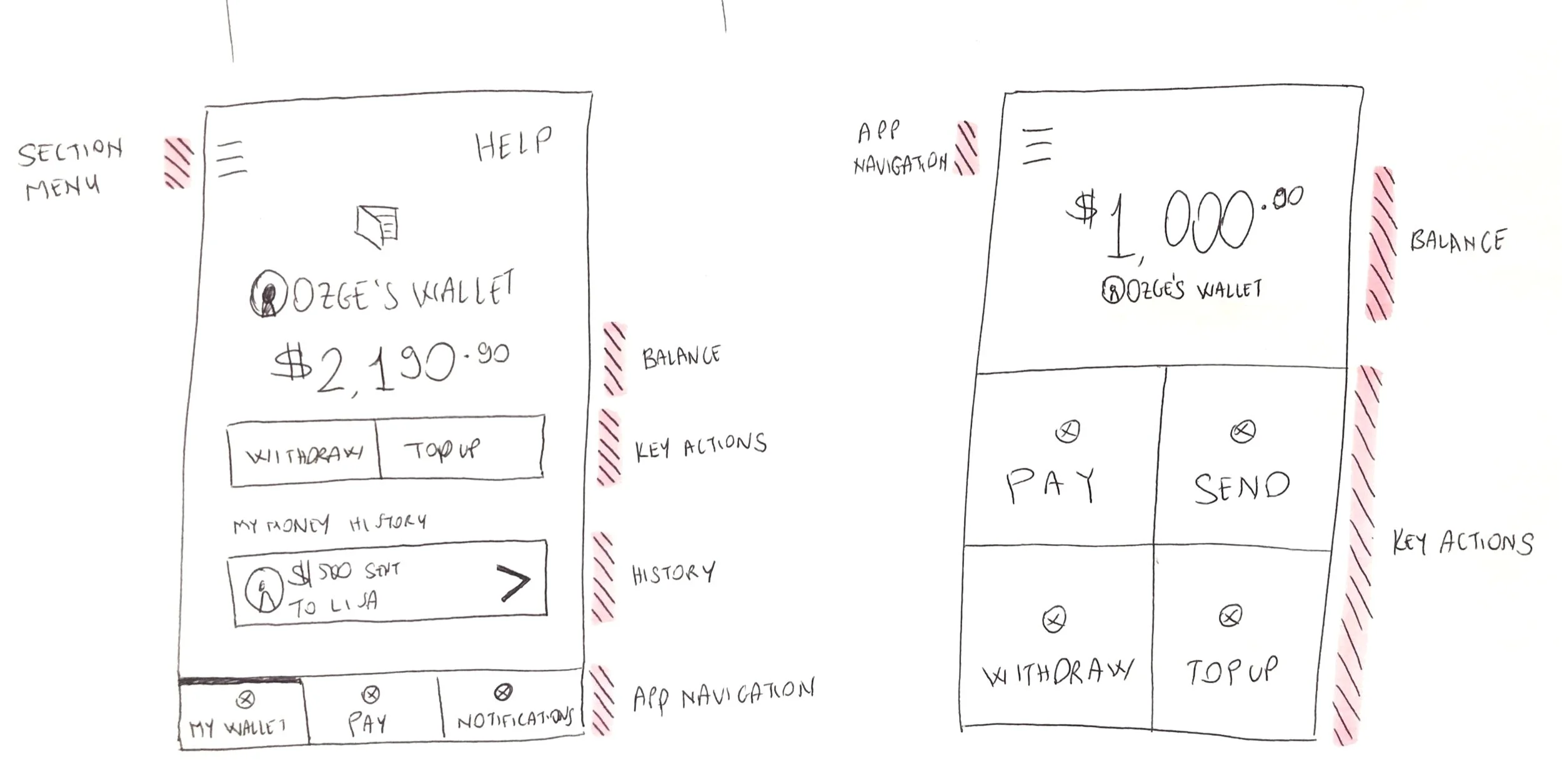
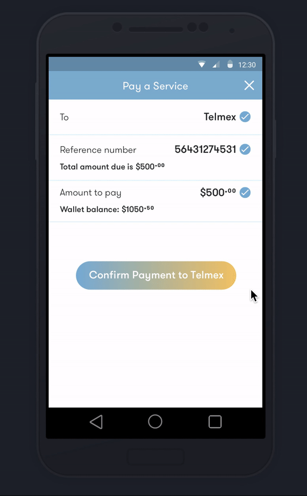
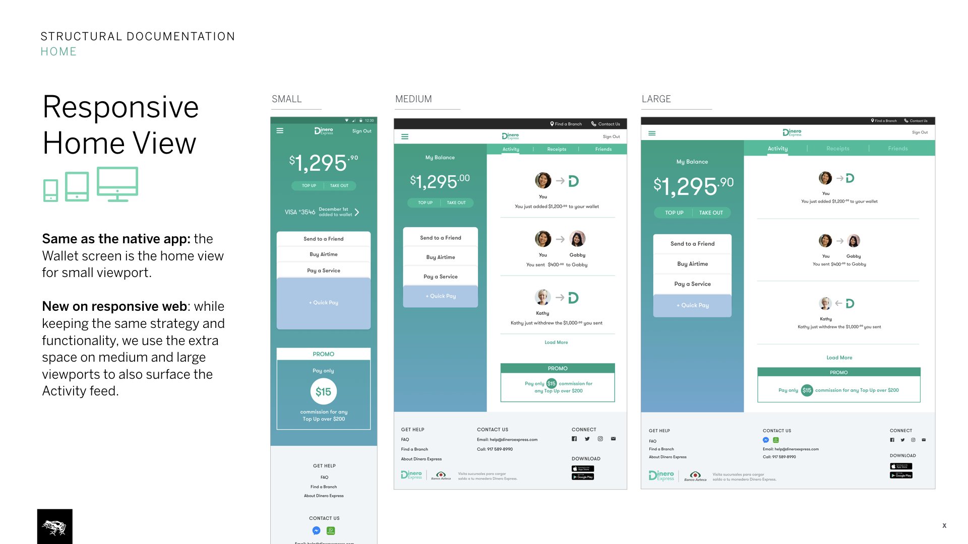
Bringing insights to the product design: I explored various models from skeuomorphic wallets to utilitarian designs that focused solely on quick actions. We went for a concept that would feel familiar to users, showing your money (users’ balance) upfront and your actions (send money, withdraw etc.) stacked at the bottom (resembling cards in a physical wallet).
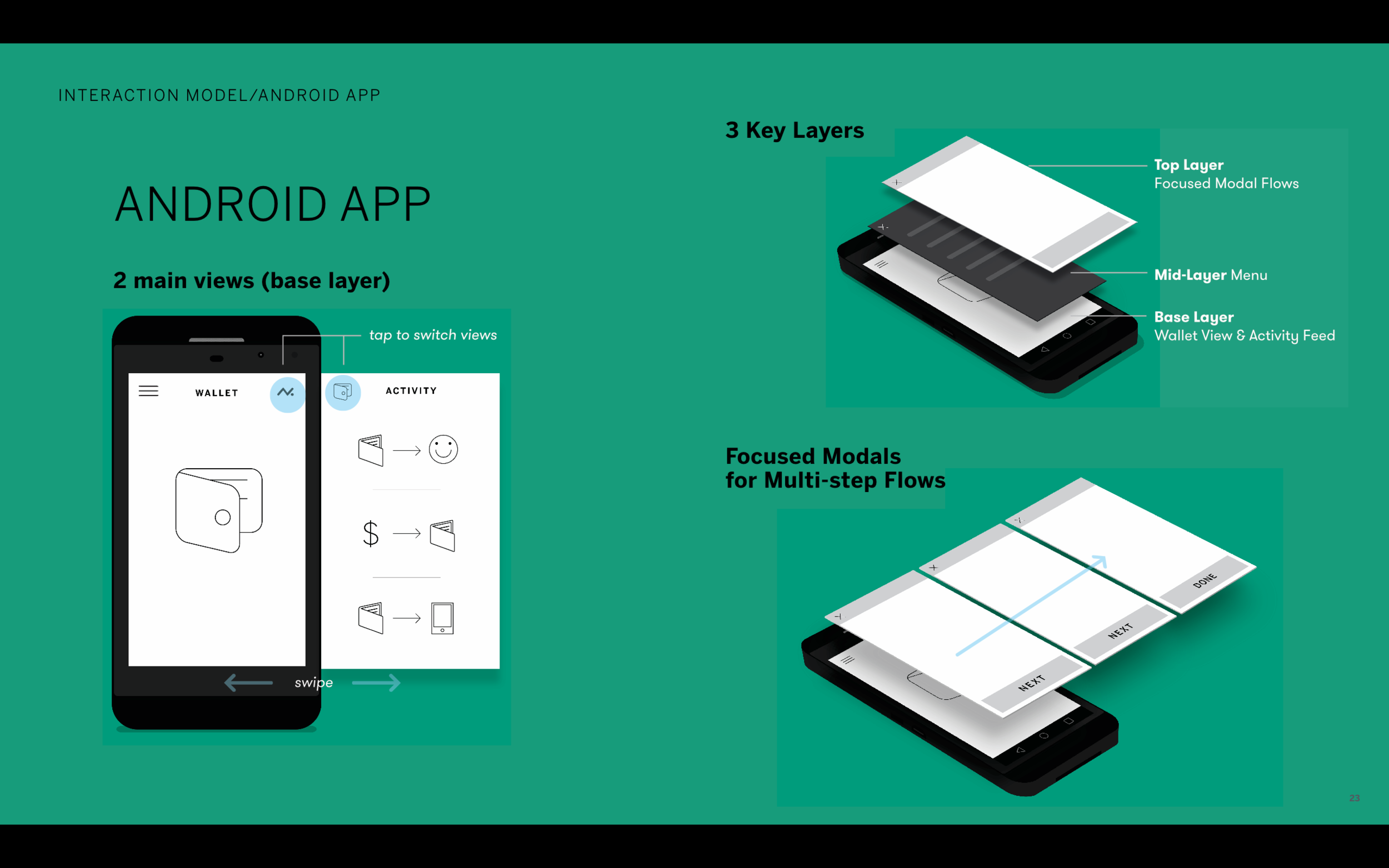
I created a 3 layer interaction model, making the base layer contain wallet view and activity feed.
I proposed this structure because we learned how important it is for users to know that their money is safe. This way when user launches the app, they immediately see how much money they have and the last transaction that occurred.
Successful launch of the Android and iOS apps (signaling user acceptance) brought Banco Azteca back to collaborate with us on a responsive website.