[Case study]
DEX FInance mobile app & responsive web
for banco azteca, Mexico & south America
Product strategy and design for a money movement mobile app in Mexico.
Project: Over the course of 10 weeks, frog worked with Banco Azteca’s Dinero Express division to help them transform from supporting its customers in brick and mortar stores to becoming the ultimate digital money movement platform in Central America.
View InVision prototype Password: MONEY1
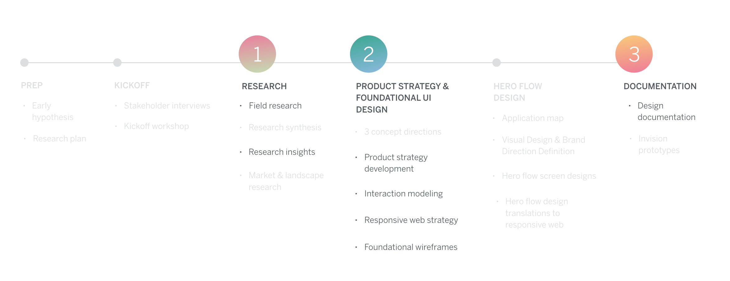
Process: To understand the user and market context in Mexico, we started the process with field research as well as stakeholder interviews. We used our learnings to define what DEX needs to be and created a product strategy based on insights. Defining the product, we designed key flows of the Android app creating an agnostic design system that client used for the iOS app. To ensure it was built right, I documented design intent and functionality.
My role and responsibilities: I worked closely with a creative lead, two visual designers and a strategist during field and market research, synthesis and product design phases. I led the product ideation and the interaction design track, creating sketches, wireframes, flows, documentation and prototypes.
user research
product strategy
sketching
wireframing
prototyping
functional documentation
project highlights
3 areas of learnings in the process
Research: How to be flexible in the field
Product design: How to bring the user insights into product strategy and design
Documentation: How to document design intent for inexperienced clients
1. research: How to be flexible in the field
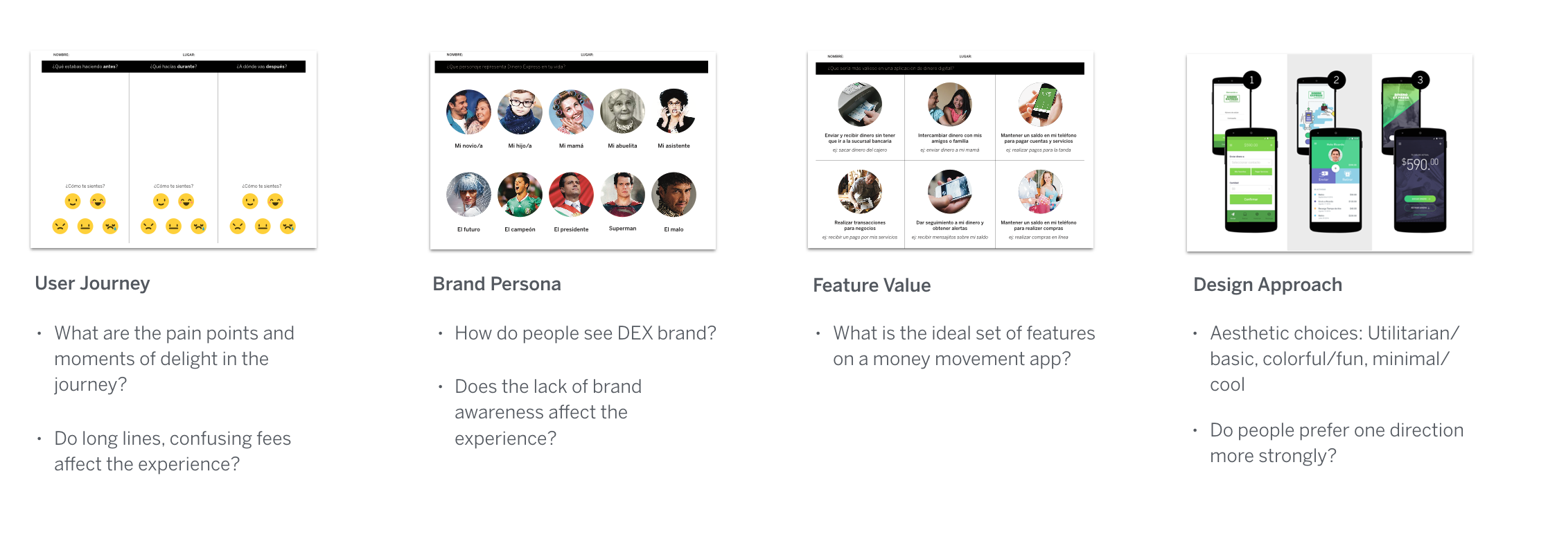
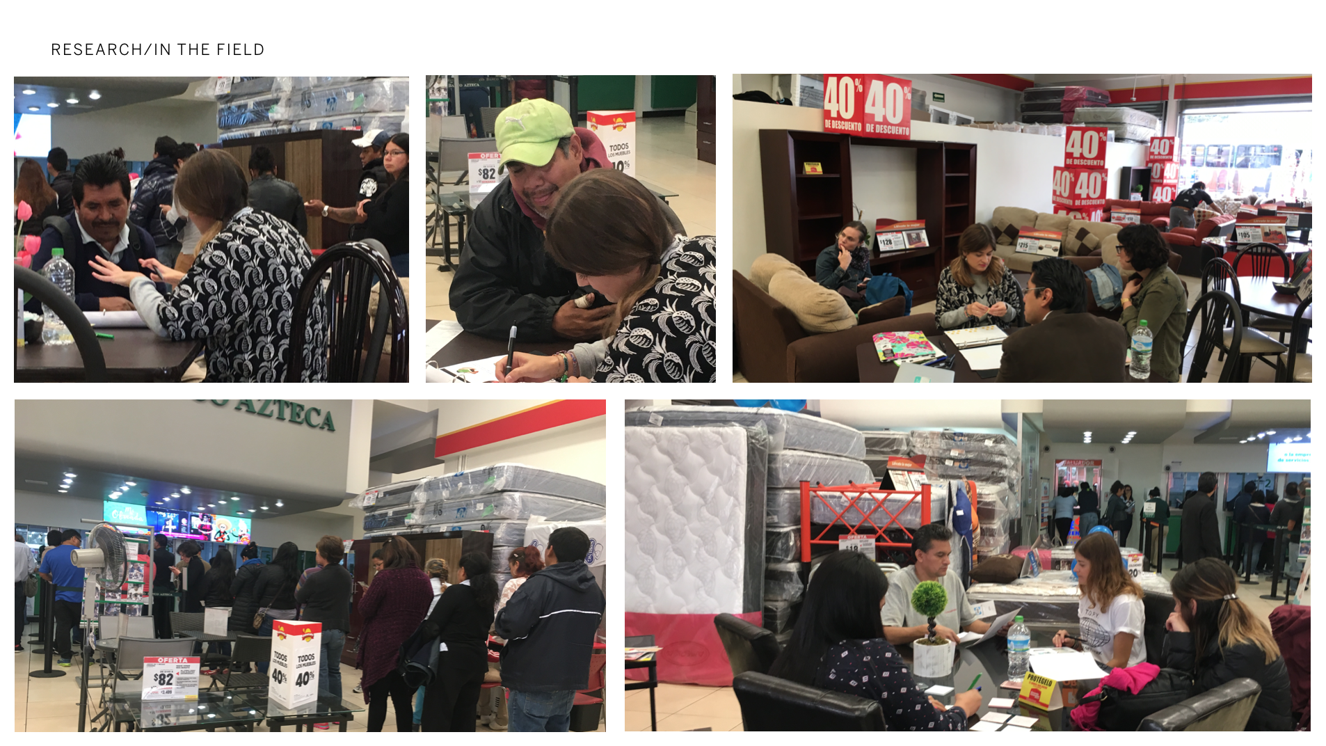
Before the field: As we were prepping for the field, we started developing some early hypothesis about pain points such as excruciatingly long lines in stores and lack of distinguished DEX brand in retail stores. We structured our research around confirming these, discovering new ones and designed participatory design exercises to conduct with participants.
In the field: It was painful to conduct interviews in the crowded and loud retail stores. More importantly, participants hesitated to talk about their finances, thought we’d scam them and some even not let pictures taken. Most had very little literacy so we barely got through the questions and design exercises. This confirmed how people had major mistrust around institutions, finances and had low literacy.
Changing course: As we were not gathering the insights we needed, we started conducting focus groups. Even though they tend to not be as insightful for the US or European markets, in the case of the Mexican culture, we started conducting focus groups. This made a huge difference as participants felt secure and more comfortable in the group environment to share personal finances.
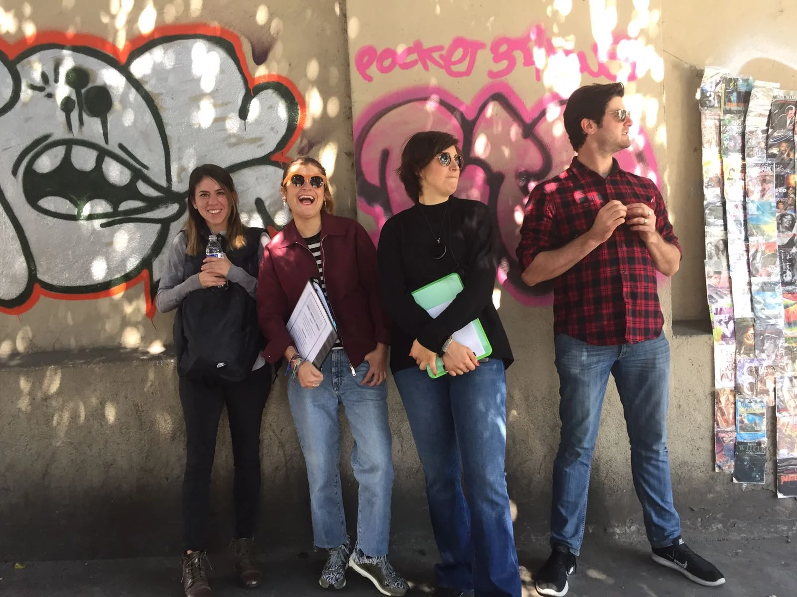
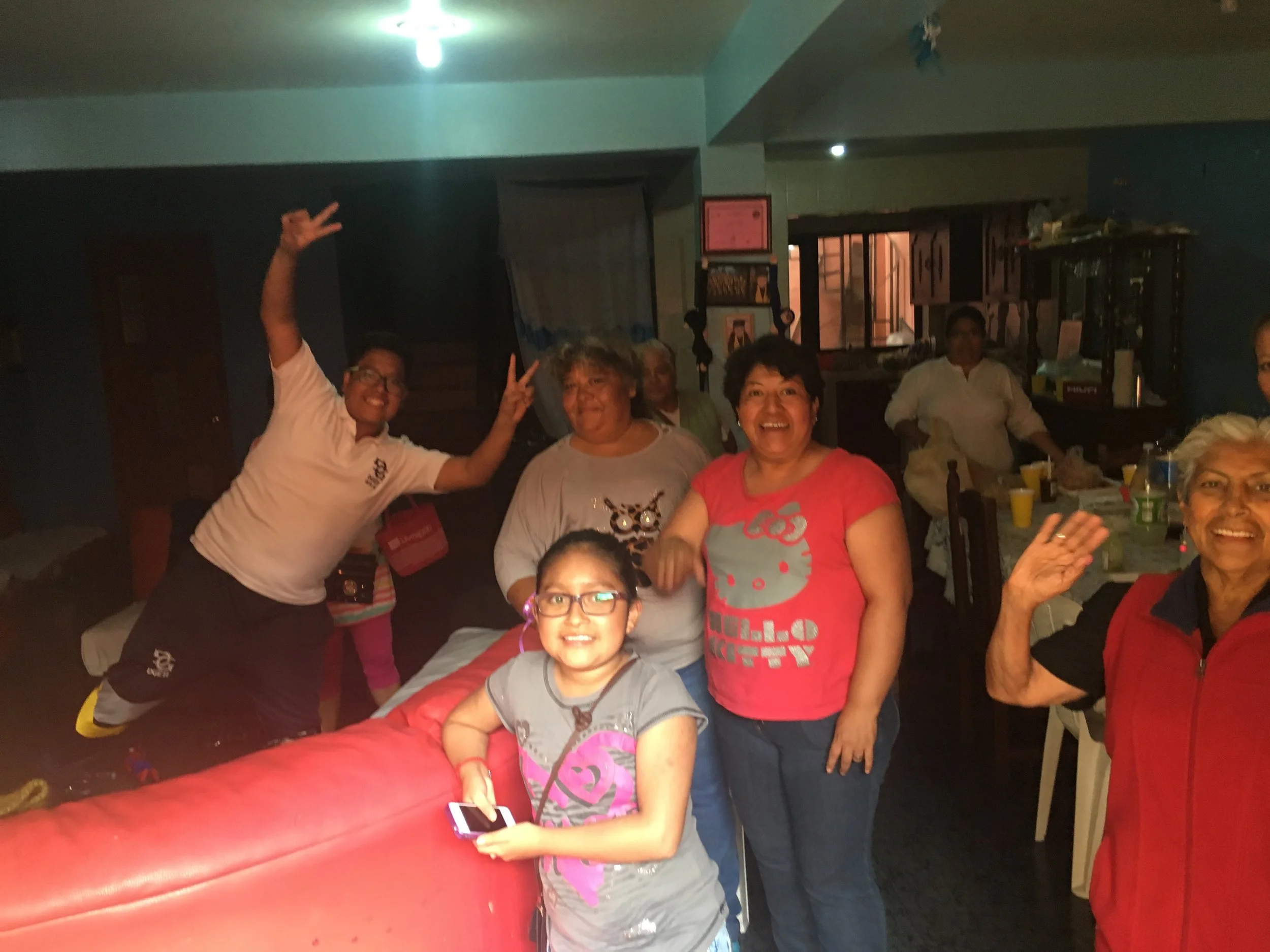
A few of us, including me, went on an anthropological tour and visited a family in their house on an outer edge neighborhood of Mexico City. This one day trip made us learn way more than we could have conducting typical interviews. We observed neighborhoods, people in their homes, we shared a meal with them and got to chat very intimately. (I had the best tamale of my life.)
2. product design: How to bring user insights into product design
Most important insights that shaped the product came from field research. As soon as we were in the field, some of our early hypothesis around the experience started breaking. For instance, people did not care about the excruciatingly long lines as we thought. They simply accepted it as “Just something you have to do”. They only cared that the money got to their families fast and secure.
Some of the insights:
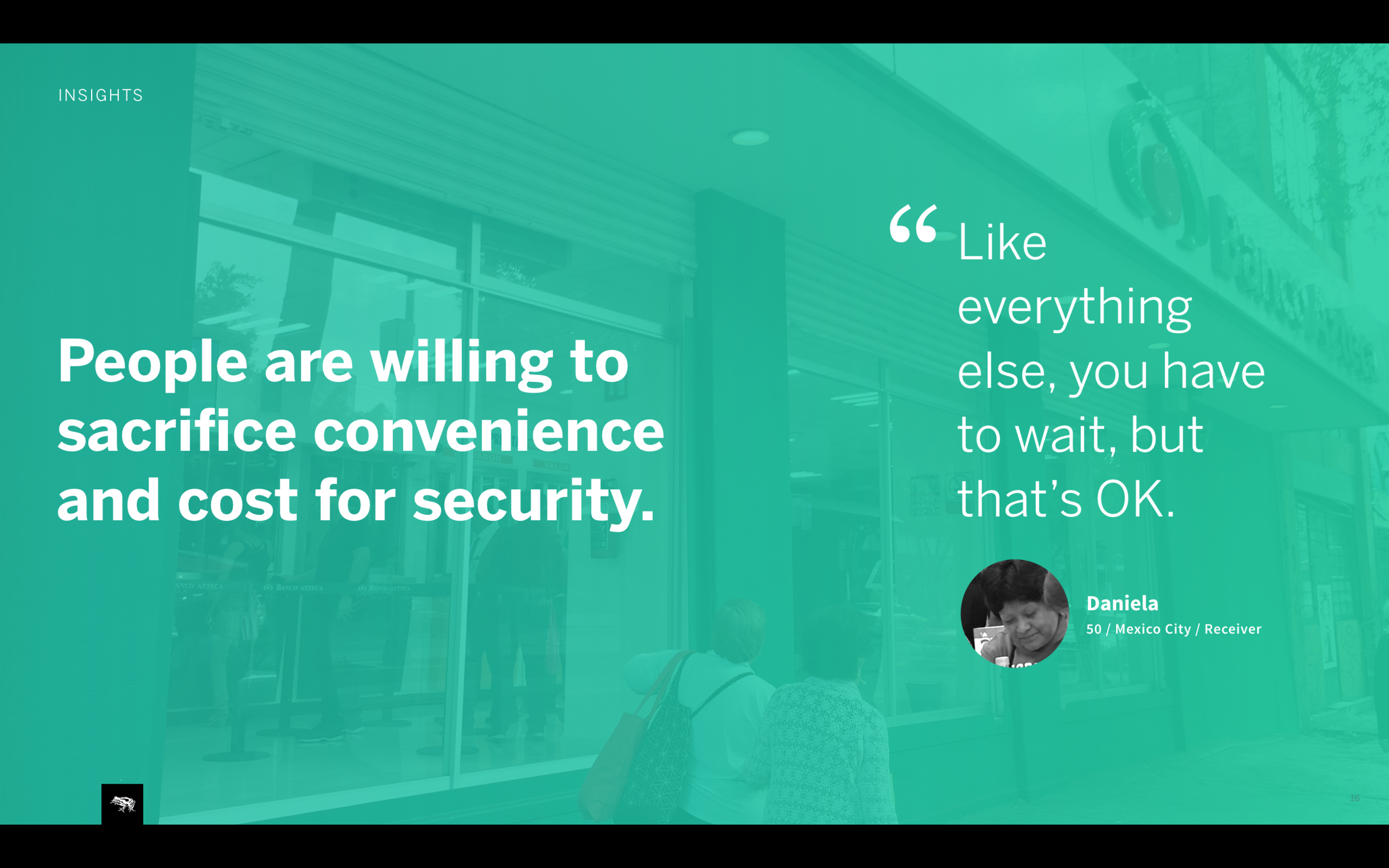
Major mistrust in institutions are part of everyday life and dictate how people think about money. People felt more comfortable with cash under the pillow than in a bank, although cash was dangerous as well. We heard many stories of people losing life savings because of scams and banks not accepting responsibility. We needed to make the product induce user trust.
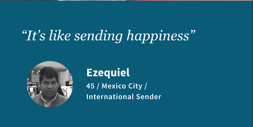
Money is emotional. One participant who lived away from her kids talked about how waiting in the line and sending money made her feel happy and proud of providing for her children living back home with her mom. We needed to support the emotional aspects of sending and receiving money in the product.
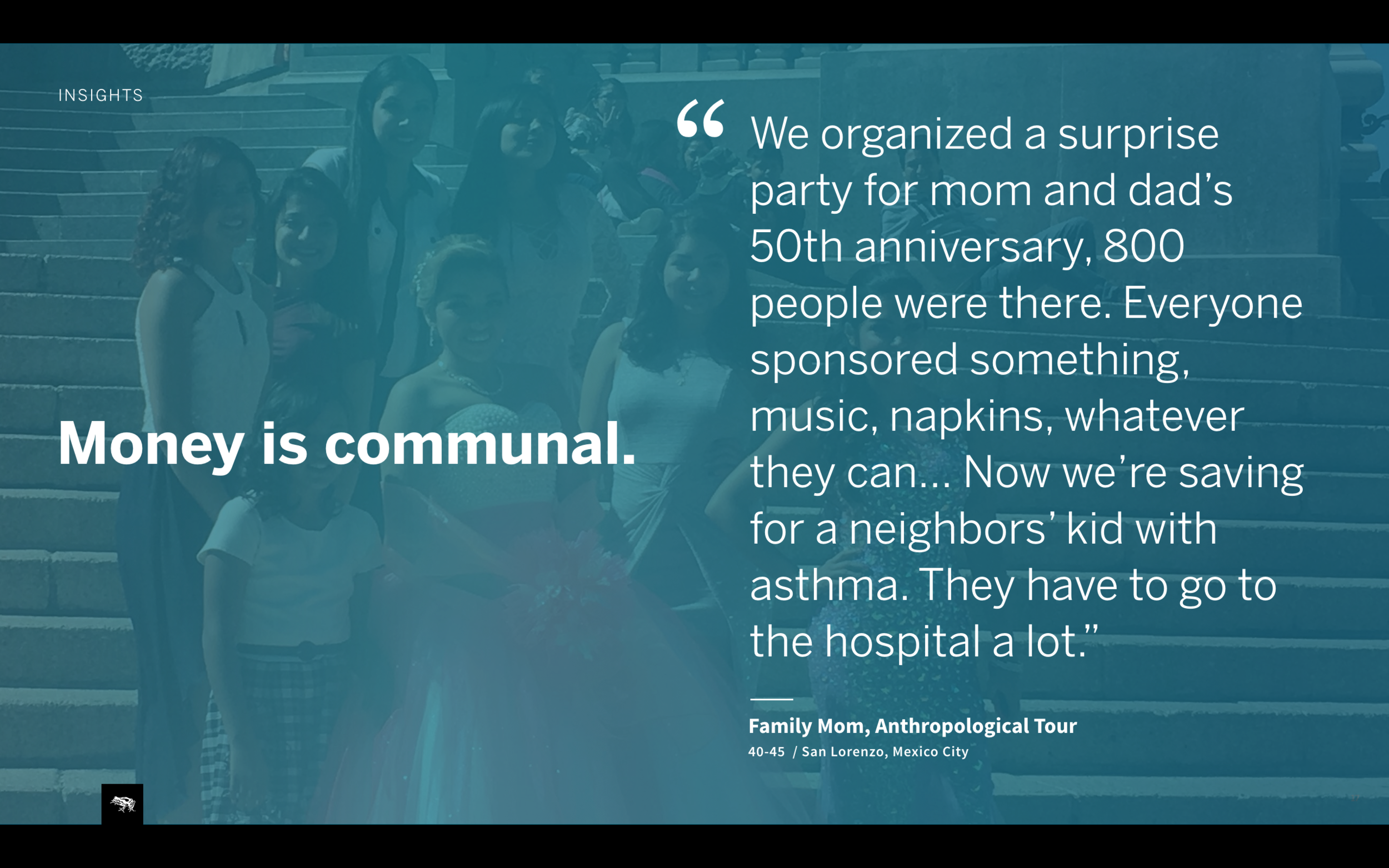
Money is communal. We learned about tandas, people saving money together with neighbors. This especially made us understand the very different social aspects of the culture and finance. Money extended from individual or even a family to a whole community. We needed to make sure money movement within a users’ community was highlighted in the product.
People desire transparency and control over their money. One problem with the existing DEX retail model was lack of transparency. For example, people didn’t know when money sent was ready to pick up and some in remote parts of the country had to take 3 buses only to hear their money was not received by the location. We needed to create a product that provided clear instructions and history of money movement.
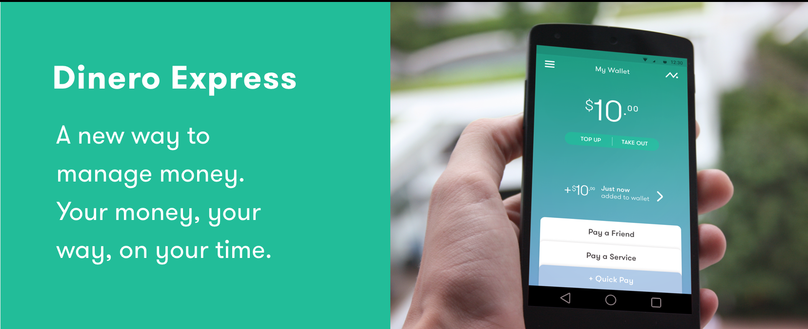
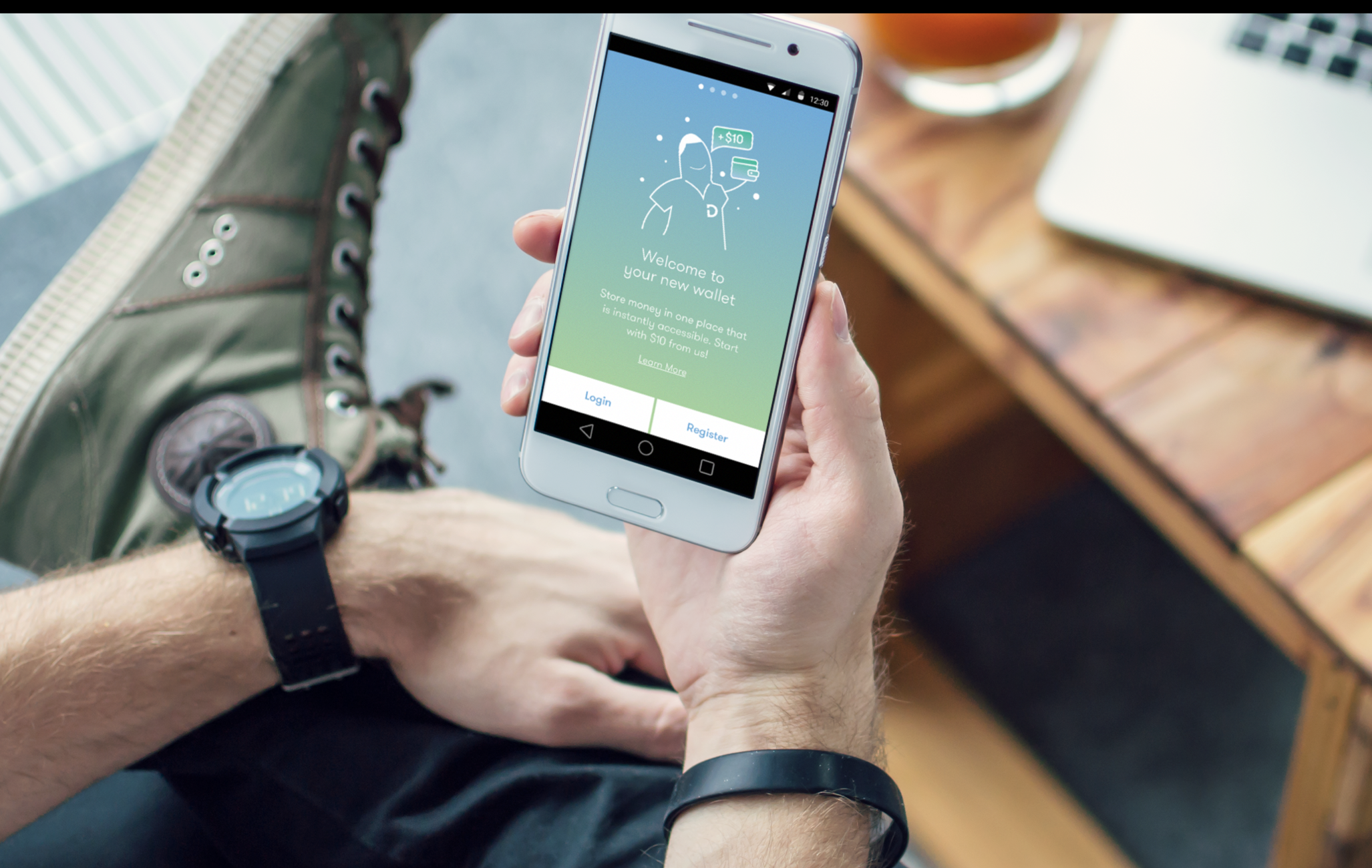
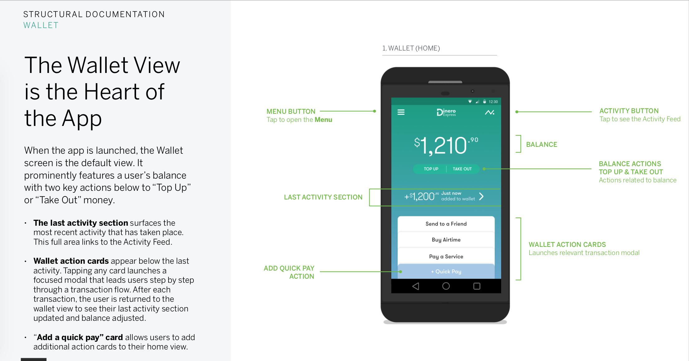
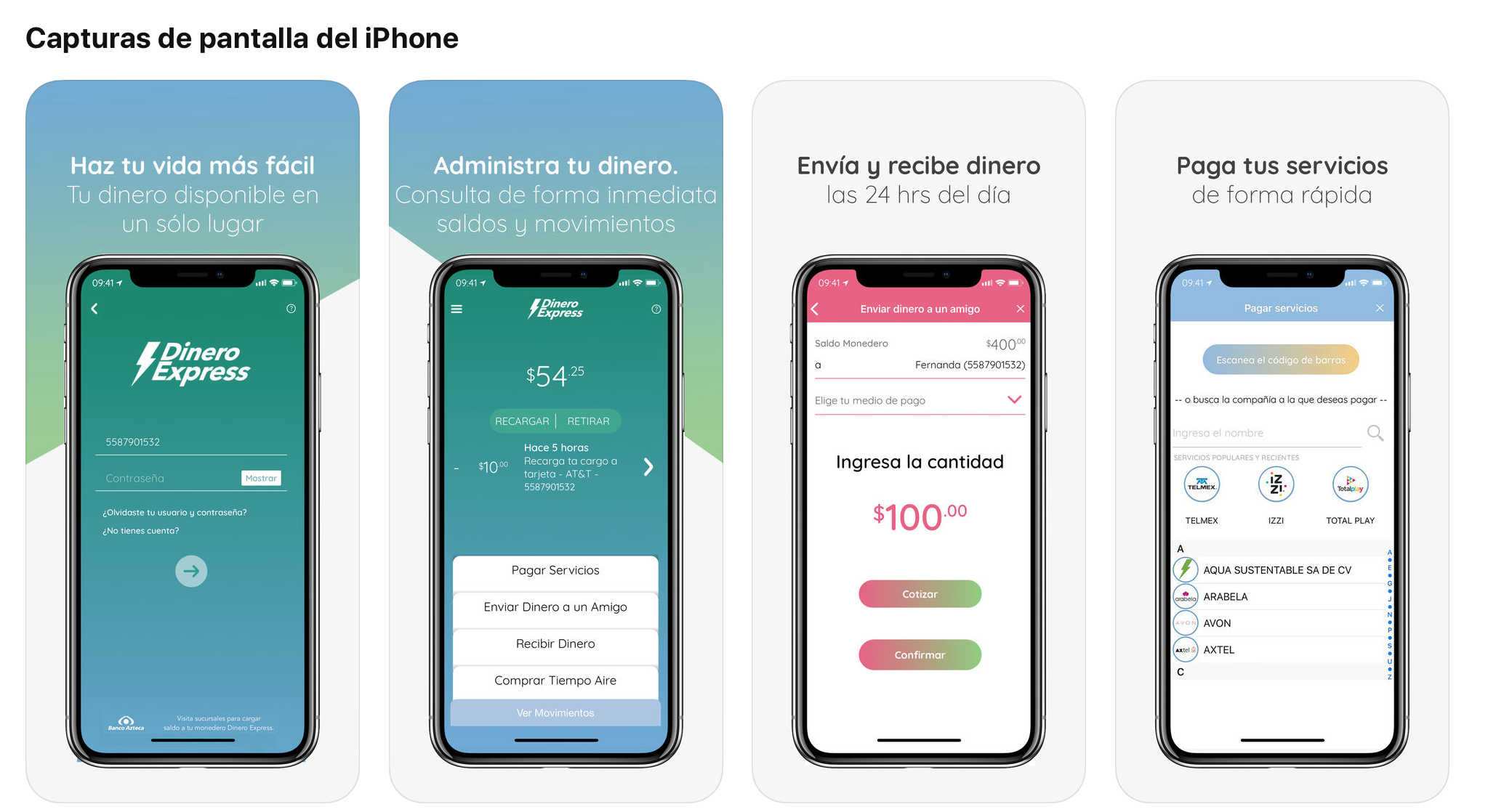
My Wallet, a secure and personal digital wallet with a prominent balance, clear latest transaction info and key actions.
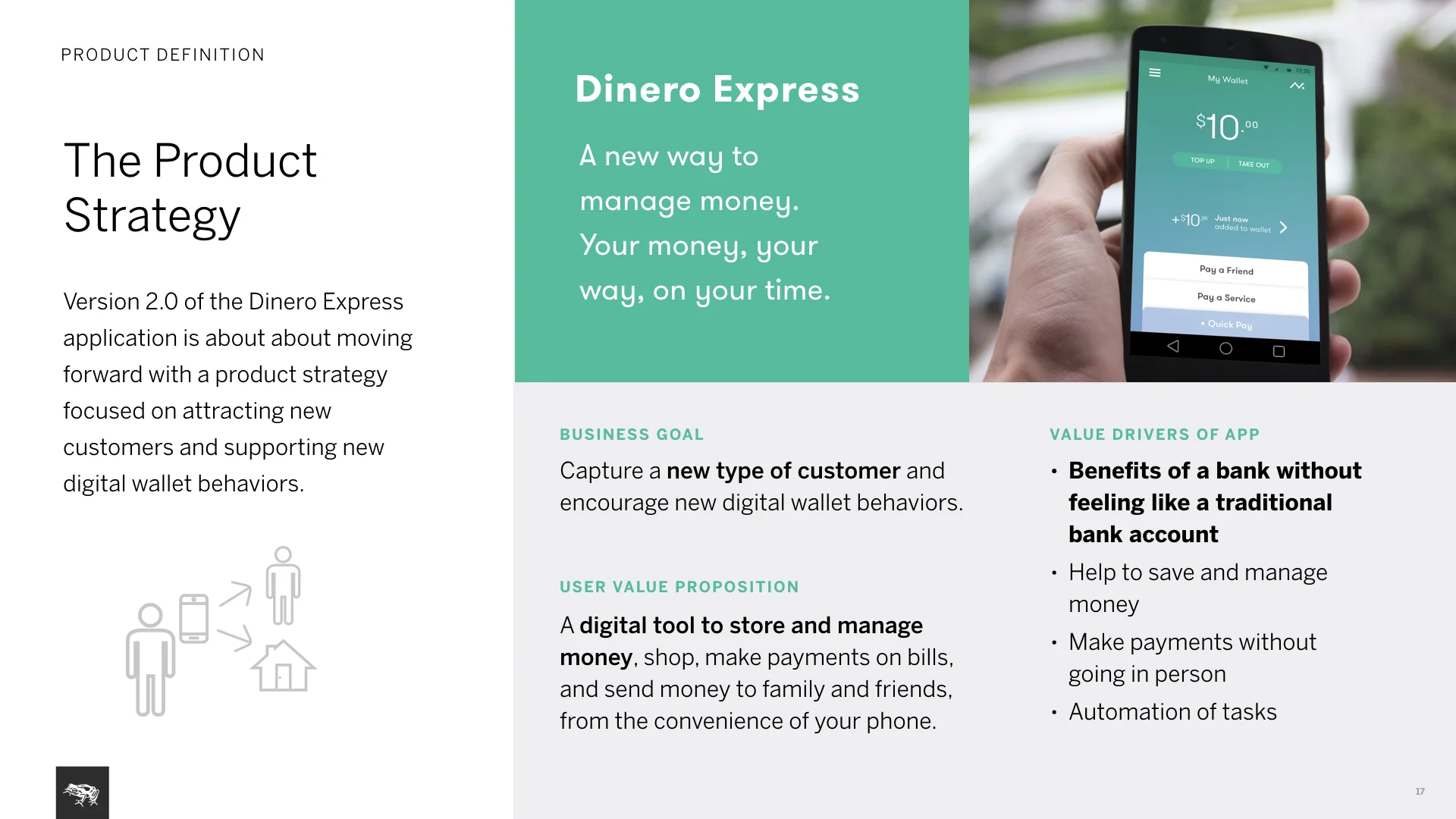
Product strategy: Main goal for business is attracting new types of customers. For users it’s a new way to manage money, keep it secure and accessible digitally without the need for a bank account, with the ability to send/spend it as they wish.
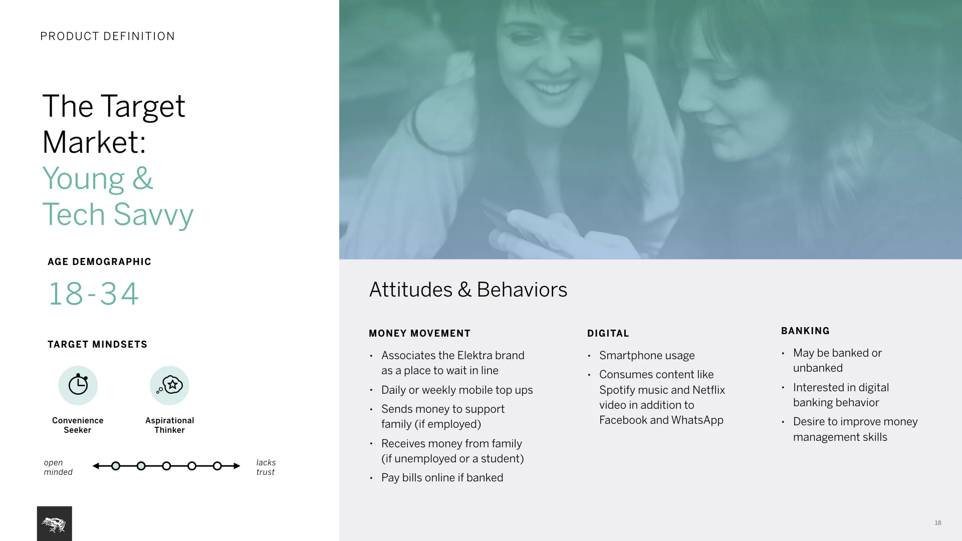
Target market: Growing tech savvy, young user base in Mexico and Central America. Users that are more aspirational towards digital products with frequent needs for money movement. They own at least a low-level/basic smartphone.
Product design: On my initial sketches I explored different ways to create a wallet digitally: from a skeuomorphic concept to a brutalist/functional one. We decided to go for the most familiar, simple design with users’ balance and key action controls stacked to look like cards in a physical wallet.
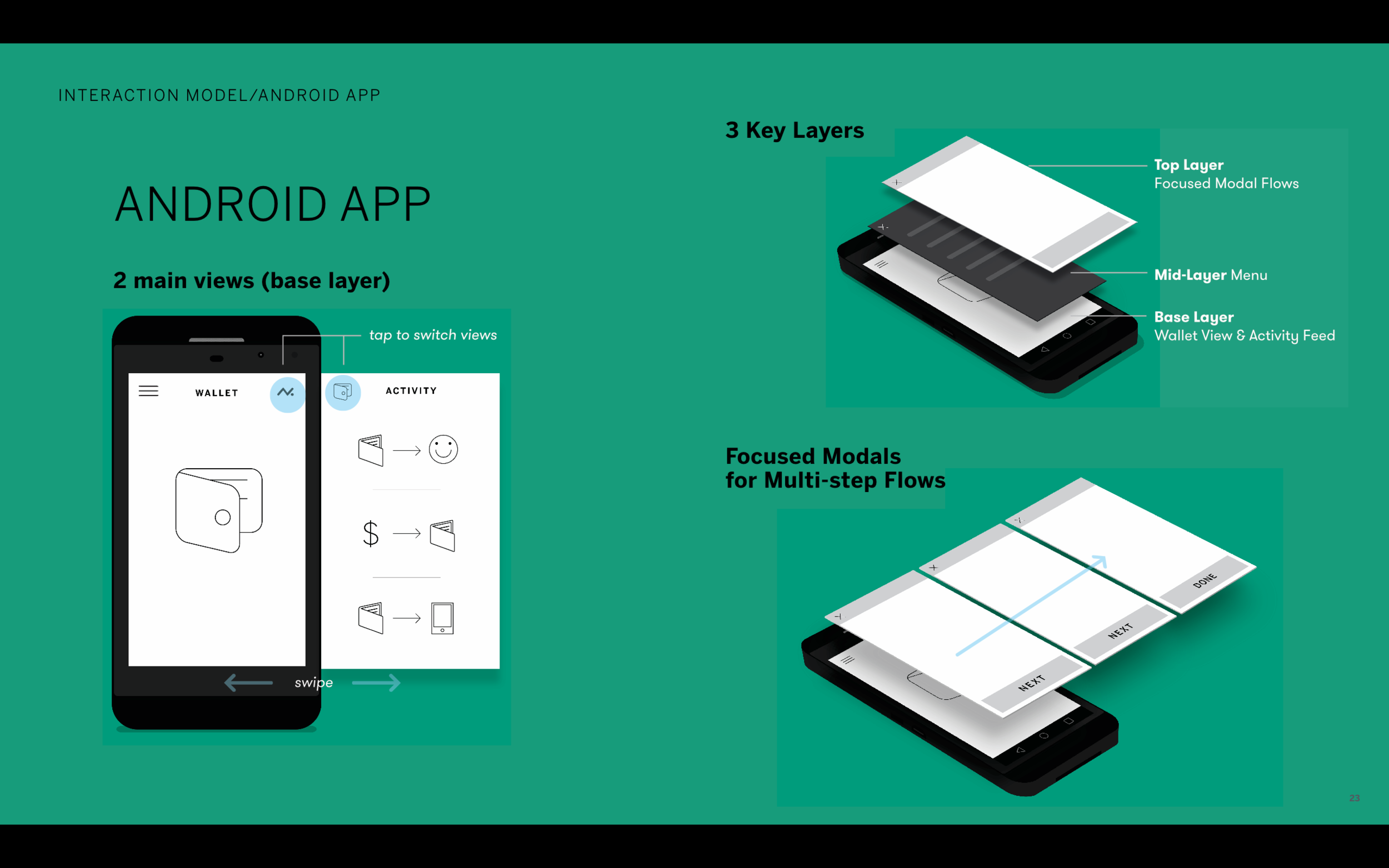
Interaction model: Features three main layers of interaction.
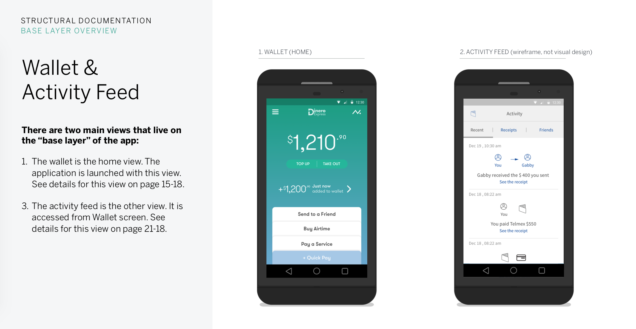
First is the base layers, home and activity feed views.
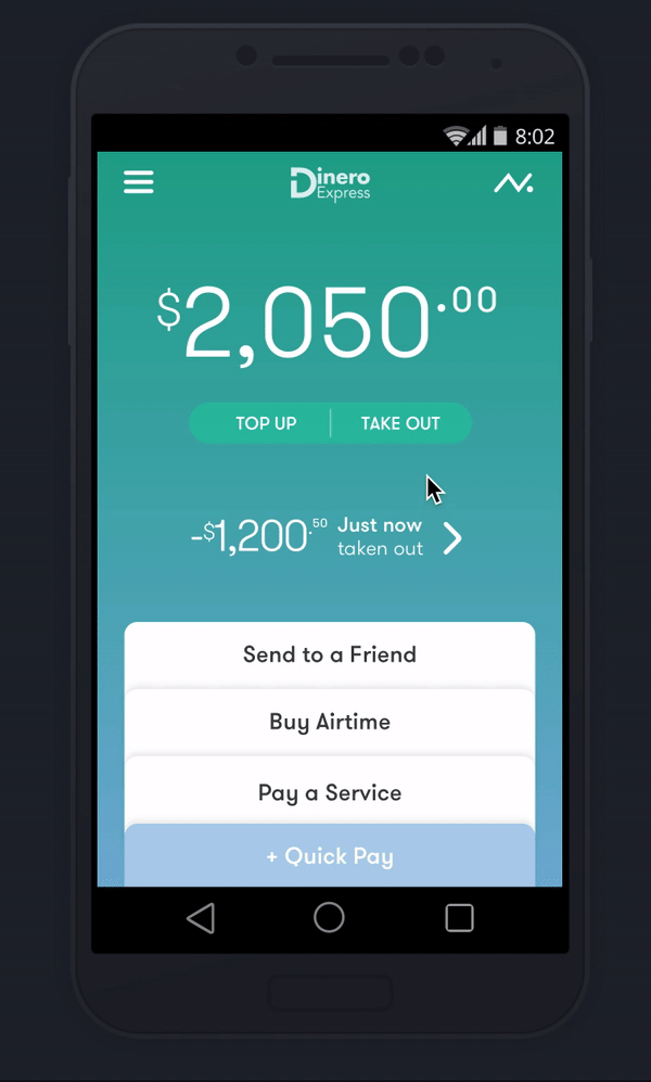
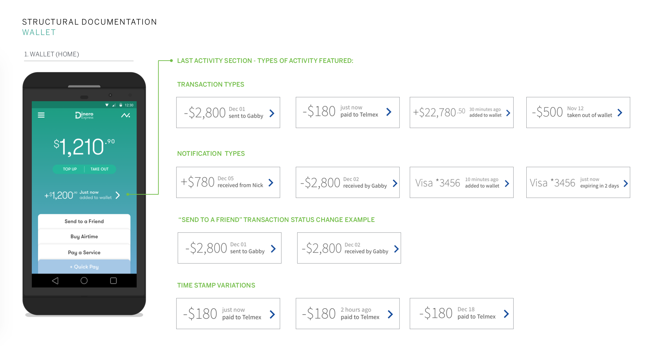
Wallet view is the home screen. Launching the app, user immediately sees how much money they have, the last transaction that occurred and can start a key transactional flow right away.
Activity feed surfaces users’ money movement history and is only a swipe away.
Second is the app menu presented as a partial drawer.
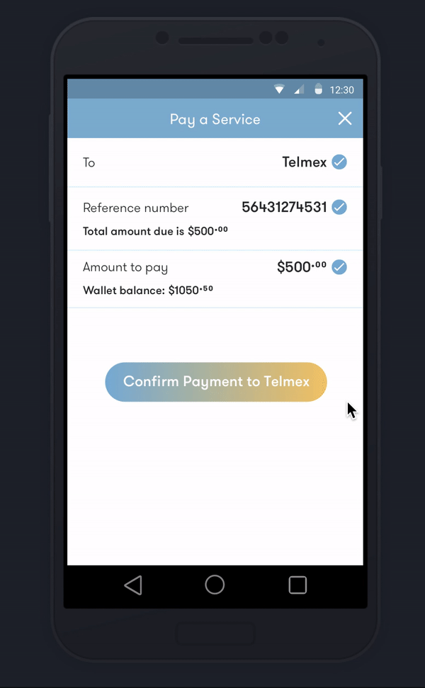
Third is the top layer with transactional flows that occur on a modal window and land user back to the base layer. All transactional flows feature progressive forms, making sure users see all details in one screen and pursue without errors.
a few ways to make The interface respond to user needs
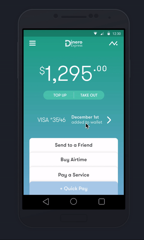
Building trust by providing transparency
Wallet balance and last transaction are the first things user sees, letting them know their money is safe and secure.
Activity feed holds the details, receipts and exchanges with users’ community. For instance letting user know when a loved one picks up money from a retail location.
Total control over key actions
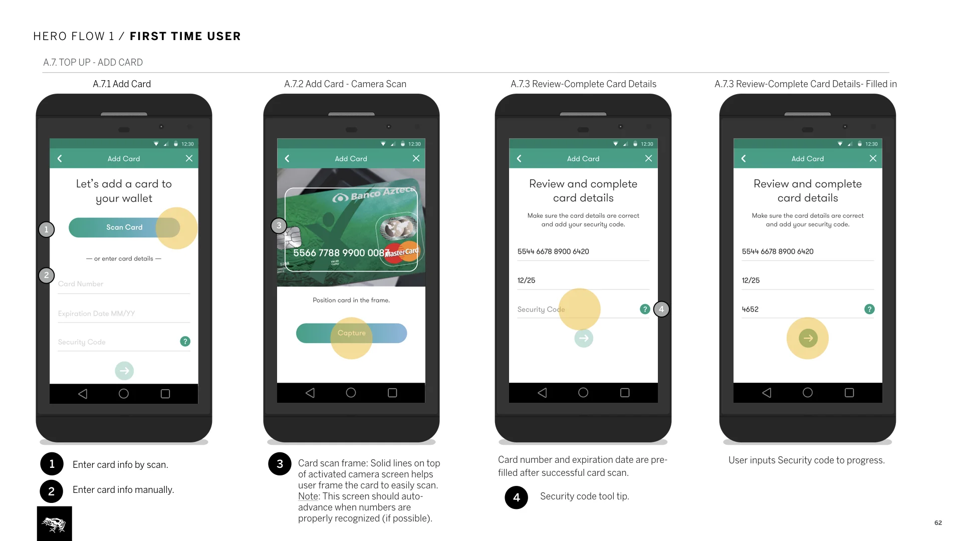
Progressive forms guide users through the process, one step at a time.
At the last step, user sees all input before confirming the transaction.
“Send to a Friend” featured as the first action on Wallet view, celebrates the communal aspect of money.
Hand holding for first time use
First time usage screens appear the first time a transactional flow is initiated, giving clarity to an unfamiliar experience, helping user feel at ease to continue.
On later phases of the engagement, we also added on the ability to keep the instructional first use screen until user dismisses it.
Reassuring the user
Upon submission of a transactional form, animations surface quick details about the action in progress. This step uses the processing and loading times in favor of the experience while reassuring the user of the progress.
Receipts right after the animation states are proof and record of the money movement.
3. documentation: How to document design for inexperienced client teams
We were only scoped to do “light” documentation for this project, but to make sure the product was built right I had to strategically document as we knew that the client teams were new to app development. I approached documentation in 3 parts:
How it’s structured: For product definition, I documented design intent and key functionality for the three layers in the interaction model. I explained purpose of each while breaking down to sections.
How it behaves: Documented key actions through 4 hero flows. This explained user actions and key functionality requirements in the context of the flow.
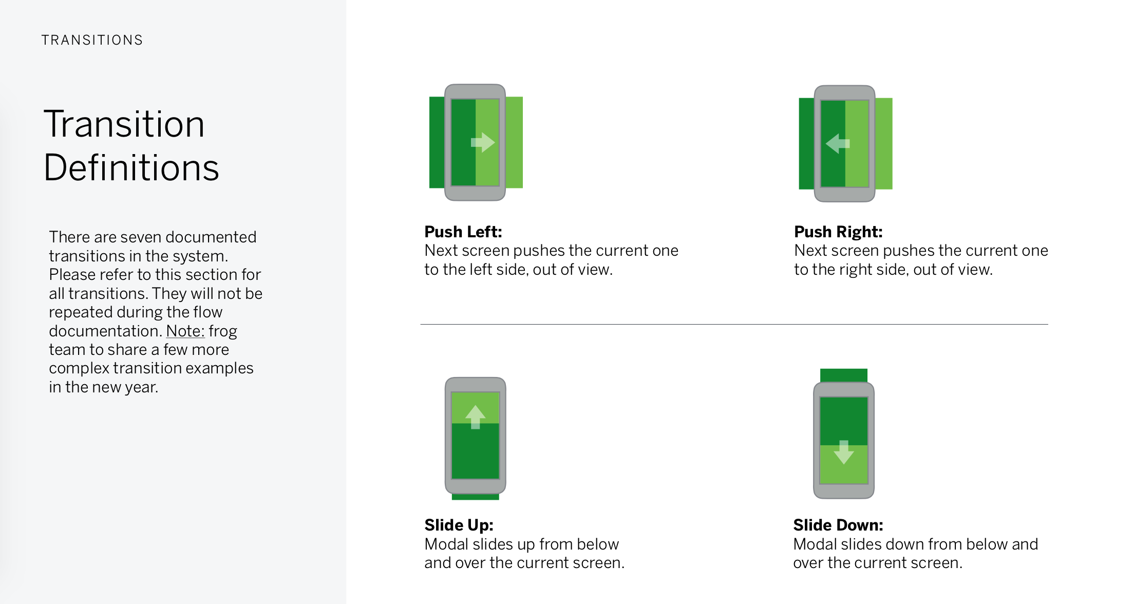
How it moves: An essential section for any app documentation. Defined transitions used in the system and referenced them in the flow documentation. On this product, we intentionally used basic, off the shelf Android transitions as we knew that the client had a brand new internal team. These transitions were efficient, easy to develop and sufficient enough for the initial release.
Product In the market
Android and iOS apps are on the Mexican app stores. Unfortunately frog was not involved in the build phase to support, therefore there are elements from original design that were not implemented with the highest quality.
I also worked on the responsive web platform on a second phase of design, expanding the design system and supporting web use cases (see on Breath section).
Some other deliverables that helped define the product and service
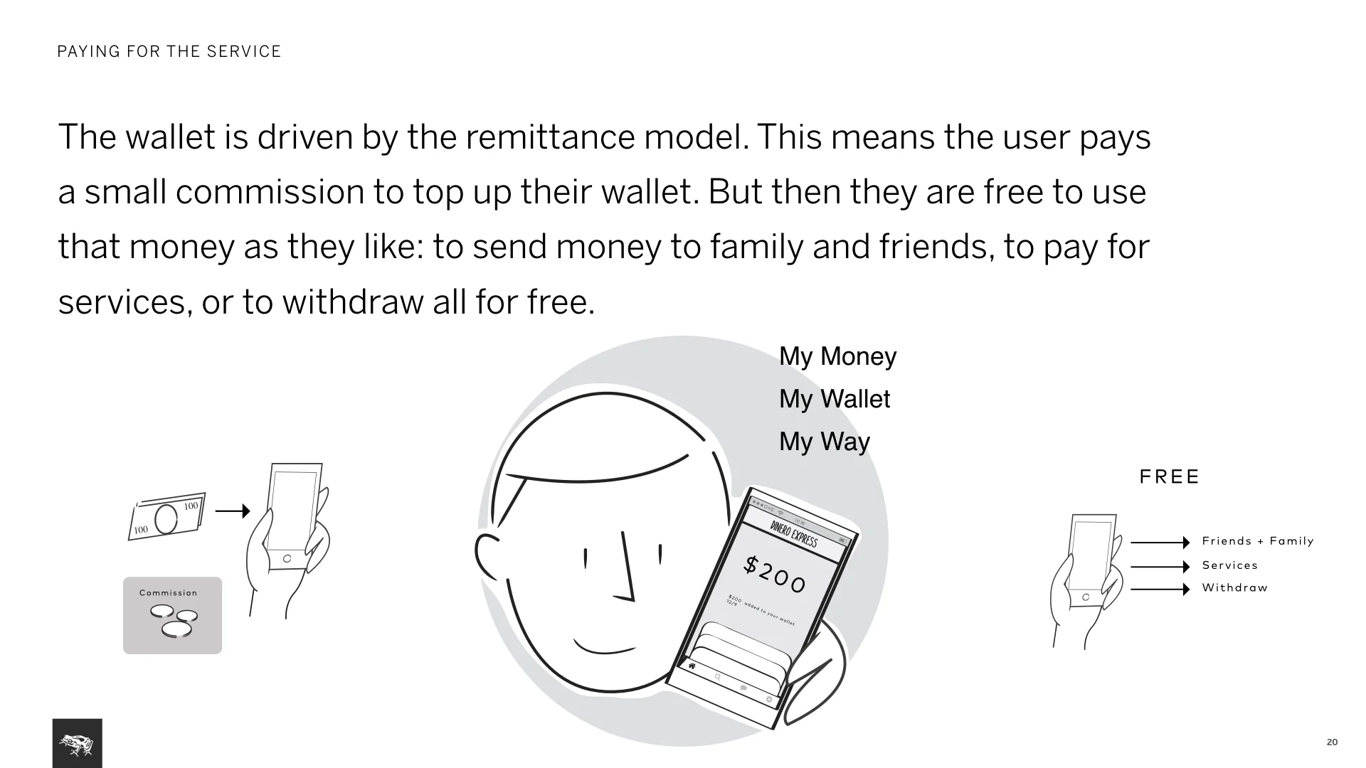
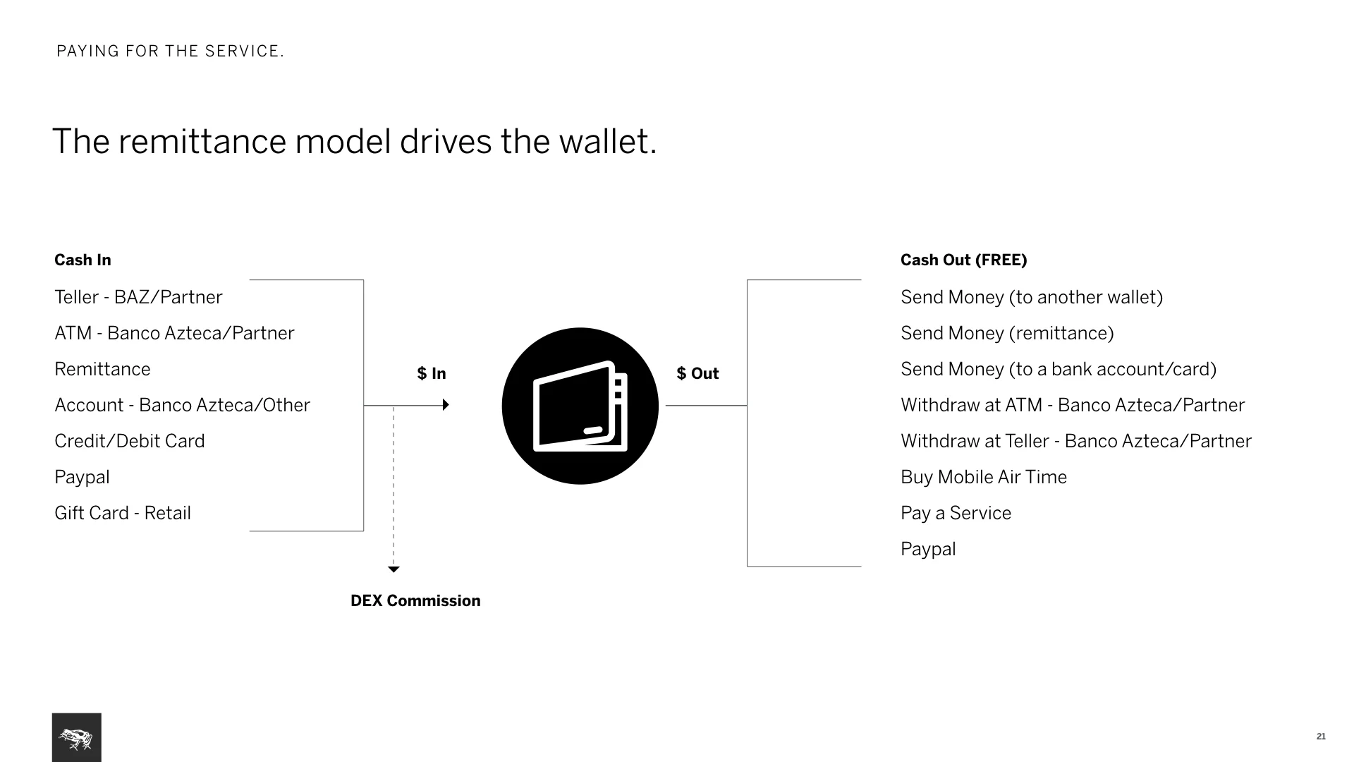
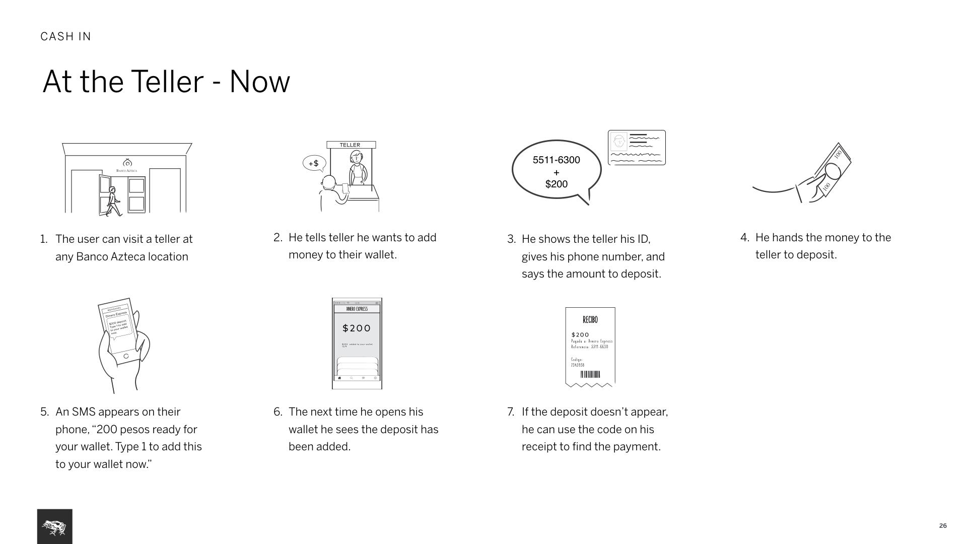
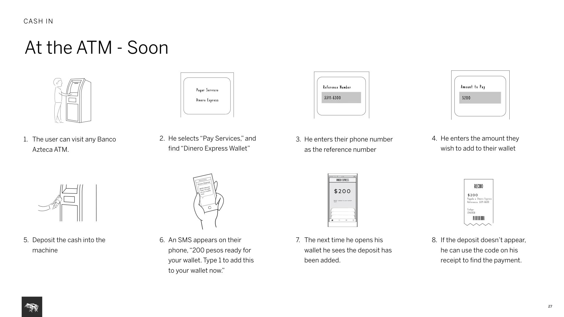
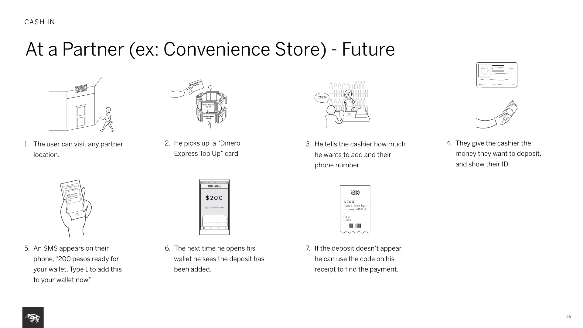
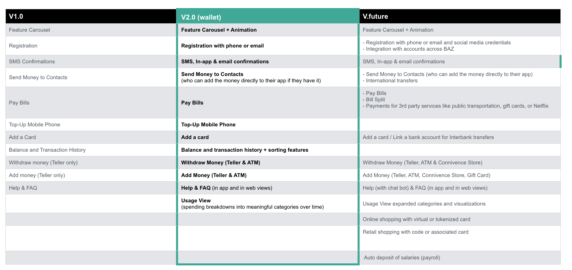
A new fee model and key service scenarios: We documented how service works and made suggestions around a new fee structure, recommending a one time fee to top up the wallet. This was aimed to create a more efficient and frequent habit of use. Documented the new service model via three flows: At the teller, at the ATM, at a partner.
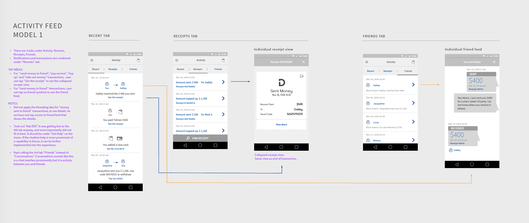
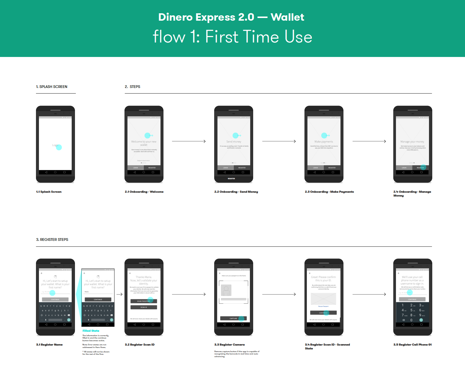
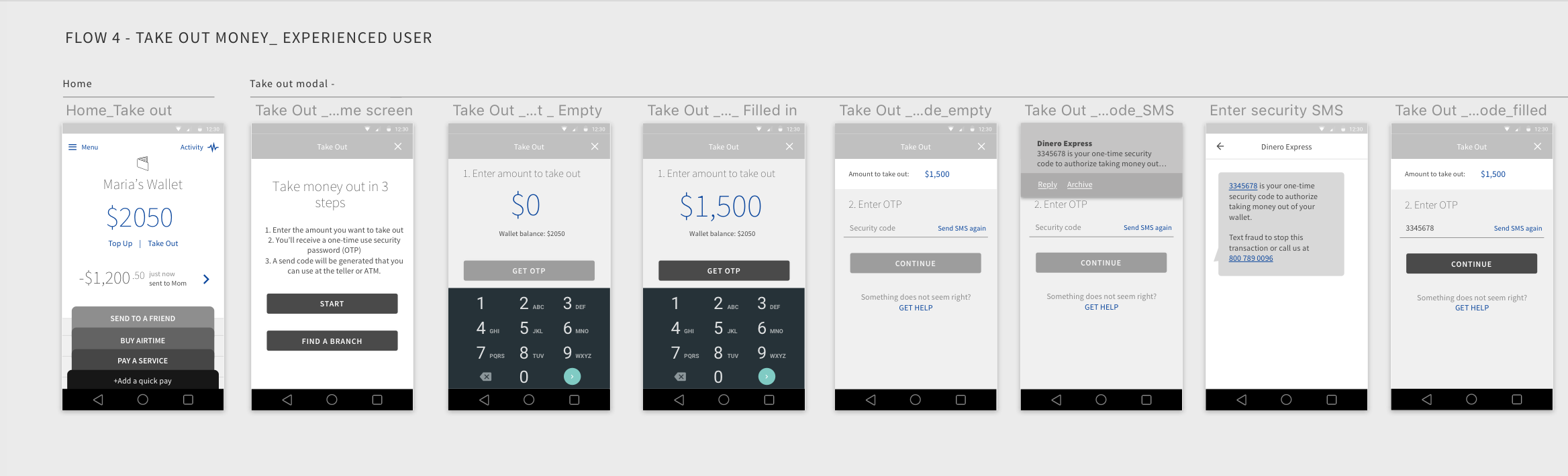
Use of flows: Starting from wireframes and continuing to visual design phase, we always presented work in screen flows, mostly using InVision. Also provided flow diagrams. Work presented in screen flows let the client continuously think in user context.
While solving interaction problems, I always did light documentation that explained advantages, disadvantages of options to communicate to my internal team first.