[Case study]
DEX:
Enabling money movement for the unbanked population
for banco azteca, Central America
user research
product strategy
prototyping
functional documentation
Project: Product strategy and design for a money movement mobile app in Mexico.
Problem statement:
Banco Azteca’s Dinero Express (DEX) division only had brick-and-mortar presence. They were rapidly falling behind competition who had online presence and were attracting the younger tech-savvy generation. DEX thought customer satisfaction and brand loyalty were mainly affected by the limited store infrastructure.
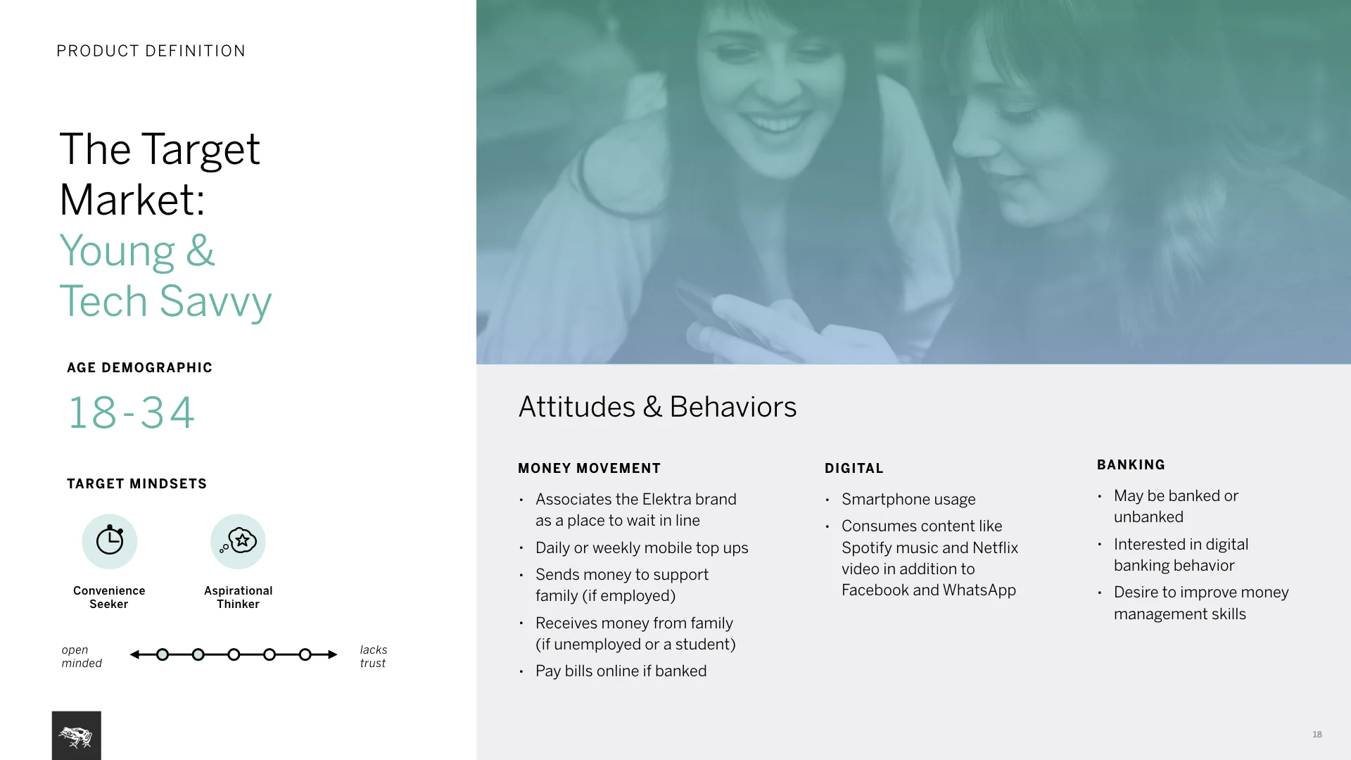
We needed to understand the user and business needs in a new market; and design a product that’d be well-adopted.
Process: Starting this 3 month effort, we first wanted to understand the user and market context in Mexico. Conducted field research and stakeholder interviews. We used learnings to define how DEX needs to position itself and created a product strategy based on user insights.
My role and responsibilities: I worked closely with a creative lead, two visual designers, a researcher and a strategist. I led the interaction design track, creating the hero flows and architecture of the Android app.
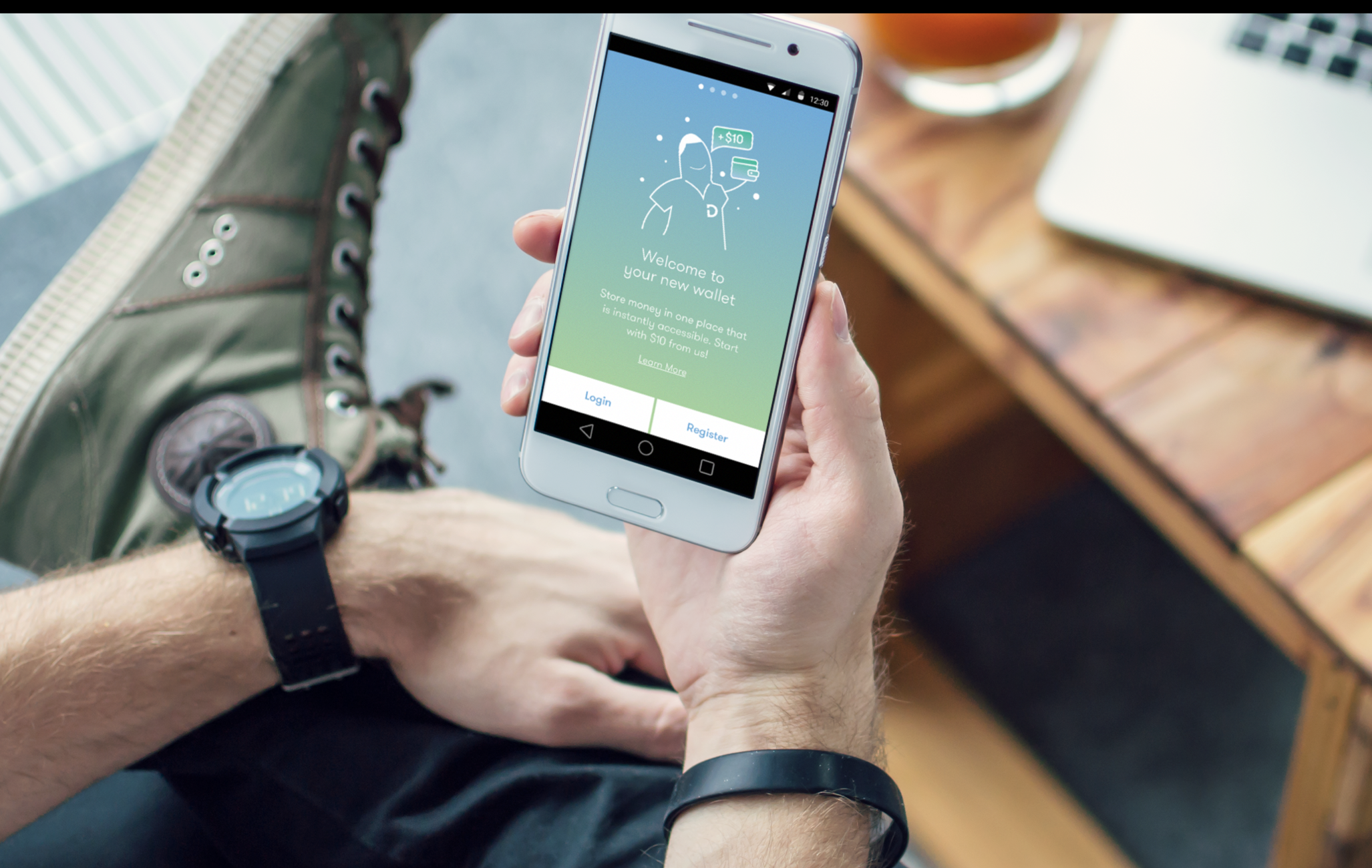
Final product snapshot
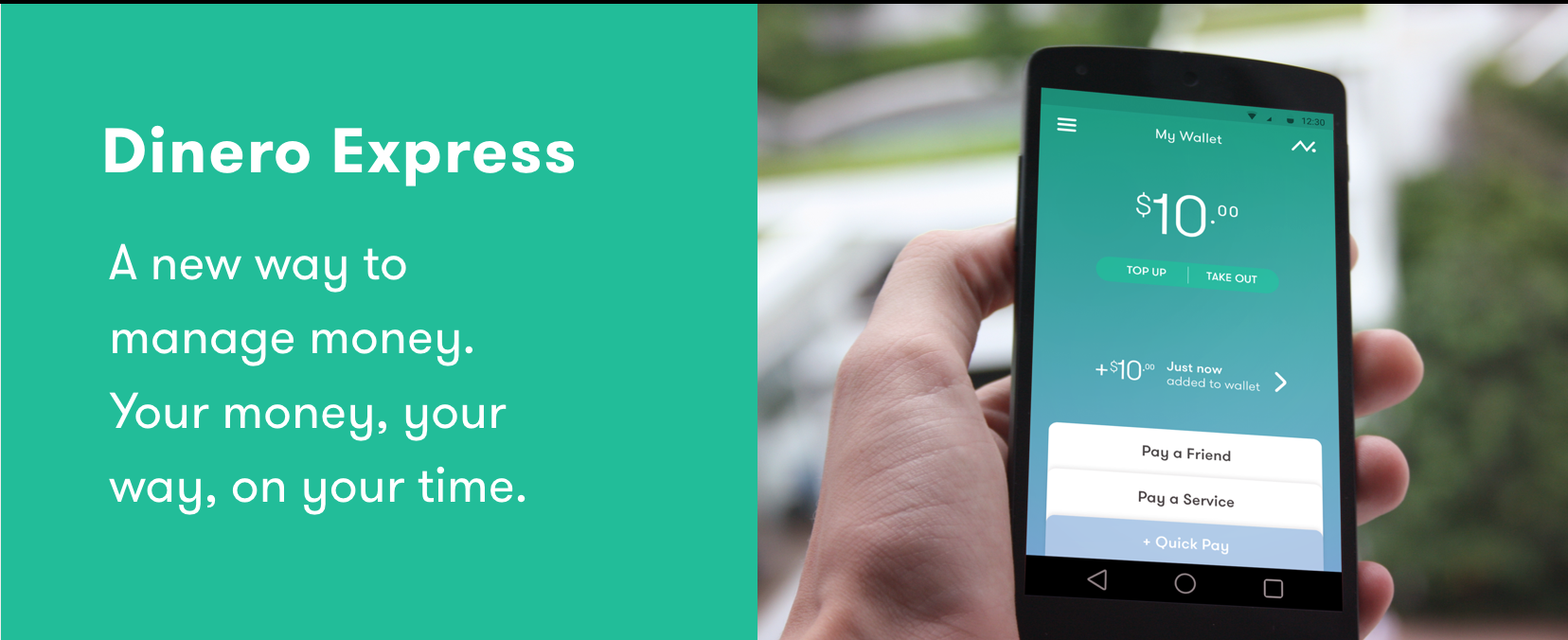
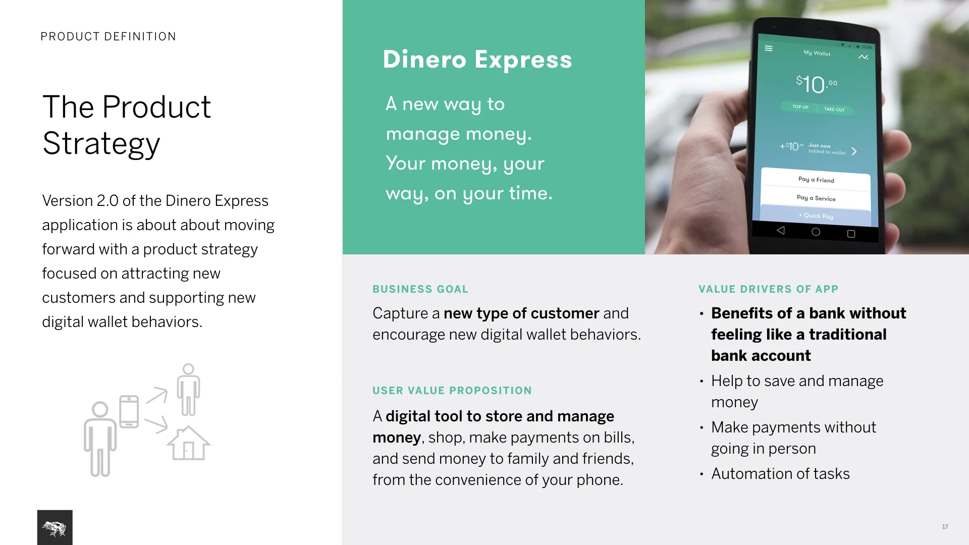
DEX, a secure and personal digital wallet featuring user balance and latest transactions alongside key actions.
Primary business goal is attracting new types of customers while encouraging digital money management. For users, it is a new way to manage money, keeping it secure and accessible without the need for a bank account.
DEX Android and iOS apps have been developed by Banco Azteca: Google play link, Apple app store link.
Project highlights
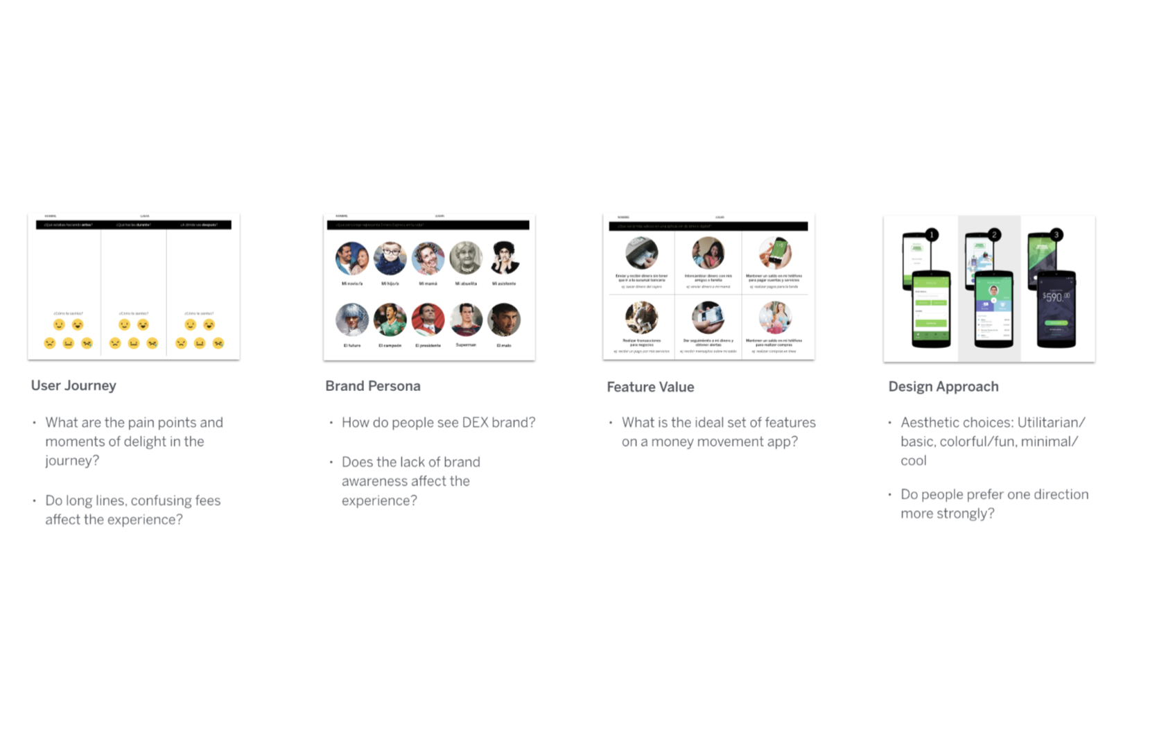
field research to debunk initial hypothesis and explore user insights
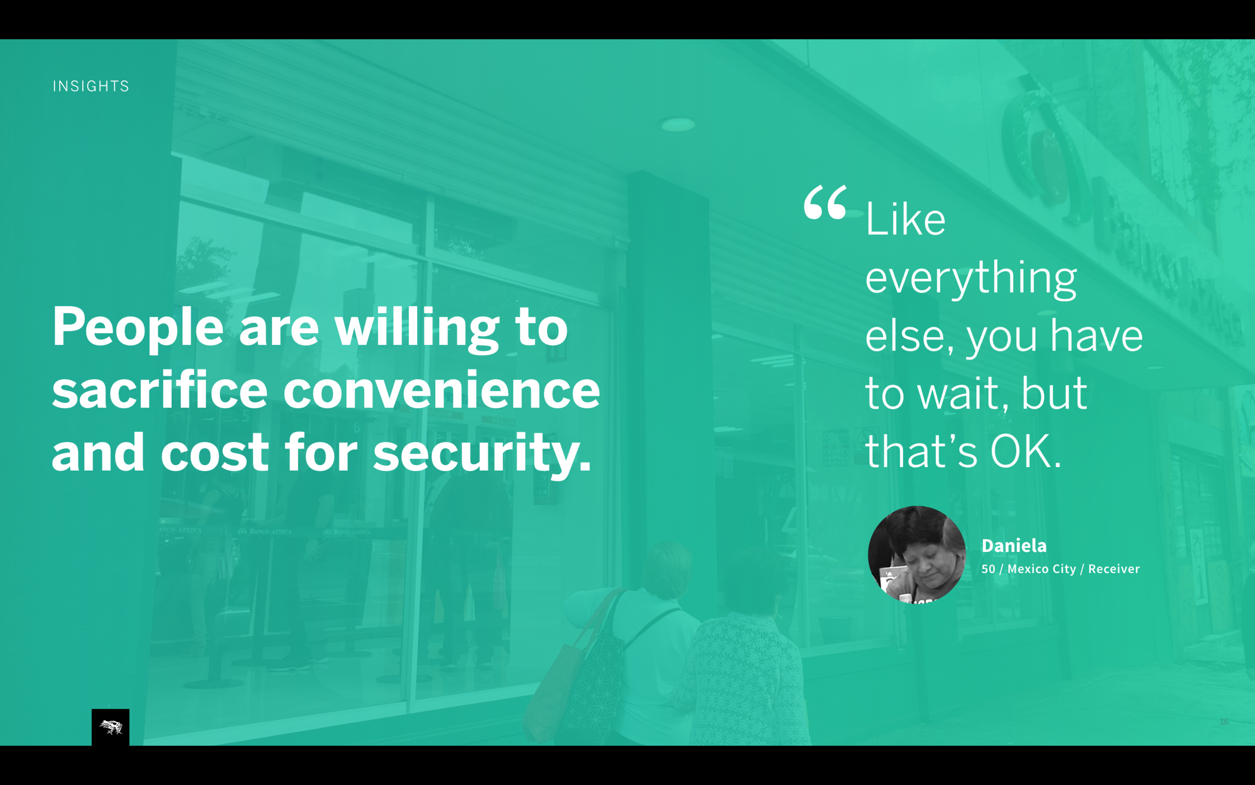
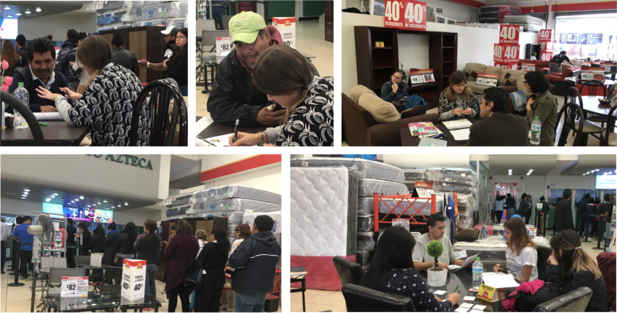
Based on stakeholder interviews, we developed early hypothesis on user pain points and opportunity areas. These were primarily focused on excruciatingly long lines and lack of distinguished DEX brand in retail stores.
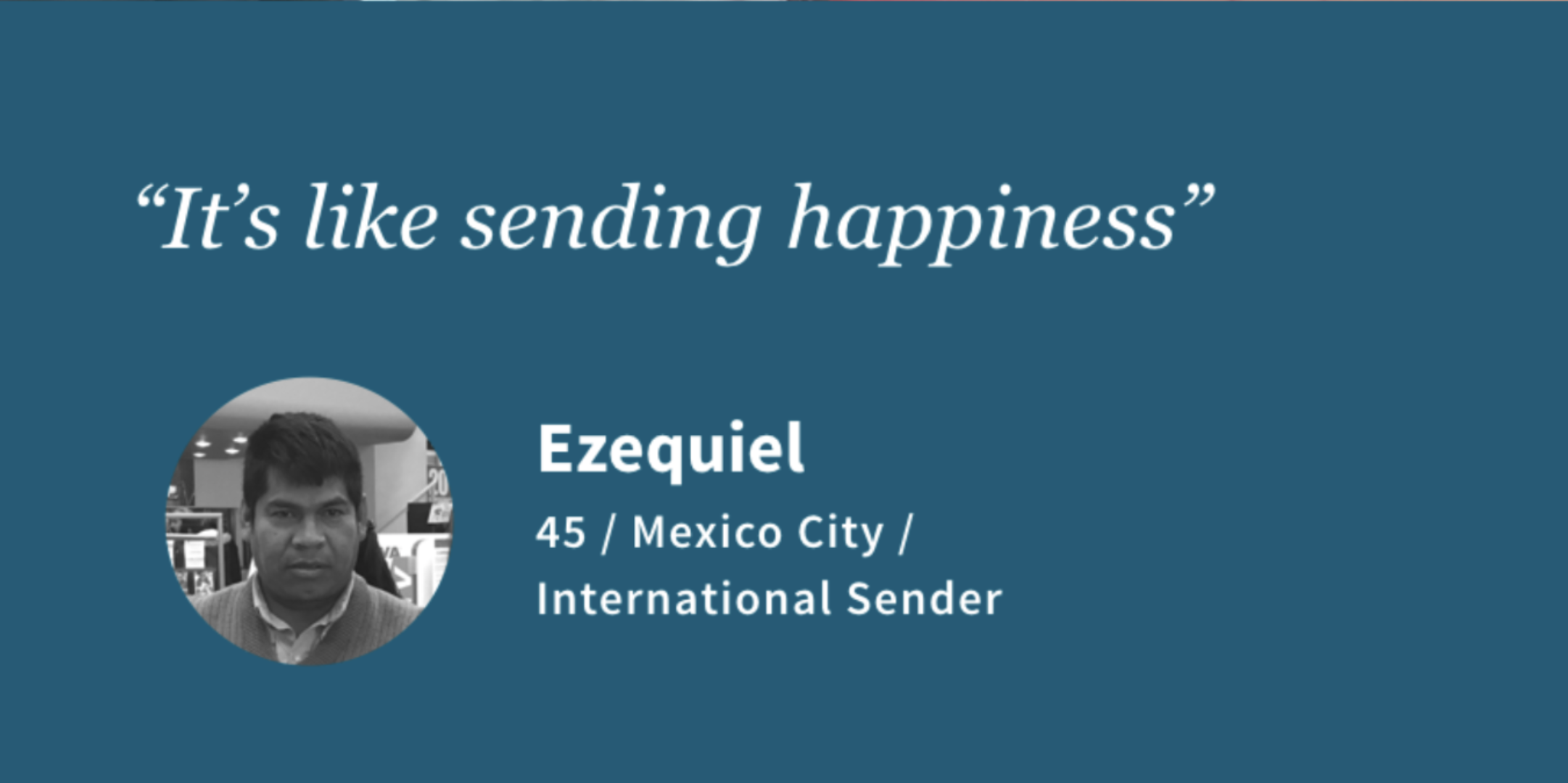
As soon as we were in the field, we quickly realized our hypothesis was off. People did not care about the long lines. They simply accepted it as “..just something you have to do…”. They only cared that the money got to their families fast and securely. This was a breakthrough signaling the real problems.
Primary insights we gathered:
Major mistrust in institutions are part of everyday life and dictate how people think about money. We needed to make the product induce user trust first and foremost.
People desire transparency and control over their money. Participants repeatedly mentioned the difficulty of not knowing status of money sent to their loved ones. We needed to create a product with clear instructions, status and record of money movement to ease the user.
2. How to apply learnings into the product
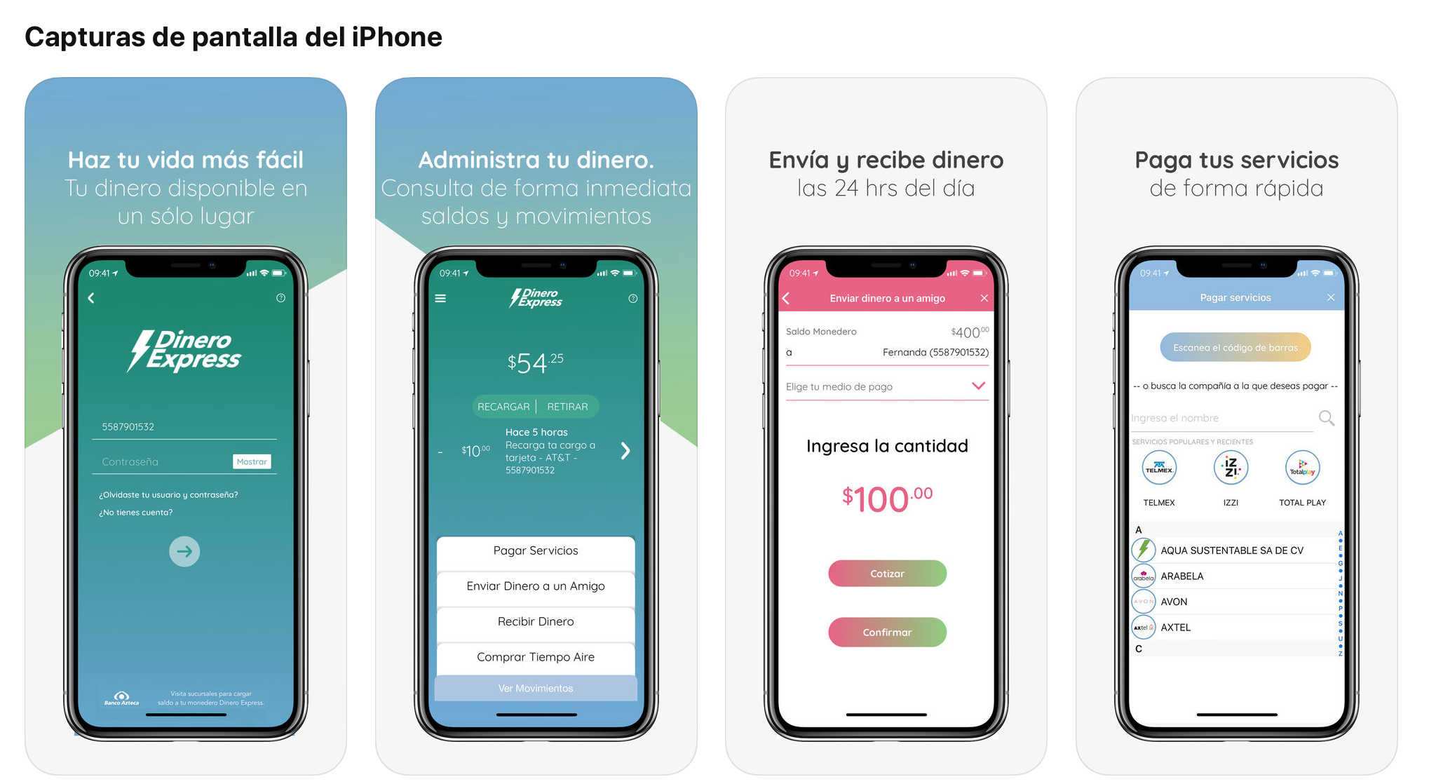
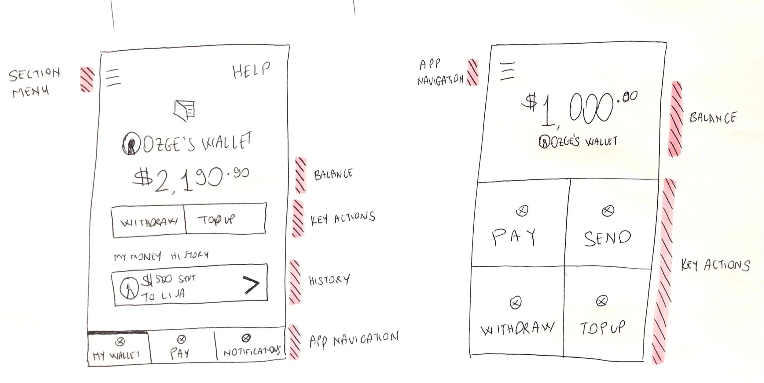
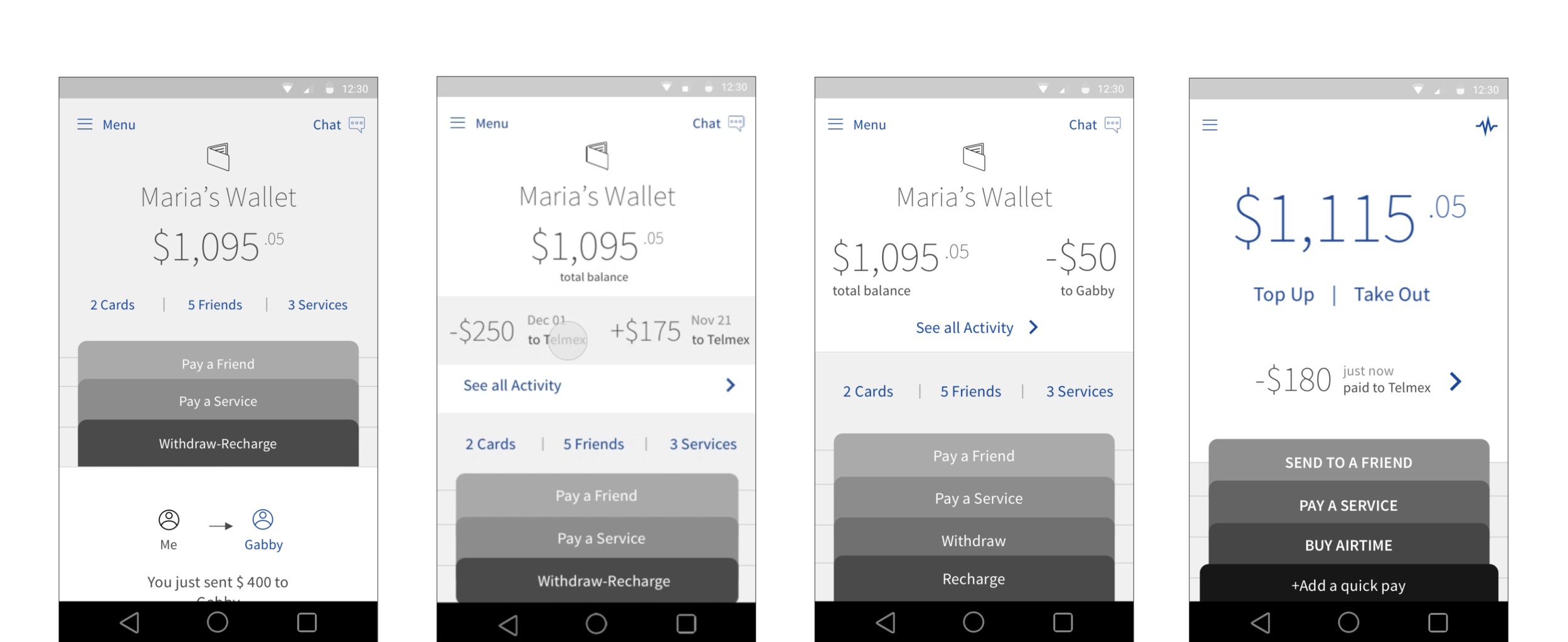
On my initial sketches, I explored various models: from a skeuomorphic wallet concept to a utilitarian one focused only on quick actions. We decided to go for a simple and familiar concept that featured users’ balance and key wallet actions stacked to resemble cards in a physical wallet.
Building trust by providing transparency
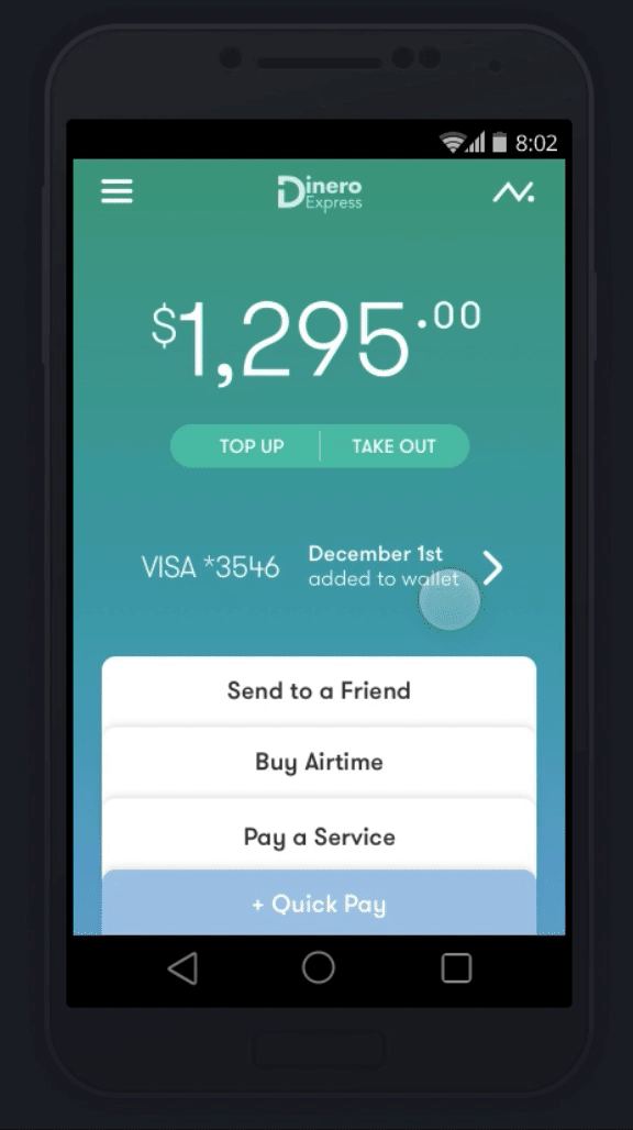
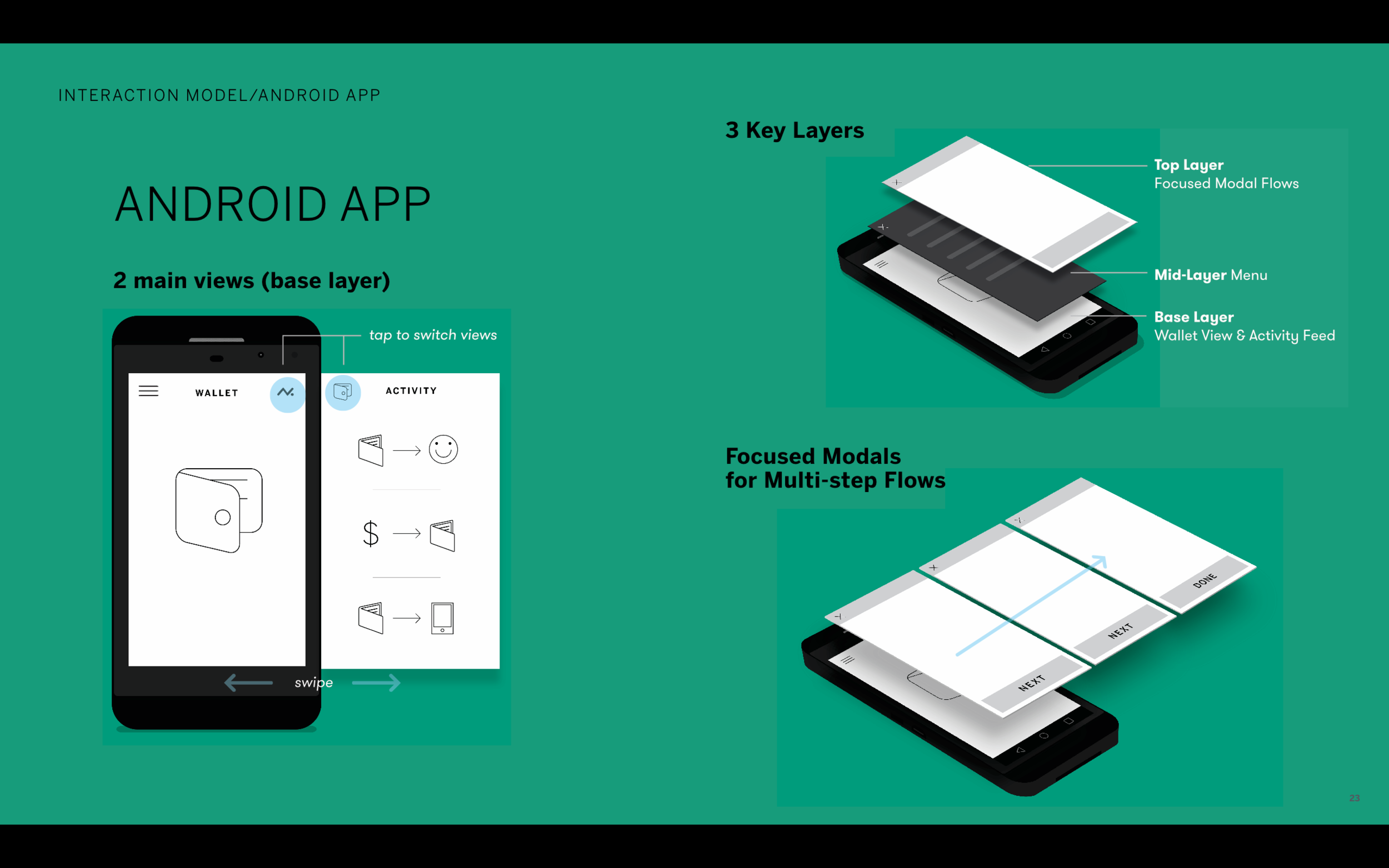
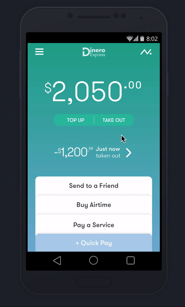
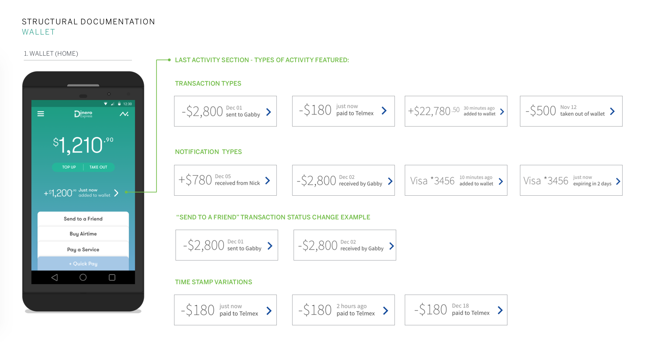
I created a 3 layer interaction model, making the base layer contain wallet view and activity feed.
I proposed this structure because we learned how important it is for users to know that their money is safe. This way when user launches the app, they immediately see how much money they have and the last transaction that occurred.
I placed activity feed on the same level, only a tap/swipe away from wallet view. This feed surfaced users’ money movement, enabling them to know when loved ones pick up money from a retail location.
Hand holding during complex flows and the unfamiliar first use
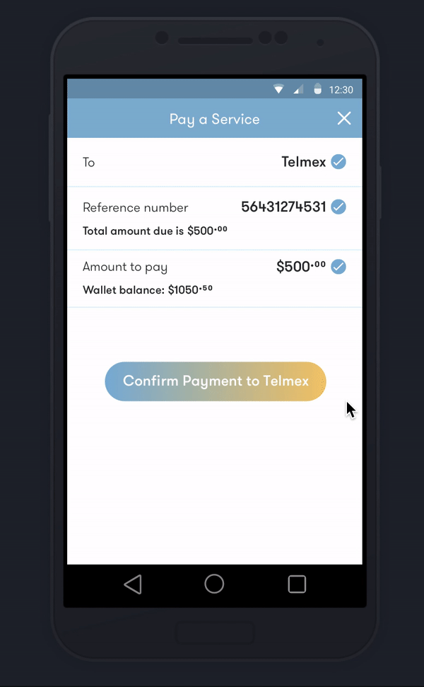
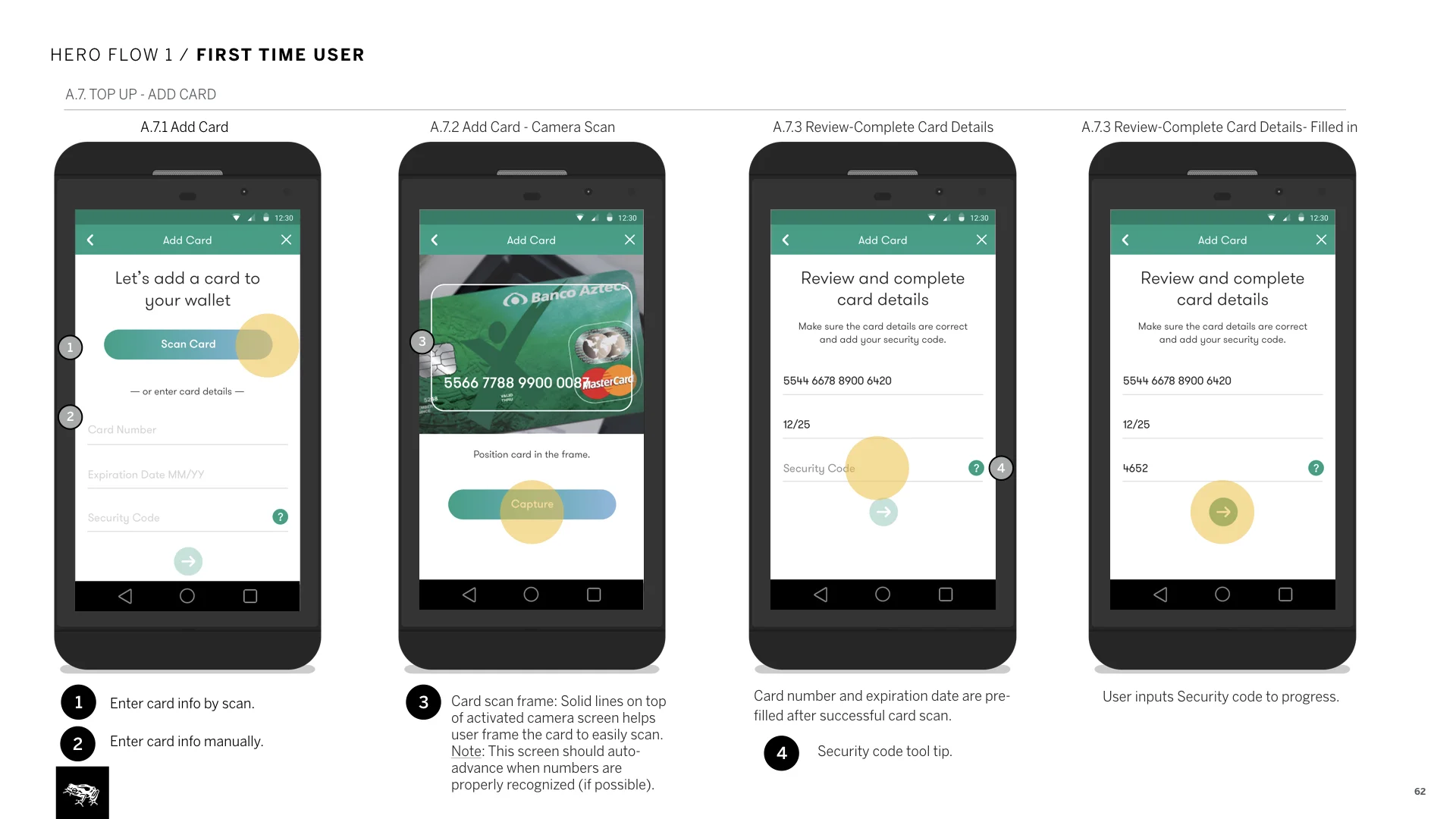
Top most layer on the interaction model is transactional flows that occur on modal windows; letting user solely focus on the complex flows.
All transactional flows feature progressive forms, making sure users see all details and continue without errors or confusion.
To provide clarity during the unfamiliar first time use, we added brief informational screens to transactional flows.
Reassuring users via delightful animations
I realized that processing and loading times could take a considerable amount of time, made worse by slower connections. Wanting to use this lag in favor of the user, I proposed brief animations to reassure users that their transactions were being processed.
Skeuomorphic receipt designs are also shown at the end of transactions. These are used as proof of the money movement, reassuring user further.
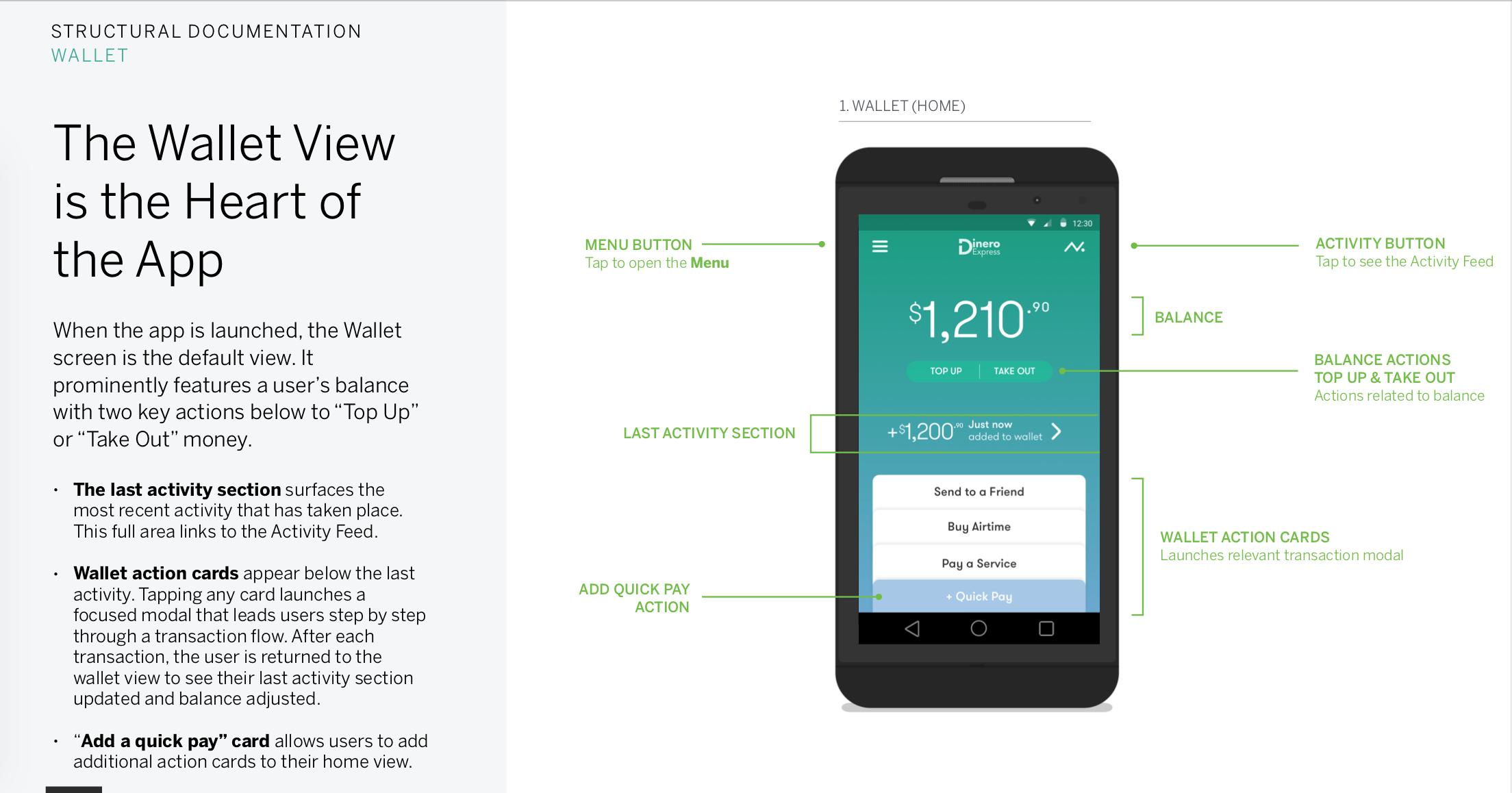
3. Documentation to communicate design intent and help implementation
A few sample pages from the documentation I created. This was scoped to just a few days, so I chose to focus on providing details on key architecture and UI elements. My efforts helped document design intent clearly, enabling Banco Azteca to use the agnostic design language to develop the iOS app on their own.
What’s next?
One learning from our market research has been the lower rates of app usage in Mexico, correlated with smartphone ownership.
Successful launch of the Android and iOS apps (signaling user acceptance) brought Banco Azteca back to collaborate with us on a responsive website. Banco Azteco has been developing it to provide more unbanked users access without the need of a smartphone.