Palo interactive hubs
Building a connected city through communities
for LQD and frog ventures
Final product
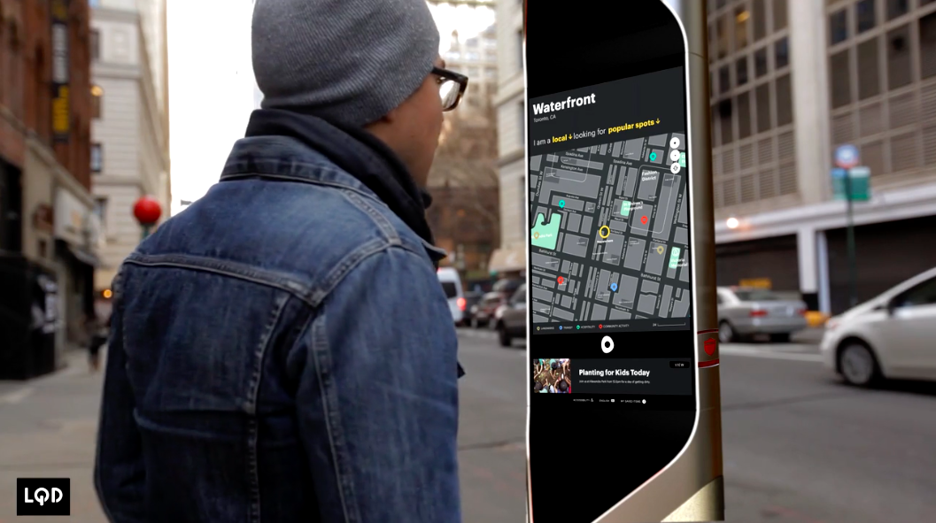
LQD is a venture building connected city infrastructures, later acquired by Verizon. Palo is their first interactive urban communications hub; there to help people feel more connected, educated, and safer in their communities. (This was the software design phase. Frog case study)
Opportunity and Problem
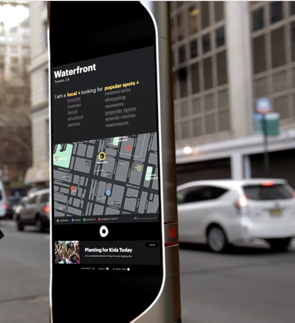
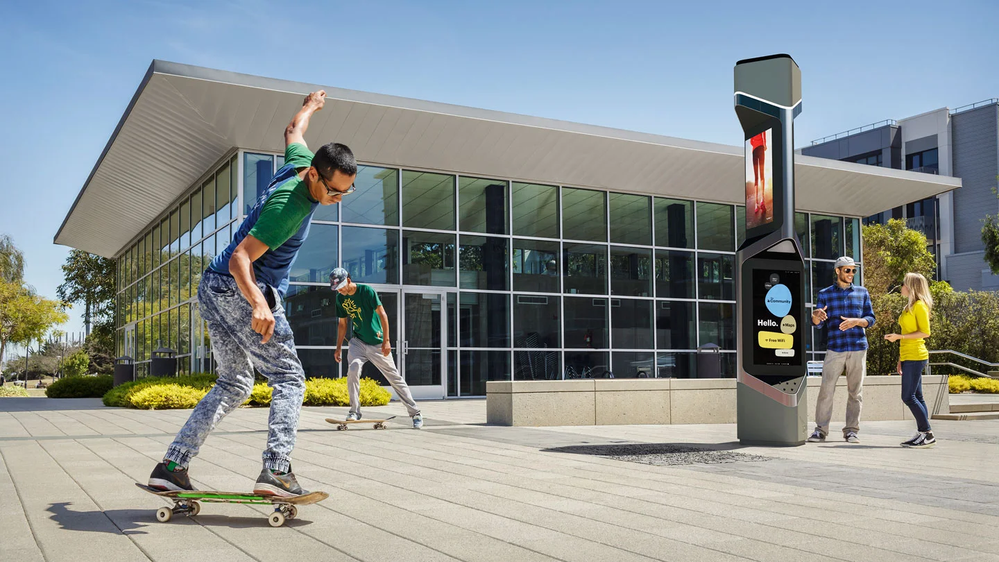
Palo was a public (large screen) device for community engagement in urban environments. This community hub needed to serve a wide variety of users with a wide variety of needs. Ease of use (interaction and content), privacy and approachability were some of our major concerns.
My role and responsibilities
I was involved during the interaction design phase (~5 weeks). I created an interaction model for the device including an ecosystem approach with content/functionality mapping for all touch points, and designed several UI patterns. Visual design was led by another designer after me.
Physical-digital design
Interaction model design
wireframing
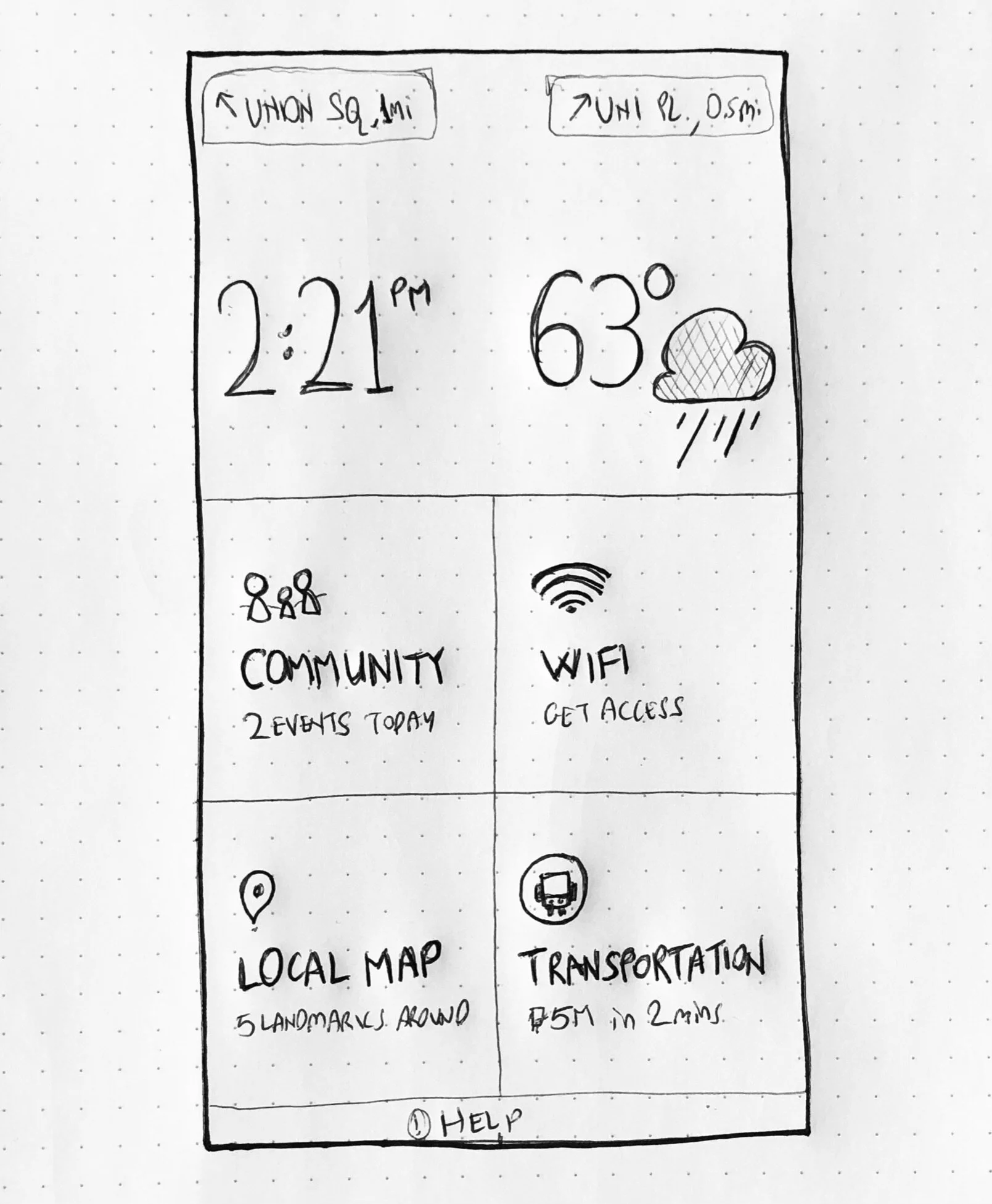
Home/Attract screen wireframes
Process highlights
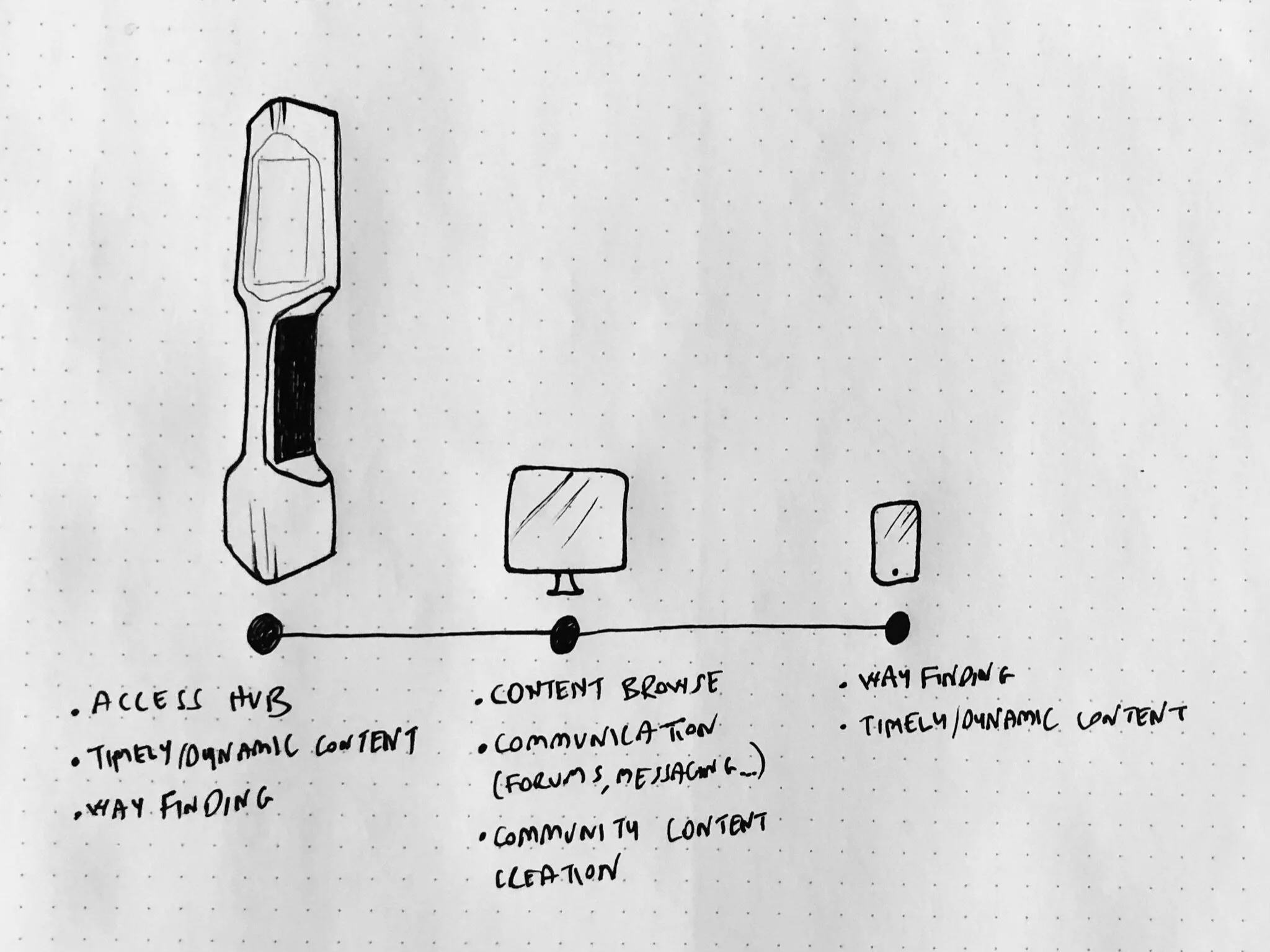
Main challenge was convincing the team to adopt a different approach for the functionality set. Palo and frog teams wanted this hub to serve all community and user needs (content creation, messaging, browsing, way finding etc.). However, this meant overloading a large public device with features it was not suited for. I proposed a multi-device ecosystem approach where content and actions were divided between multiple touch points. This simplified the experience, focusing it on the known major user needs: highlighting community events and other content, way finding and providing free internet access.
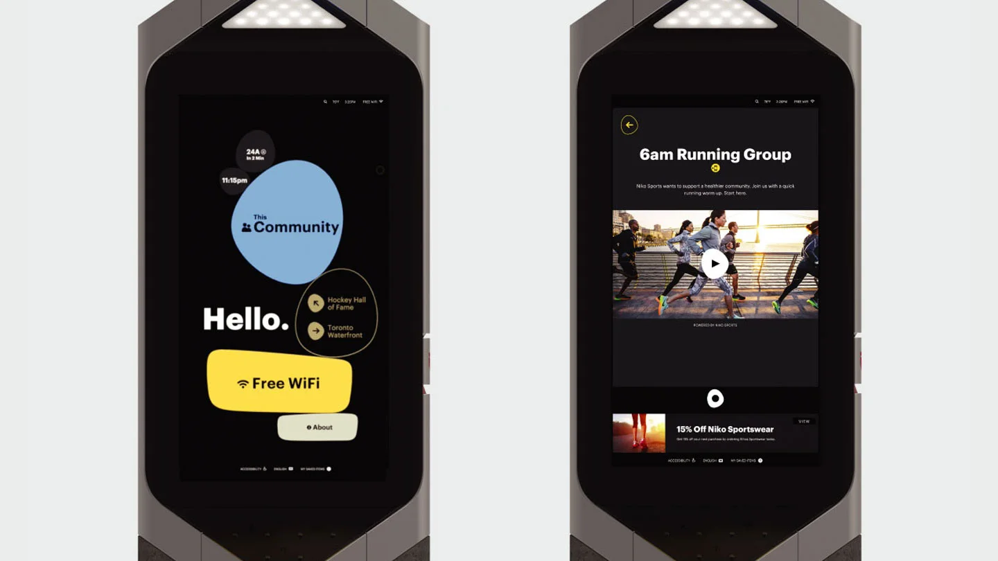
Interaction design for public devices is different than design for personal devices. For example, the start of the experience is a crucial moment, where you need to attract and establish trust immediately. We needed to make the device approachable through the interface. Initial home screen designs were heavy on content, trying to show the value first. I proposed a different approach, to start with an “Attract screen” that grabs peoples’ attention from a distance while providing starting points to the main content/functionality (free wifi, community section etc.).