DEX mobile app
for banco azteca
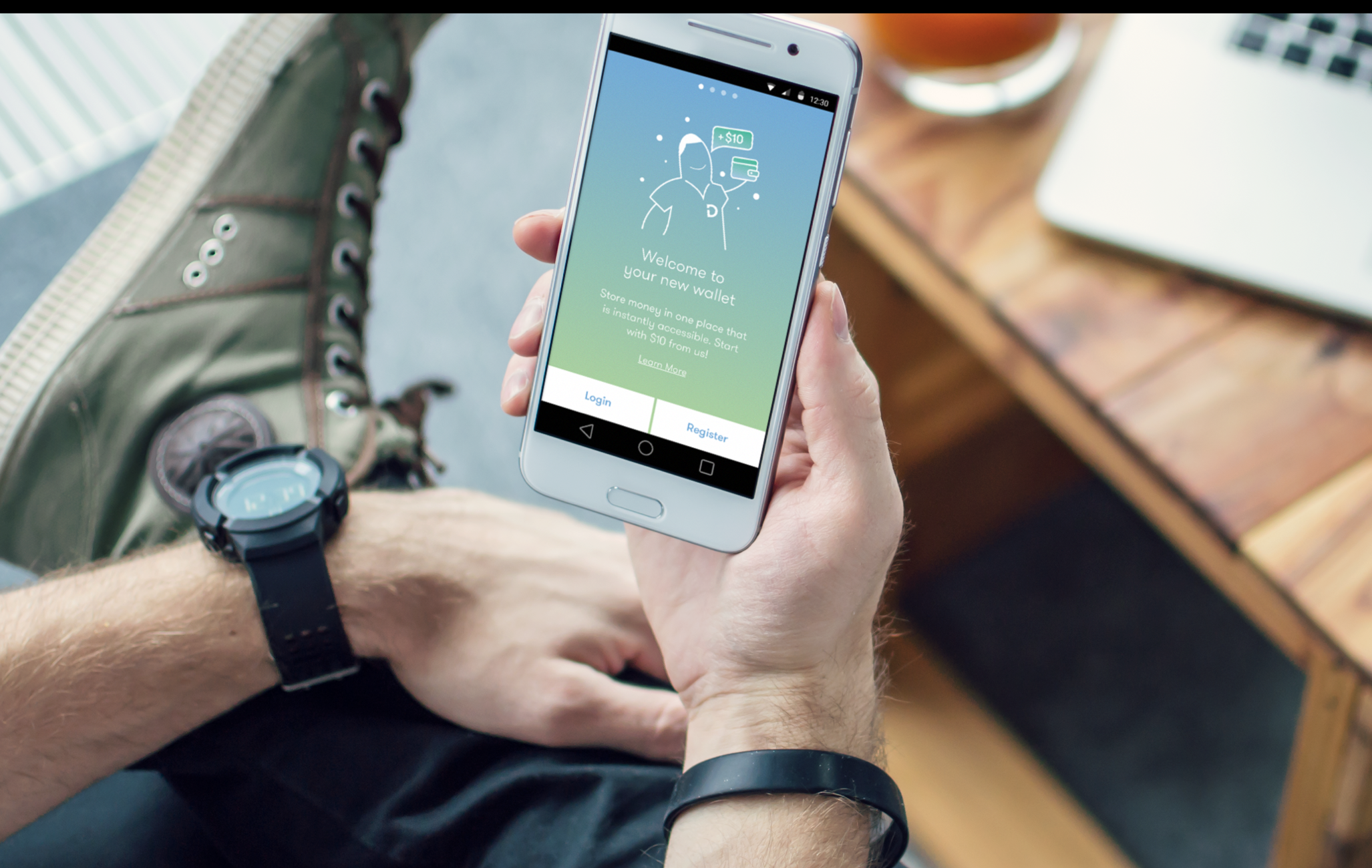
Project: Dinero Express, under Banco Azteca, is a money movement platform that was a business running out of retail locations in Mexico. Over the course of 10-12 weeks, we created a product strategy that was based on practical and emotional needs of Mexican users. In a country with so much mistrust in institutions, especially banks, we based the design around the concept of ones' own wallet. A secondary view, supporting the need for transparency and security, let users see all activity in their account with one swipe. Invision: https://invis.io/GT9RABIPF, Password: MONEY1
Process: started with field research in mexico, did synthesis to share the product strategy with, ran multiple design sprints.
My role and responsibilities: i played principle designer role, ran design prints with a team of 6 designers and technologists. I also was repsonsbible for day-to-day client relationships and product management on frog side.
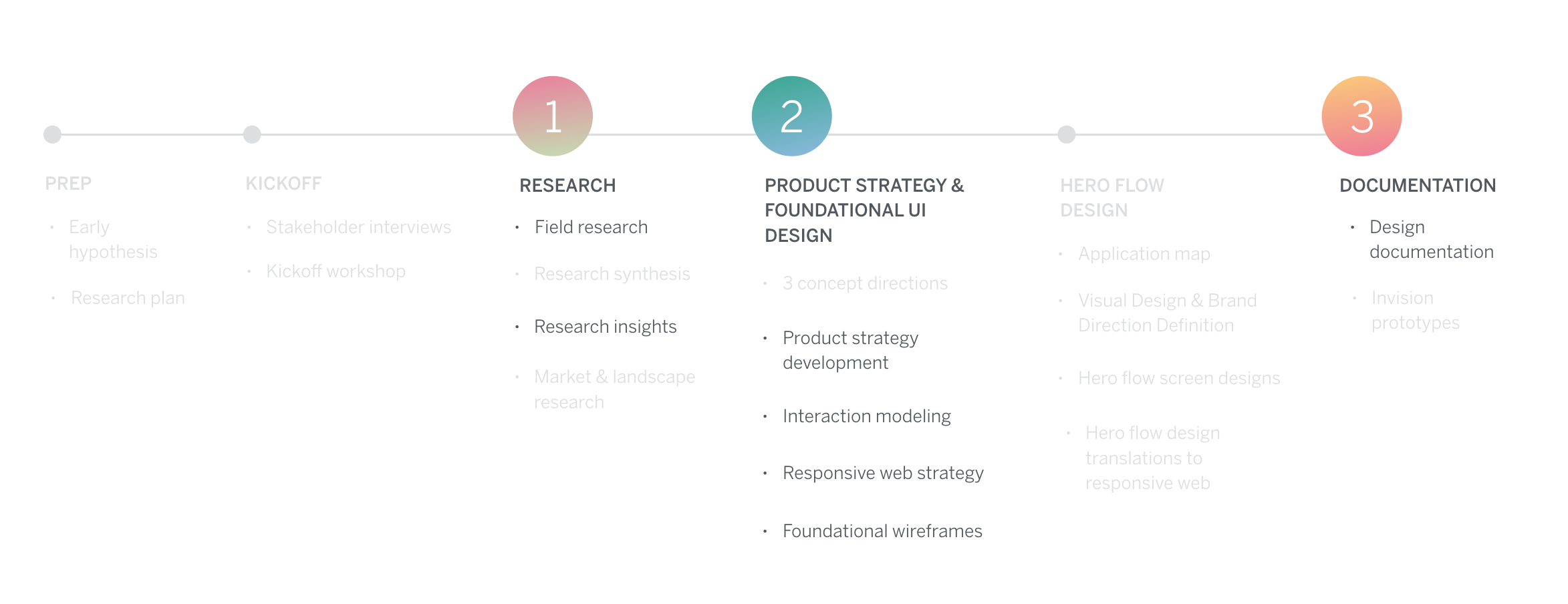
3 areas of learnings in the process
Research: How to be flexible in the field
Product design: How to bring the user insights into product strategy and design
Documentation: How to document design intent for inexperienced clients
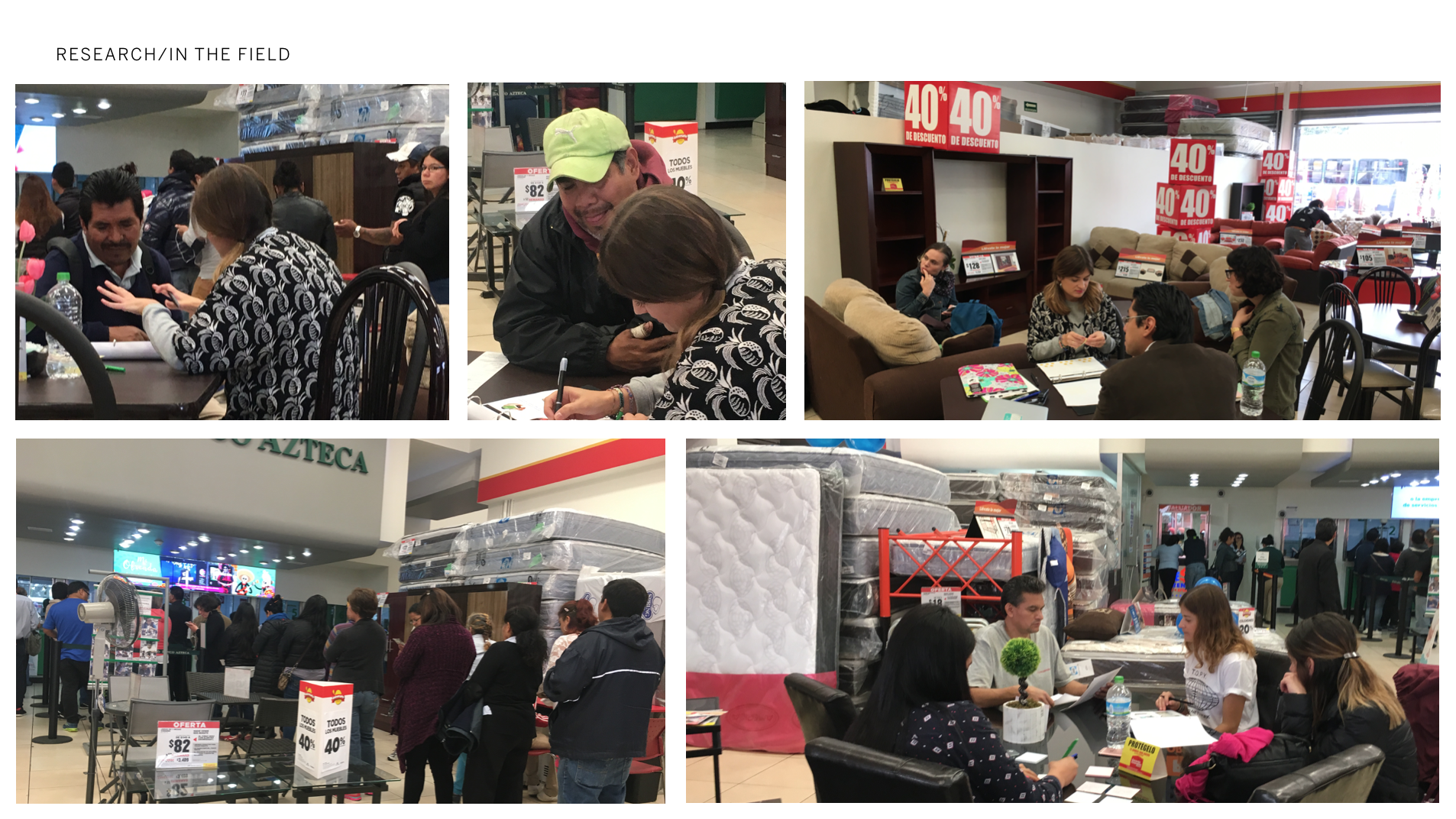
research: How to flexible in the field
Pre-field
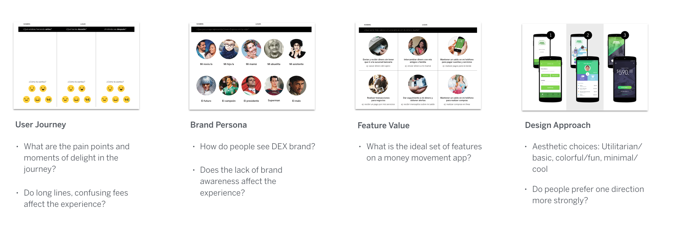
as we were prepping for the kickoff, learning about the business, we started developing some early hypothesis such as lack of distinguished DEX brand presence that was getting lost under banco, no digital presence, excrutiatingly long lines people had to wait etc. we structured our research around confirming these and eve designed participatory exercise to start solve for them.
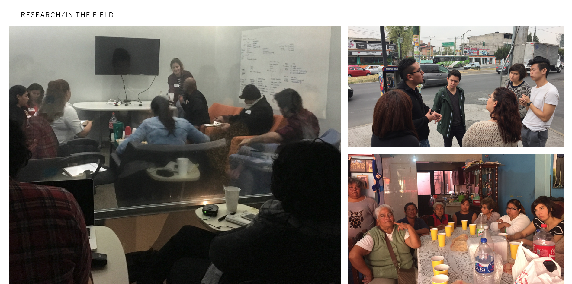
In the field
It was painful to conduct interviews in the very crowded and loud stores. more importantly the participants: people hesitated to talk about their finances, thought we’d scam them, said they’d not give their pins to us or want their pics taken, most had very little literacy so they barely got through the participatory design exercise. other than first hand seeing how much users had mistrust around finances and had low literacy, we could not gather the insights we were hoping for.
Changing course
Even though they do not work in the US, we had to start doing focus groups in this case as participants felt more comfortable and actually shared more. a few of us went on an anthropological tour to a families' house in an outer edge neighborhood where tourists from the US visiting was unheard of.
2. product design: How to bring user insights into product design
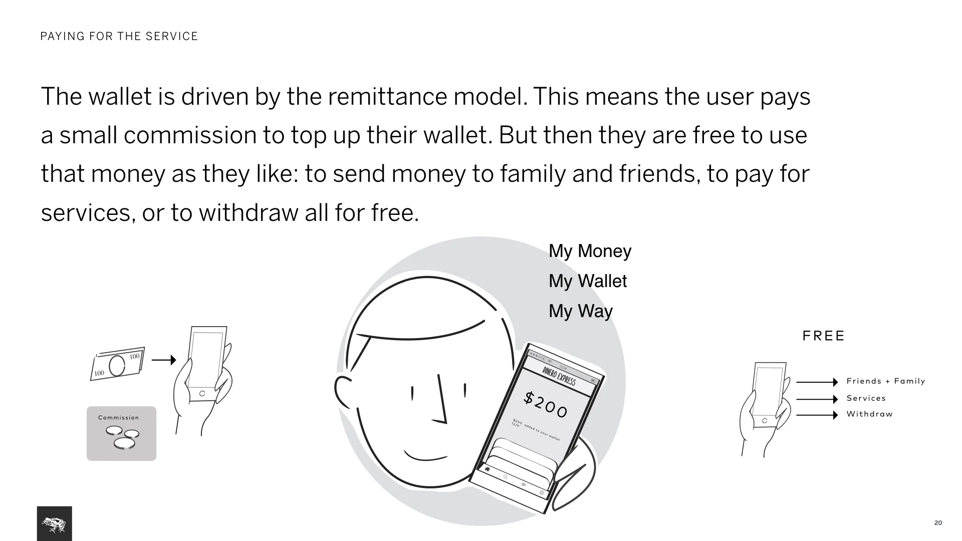
Some of the most important insights that helped shaped the product came from research directly. and as soon as we were in the field, our early hypothesis started breaking. ex. people did not care about the long lines. they accepted it, it was just something you had to do. DEX got their money there to their families, securely and it was worth the wait AND even the fees.
Insights
Major mistrust in banks and institutions. people felt more comfortable with cash, although that was dangerous as well but they were used to that too. we heard so many horror stories, urban myths about people losing savings because of scams and banks not accepting responsibility.
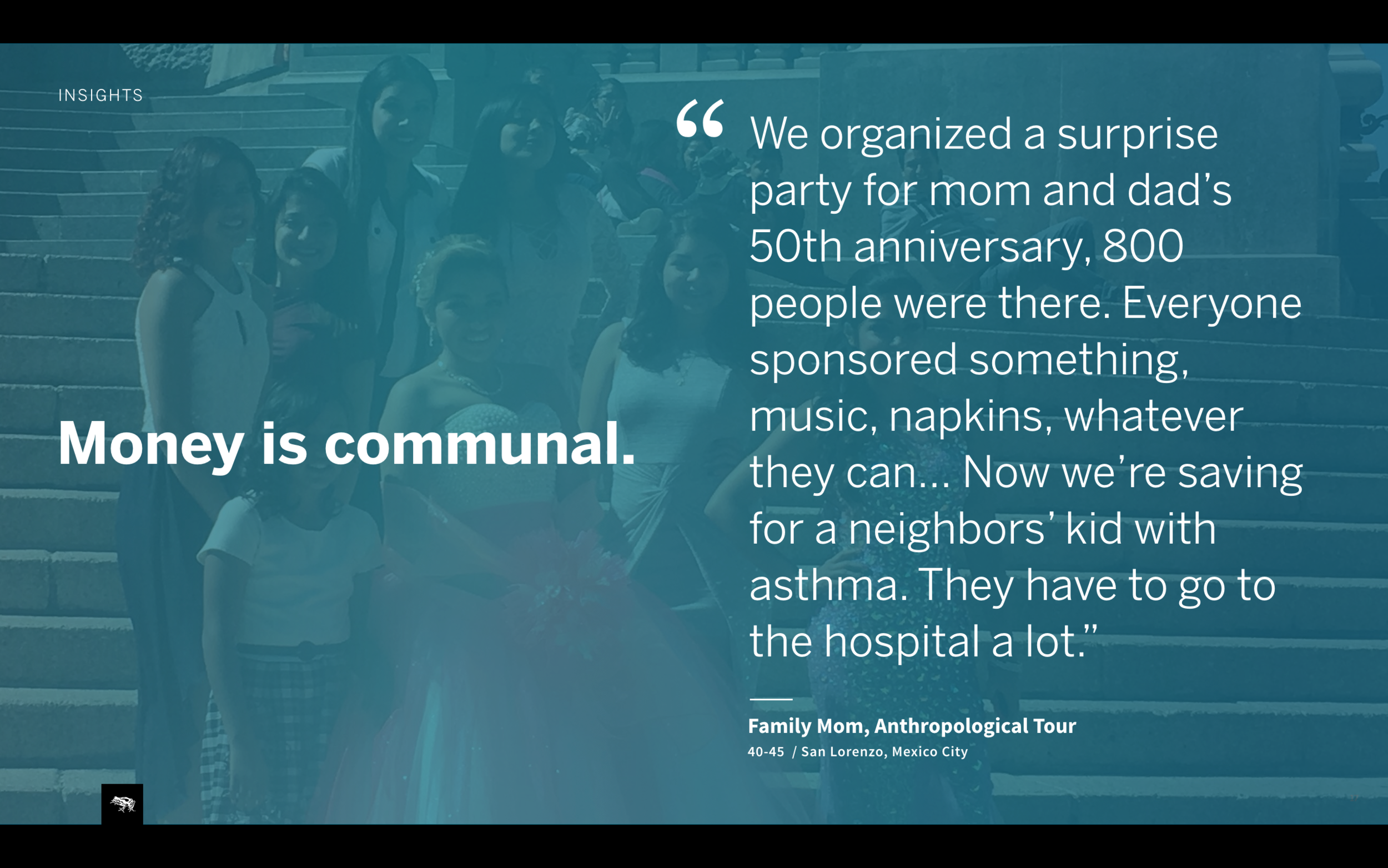
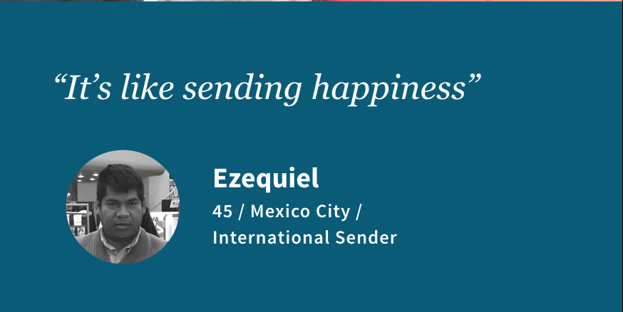
Money is emotional as well as communal. one participant who lived away from her kids talked about how waiting in the line and sending money made her feel happy and proud of providing for her children living back home with mom. we learned about tandas, people saving money together and mostly in cash. very different than how western culture handles money, money extends from individual or family to a whole community of people saving and spending together. we also had many people sending money to relatives, friends in other cities.
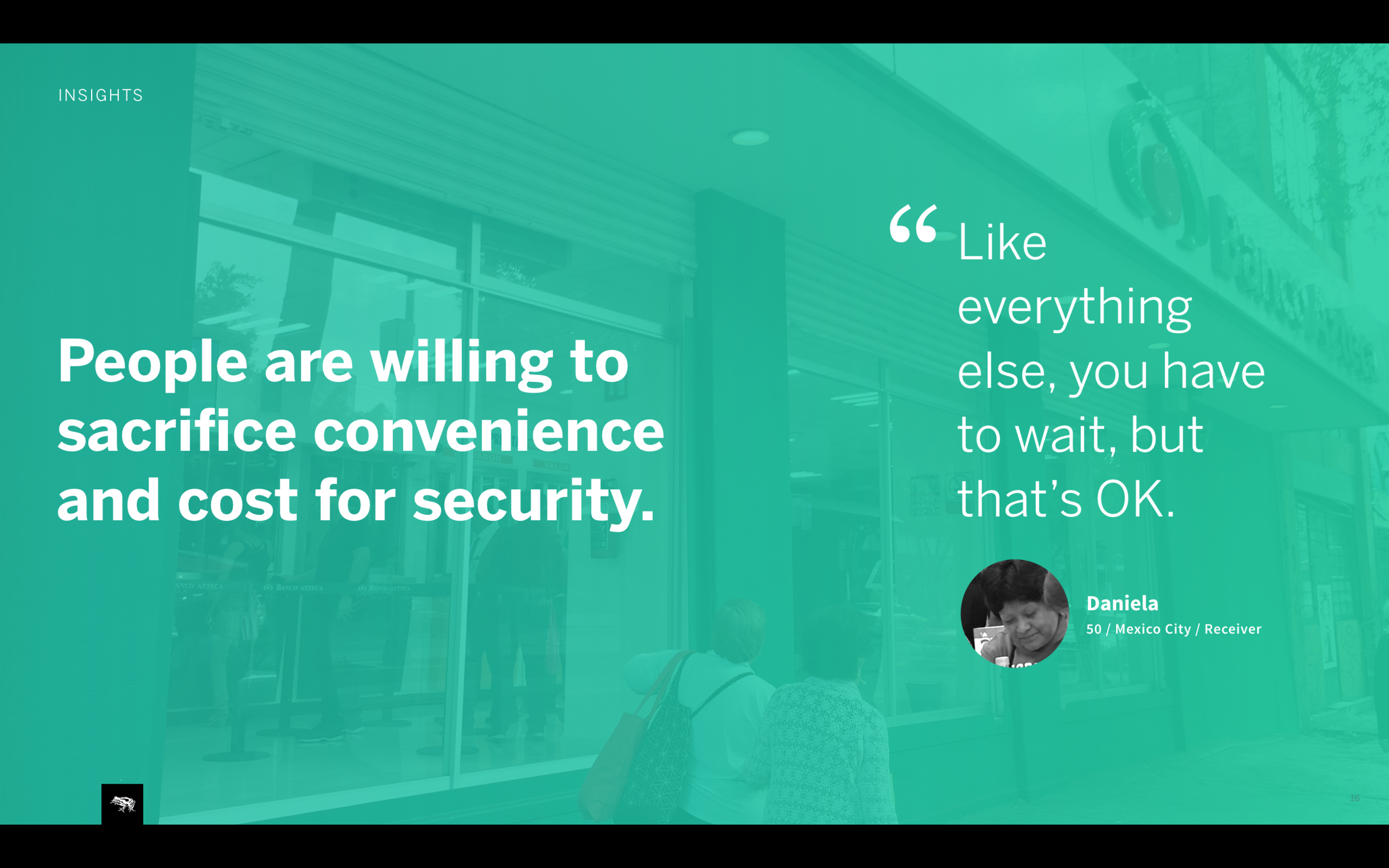
People desire transparency and control over their money. one problem with the current DEX model we heard about was not ever knowing when money is ready to pick up or got received. you send it and than you wait for a message from the receiver. sometimes people took 3 buses in rural areas and there would be one misspelling on the name and they’d not be able to get their money AND sender would not know the mistake till then. it was upsetting. also in general people were border line paranoid, like this lady printing balance before and after using the atm.
We knew right than that we’d have to create a product that provided a clear history of money movement.
Product strategy
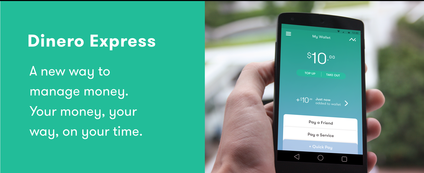
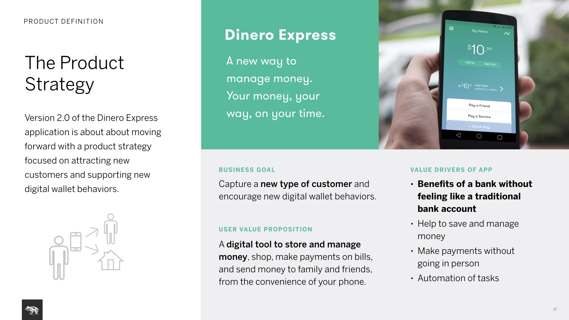
The concept is to mimic ones’ own physical wallet digitally.
Strategy
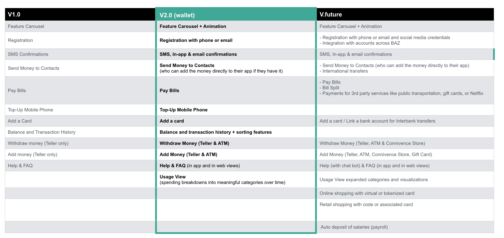
for the business its a digital wallet that attracts new types of customers. for users it is a new way to manage money, keep it digitally without the need for a bank account and ability to send/spend it as you wish.
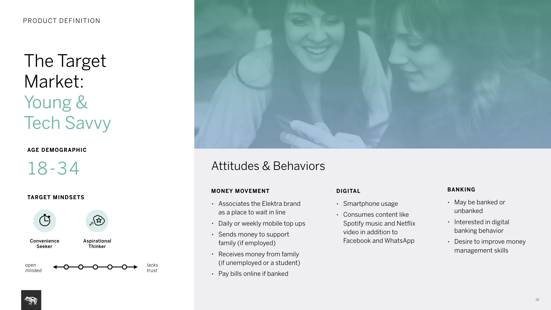
Target market
the groving tech savvy user base in the country, people that are more aspirational than just looking for basic, they’d use it to send and receive money form family, to pay bills and probably to top up their phones. they’d value not waiting in lines, they already use apps.
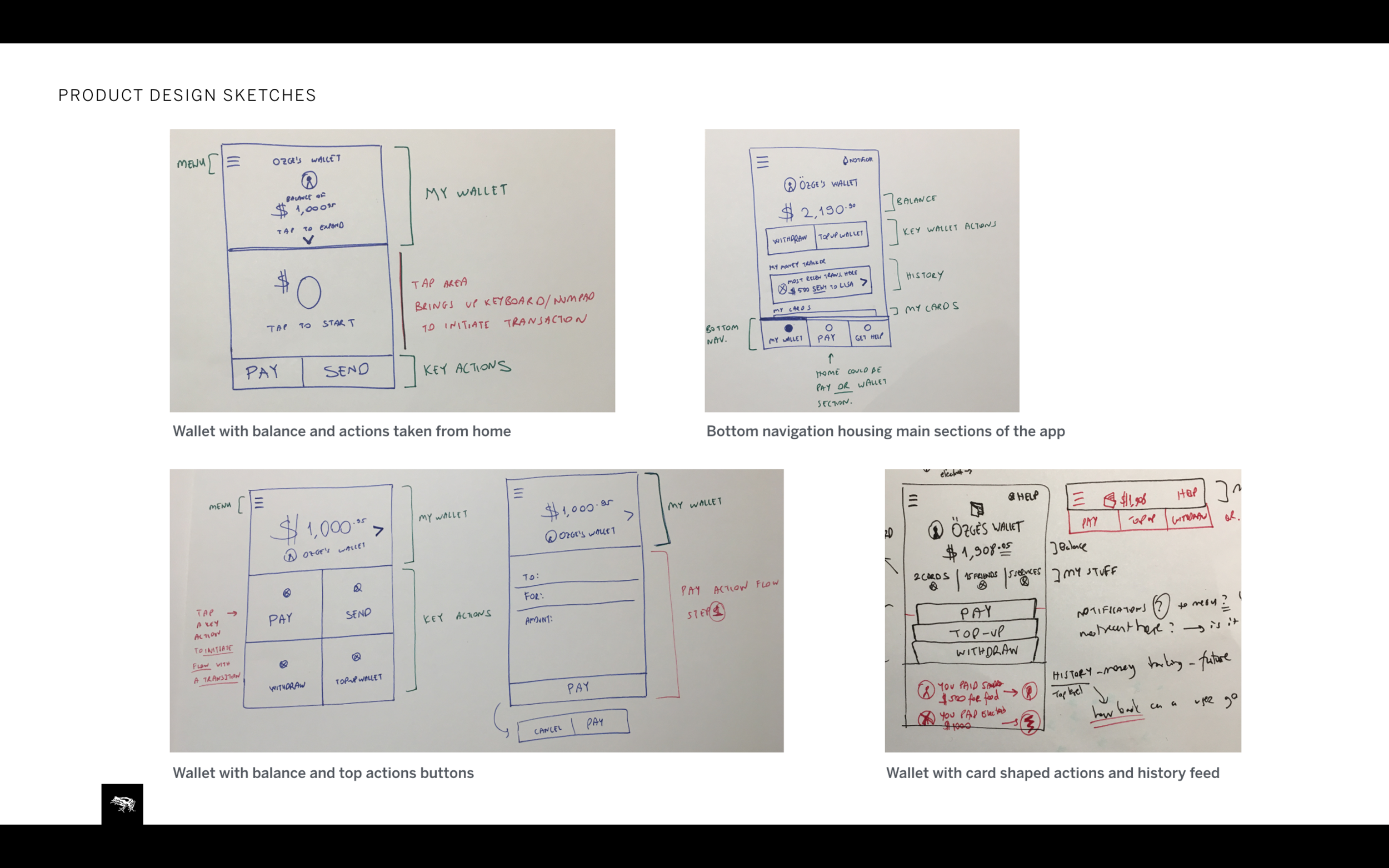
Product design
Wallet sketches exploring different ways to create an a digital wallet app. In the end as a team we decided to for the most obvious, even skeuomorphic design. we knew this design would be more familiar yet still feel new and innovative to users.
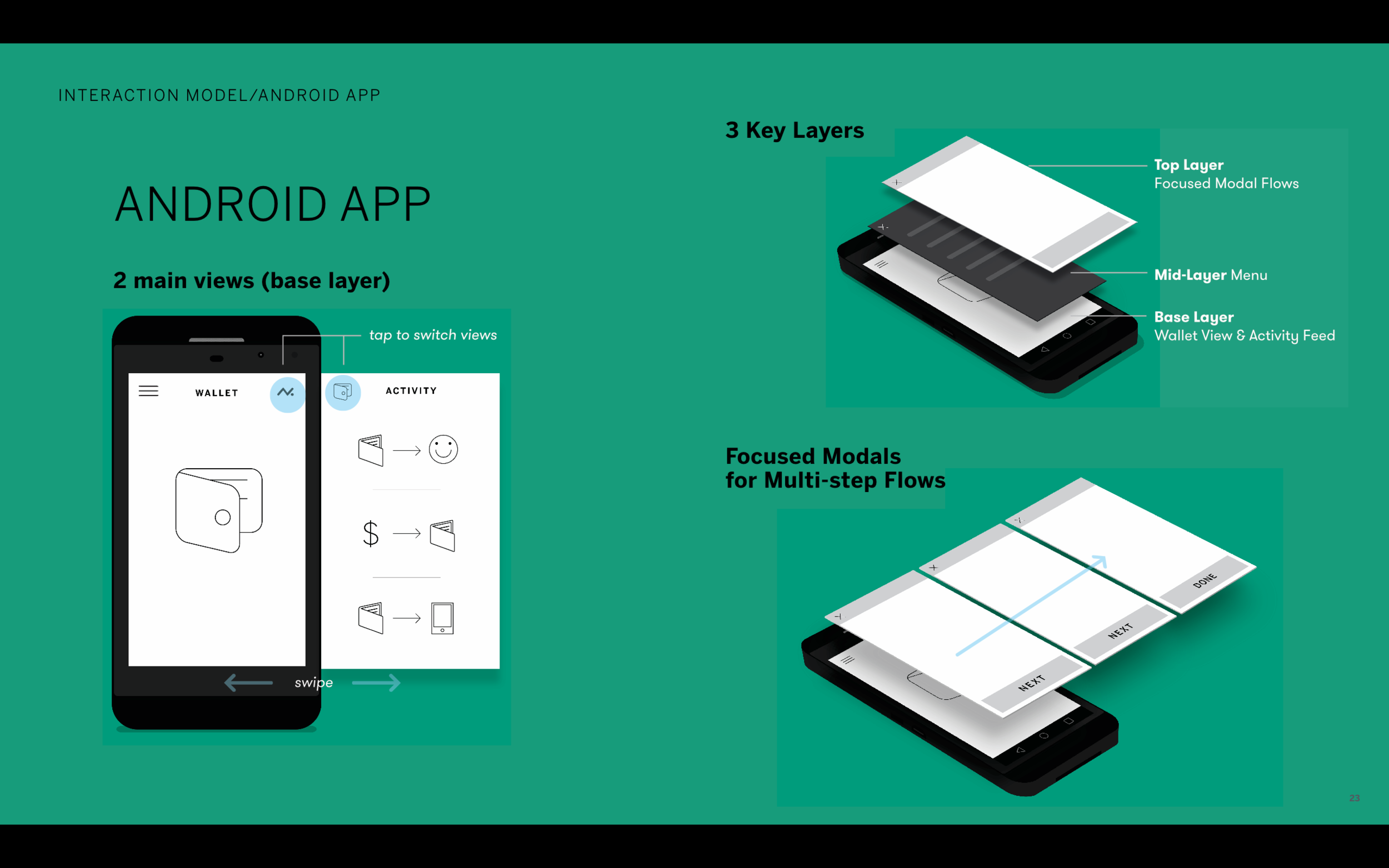
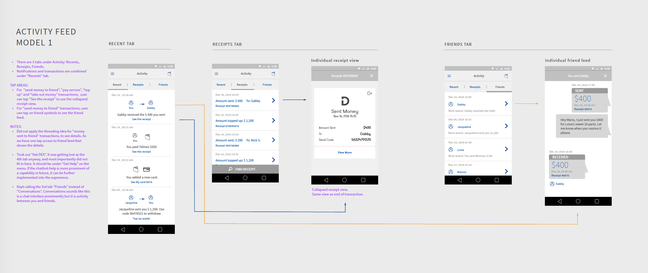
Interaction model
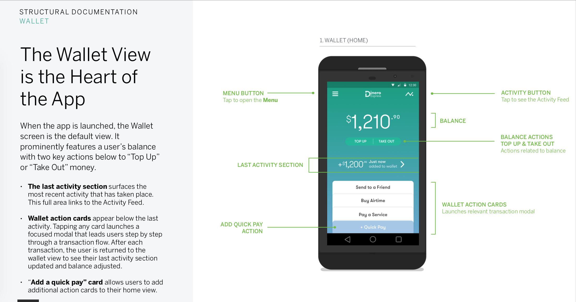
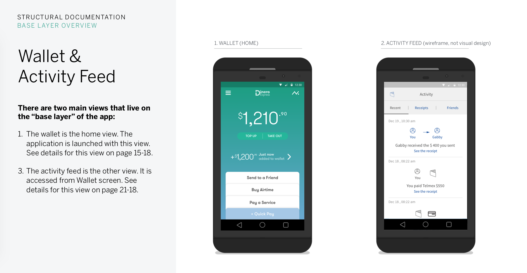
has three main layers. first two are the base layers, home and actions feed. third is the transactional flow layer that occurs on modal windows and takes the user back to a base layer.
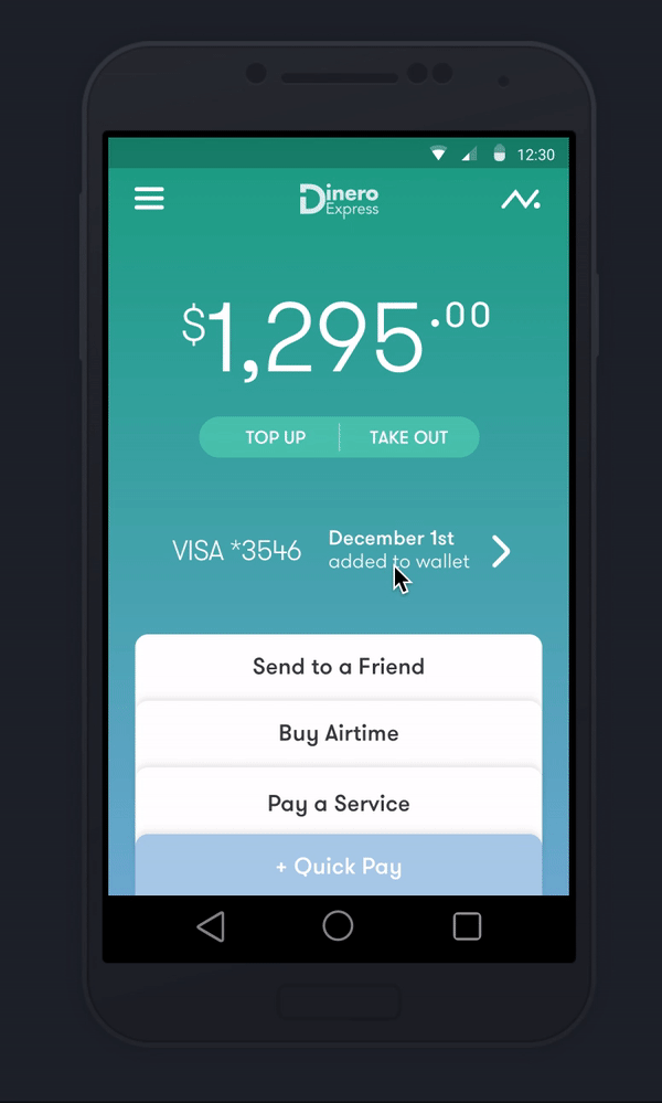
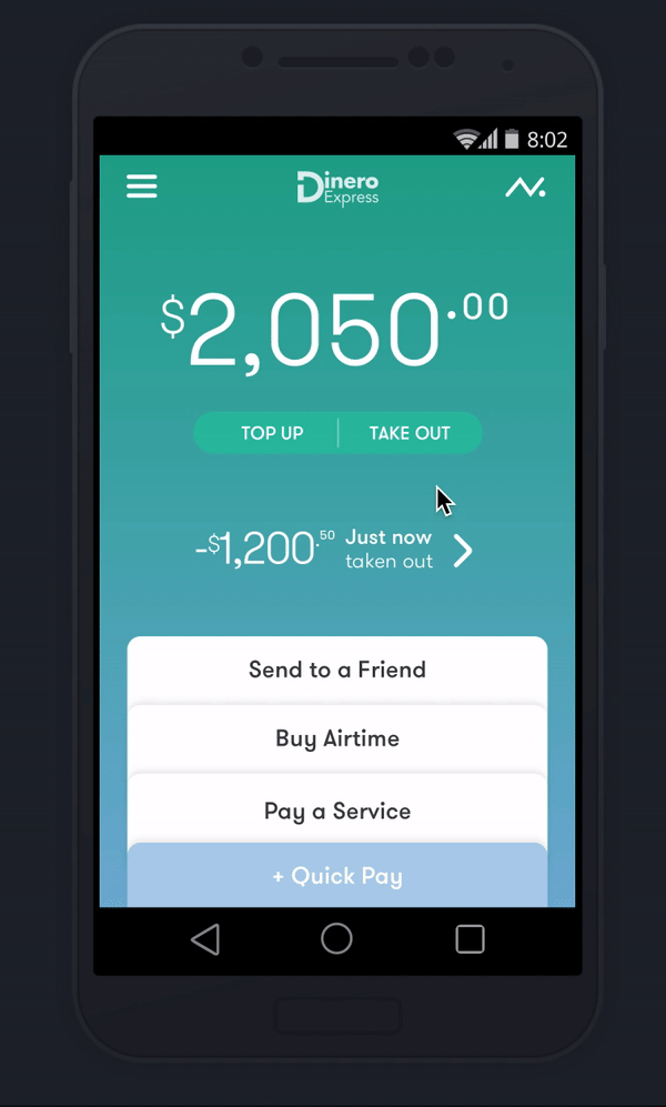
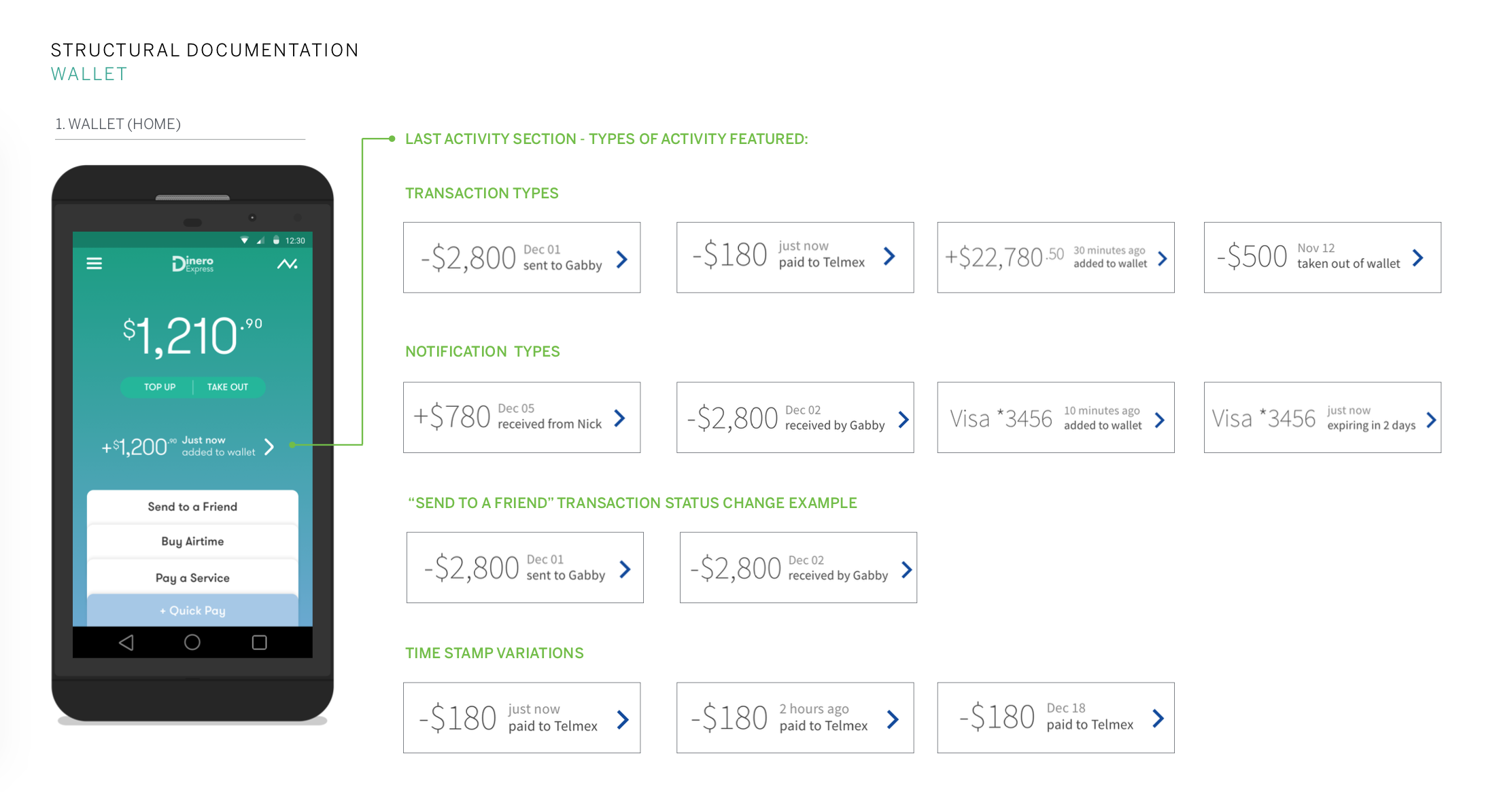
we made the home screen when user Opens their wallet house their balance so they see their balance first, underneath they see the vert last transaction or event that occurred. home also houses quick key actions that take see what occurred last and do whatever you want with your money (send it to a friend or pay a bill
activity feed houses the history and is only a swipe away.
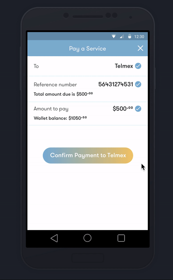
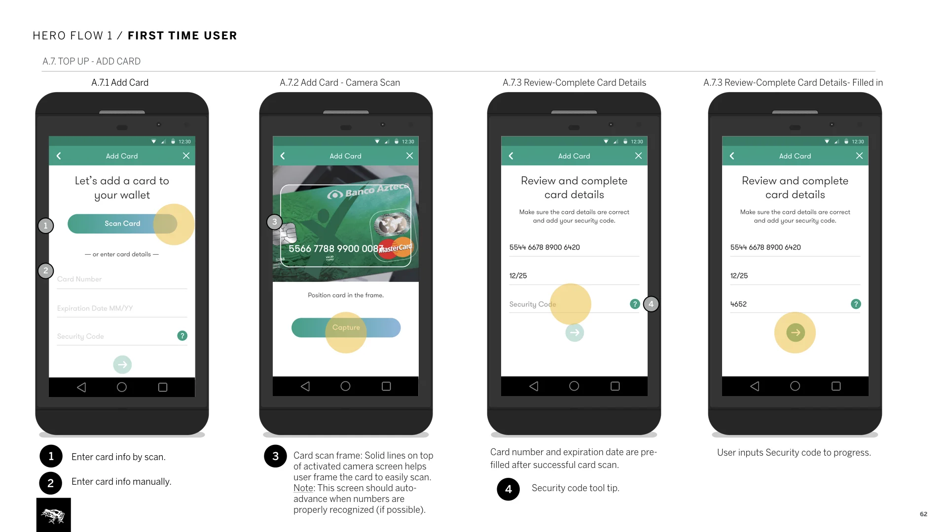
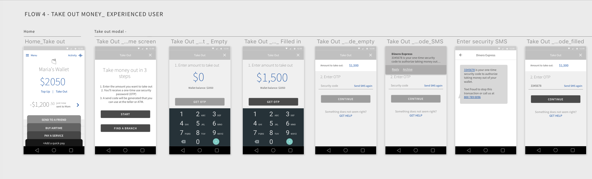
transactional flows start and end on home. forms are progressive, making sure users see all details on one screen and submit with our errors.
a few ways to make The interface respond to user needs
Building trust by providing transparency
Wallet balance and last transaction is first thing user sees, letting them know their money is safe and secure.
Activity feed holds the details, receipts and exchanges with users’ community. if a loved one received the money etc.
Total control over key actions
progressive forms guide users through the process, one step at a time.
“Send to a Friend” featured as the first action, celebrates the communal aspect of money.
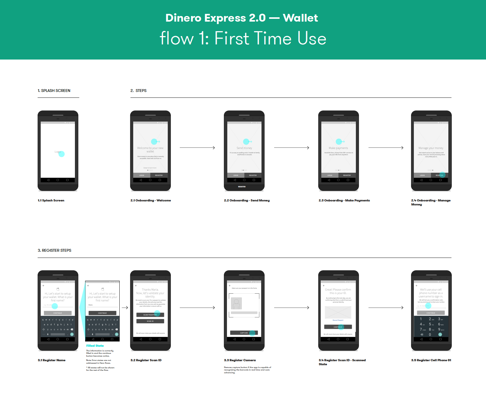
Hand holding for first time use
First time usage screens give clarity to an unfamiliar experience, helping user feel at ease to continue. on later phases we added the ability to keep the first use screen until user dismisses it.
Reassuring the user
Animations surfacing details of the action in progress, while using processing/loading times in favor of the user.
Receipts at the end of transactions are proof and record of the money movement.
3. documentation: How to document design for inexperienced clients
It means way more than a deliverable for me, it is making sure things are built right. as we were only scoped to do “light” documentation, ii approached documentation in 3 parts:
How its structured: all main parts of the app, the interaction model and details of sections. some you see are in wireframes as we were not even supposed to get to them in the hero flows. but they were needed for the product definition
How it behaves: thats documenting the functional flow of the 4 hero flows.
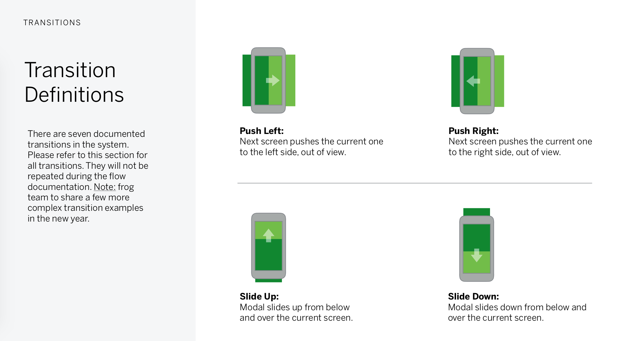
How it moves: an essential section for any app documentation. we intentionally used basic off the shelf android transitions as we knew that the client had a brand new internal team who were new to app development. therefore using transitions that required less customization and were adequate enough made way more sense.
In the market
iOS app has been released on the Mexican app store. we also worked on a second phase to translate this work into responsive web, see it here: link
Some other deliverables that helped define the product and service
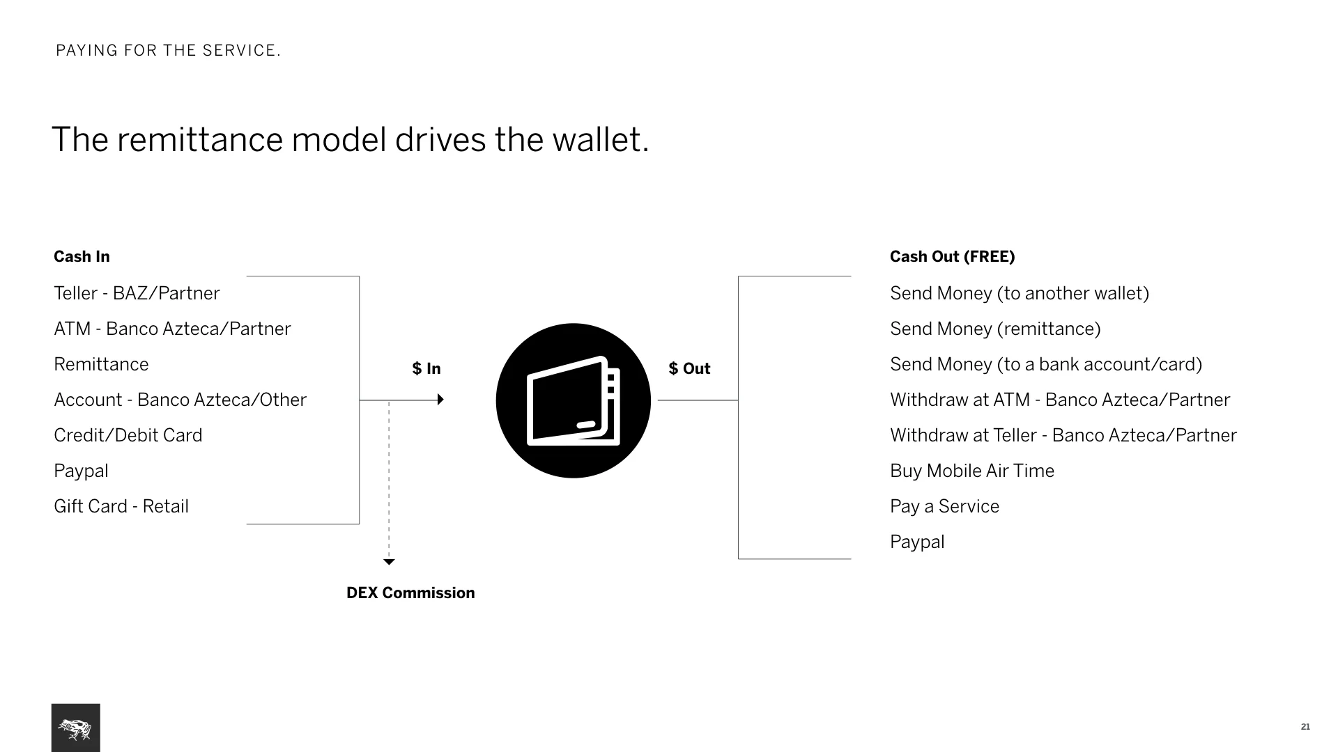
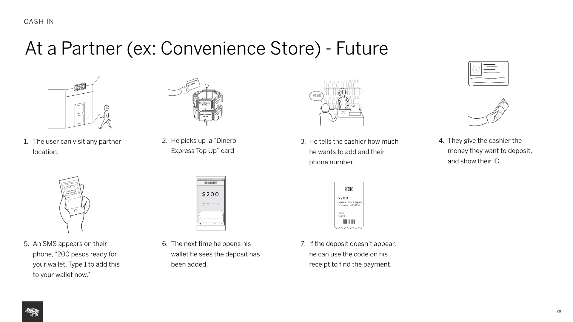
Key scenarios for current & future services and service fee model description
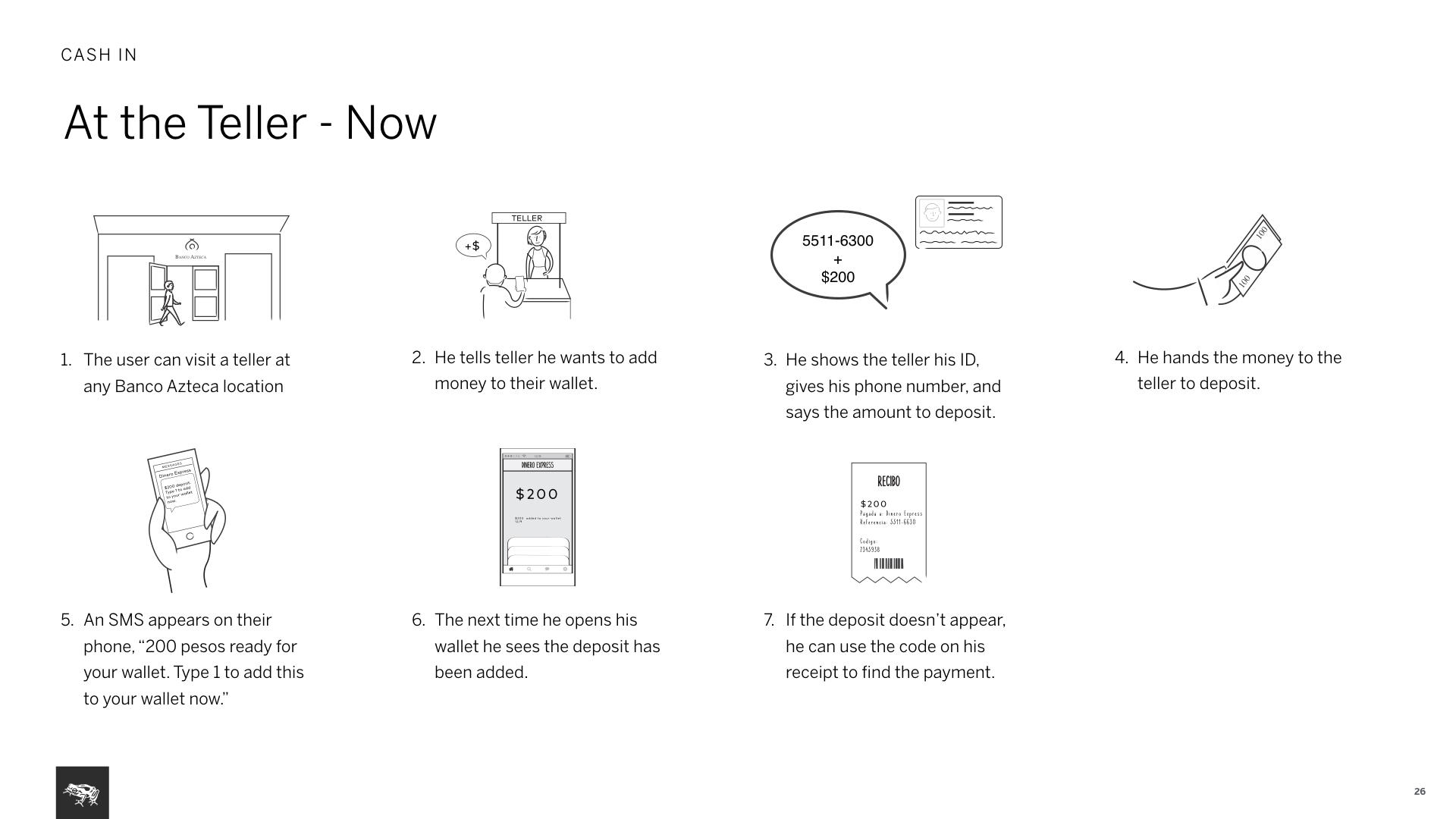
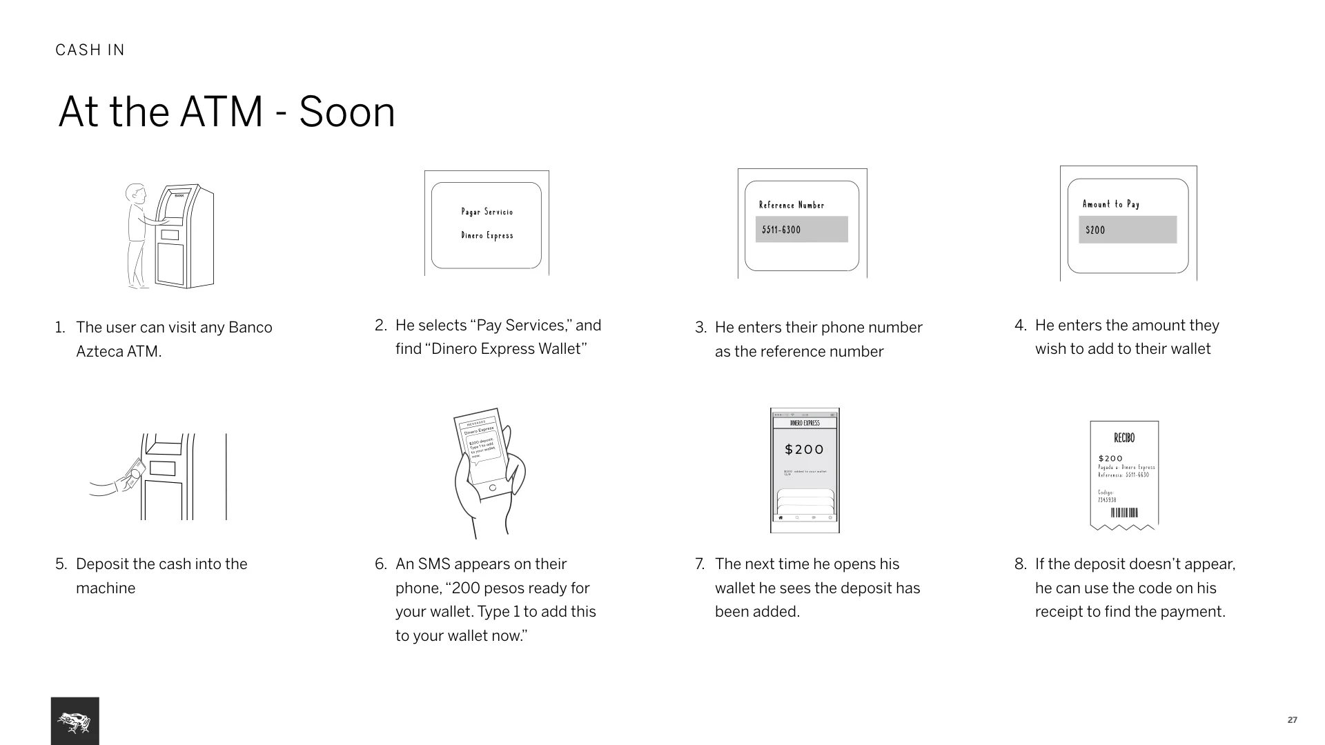
At the teller, at the ATM, at a partner
Use of flows
Wireframes presented in key user flows let us think in context and actual flow of the product rather than thinking in isolated states and screens. Always presented work in InVision plus provided flow diagrams. To solve interaction problems, I always did light documentation that explained advantages, disadvantages of options to first communicate to internal team and to make informed decisions.