[Case study]
anroid for cars app library: creating a simple and efficient way to develop car apps
for Android Auto
Design lead
product definition
research
ui design & Prototyping
Partner relationships
developer facing documentation
Project: Develop an SDK (development kit) for car app developers
Problem statement: Number 1 user dissatisfaction on Android Auto was lack of apps. 76% of respondents in Churned User surveys reported that missing apps was the reason they churned.
Android Auto needed to provide an efficient way for developers to create car apps . Existing methods required developers to design for various screen sizes and input models (rotary, touch etc.). This meant high cost of development and maintenance. Furthermore, developers would need to be responsible for driver distraction requirements.
Process: This effort was initiated mid-year 2019 and launched to public early 2021. It had an ambiguous scope at the beginning and involved close coordination with external partners as well as internal Auto/Google teams. We developed and iterated alongside early access partners, went through closed and open user testing and released as part of Jetpack in early 2021
My role and responsibilities: I have been the UX lead and product designer for this program since early on. Worked closely with Eng/Pm to define the product. Collaborated closely with a small team of UXers (visual designer, motion designer, product and safety researchers) as well as an engineering team on a daily basis doing agile development.
final product snapshot
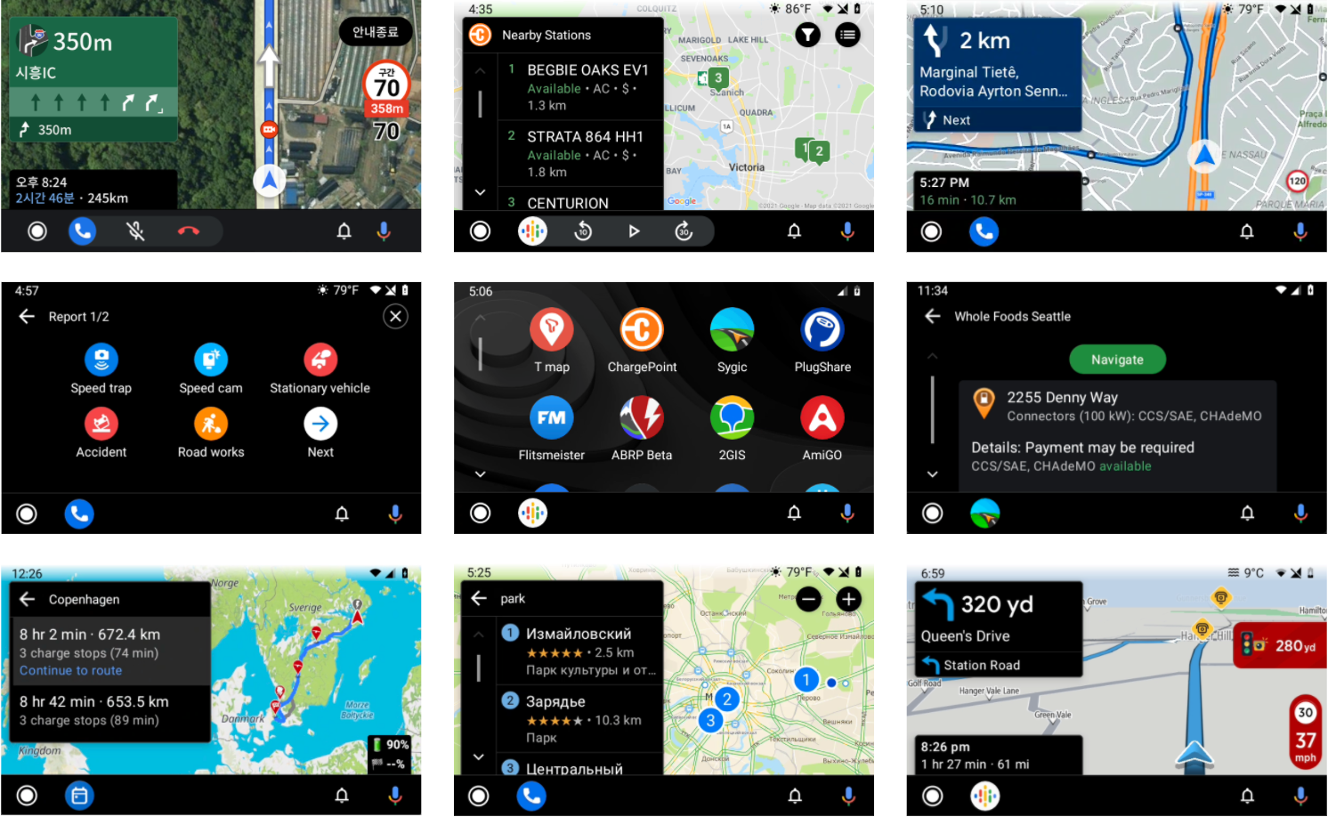
A global set of apps created with Car app library v1
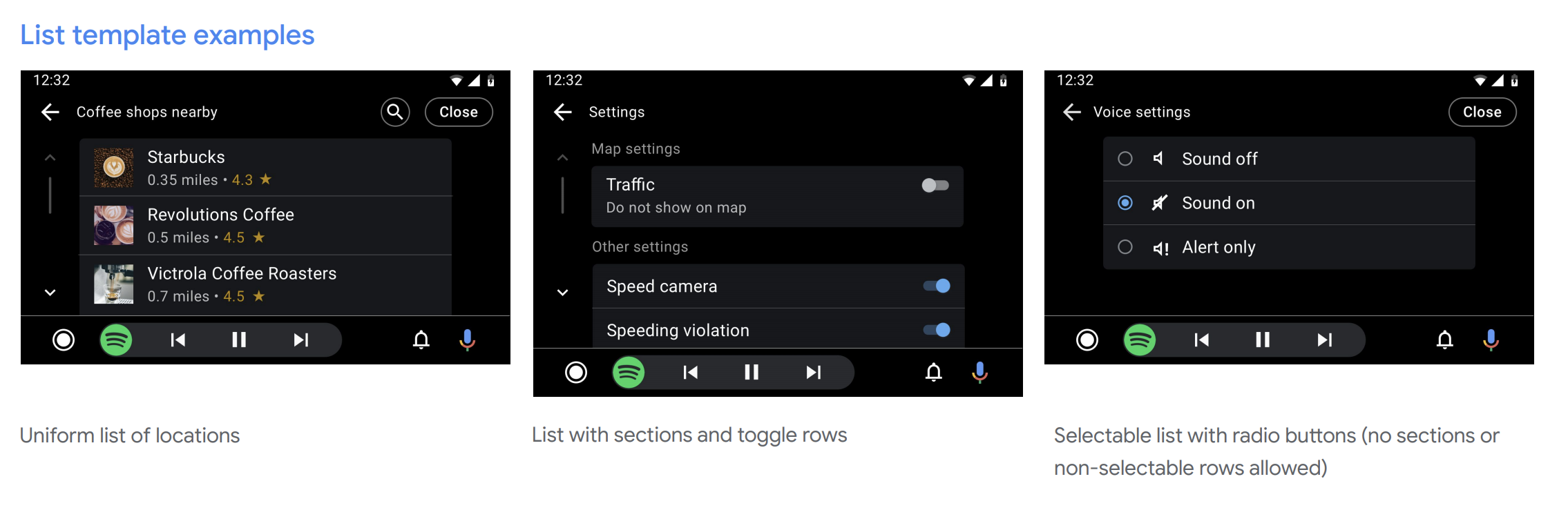
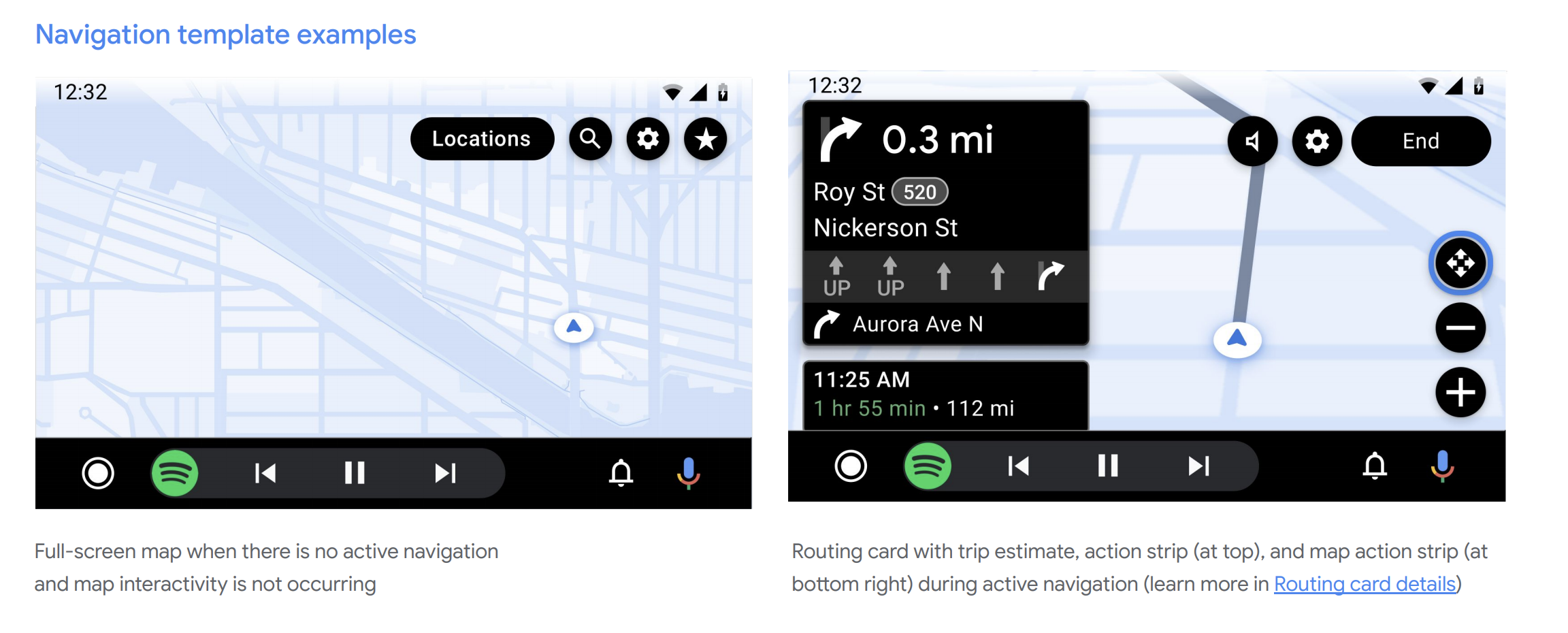
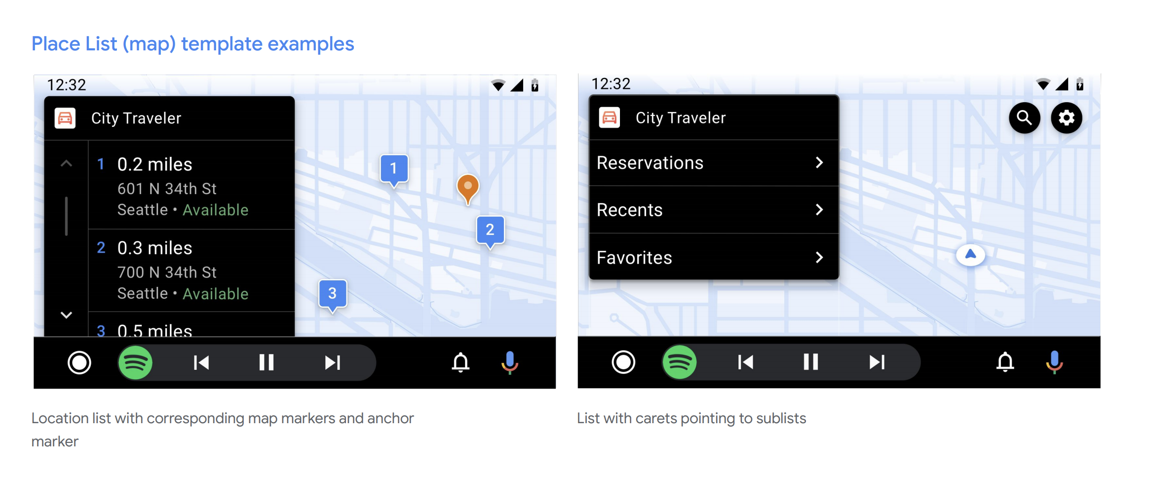
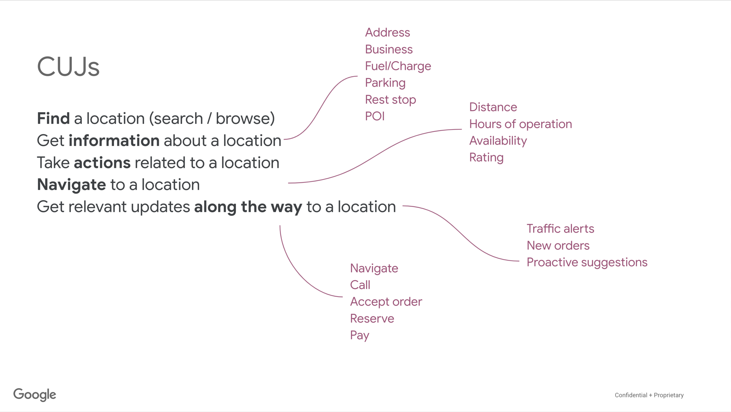
The Android for Cars App Library allows developers to bring navigation, parking, and charging apps to the car. It does so by providing a set of templates designed to meet driver distraction standards and taking care of details such as the variety of car screen factors and input modalities.
Project highlights
starting in ambiguity, and validating ideas early
The needs and end goals were clear. But, where to start and how to scope the problem was ambiguous. There was no prior art for the 2 brand new app categories, parking and charging. And very few for navigation apps.
We saw two distinct directions for how to approach the UX, and the team was split on it:
Create a set of templates and flows that are highly prescriptive and could only be used for certain use cases. The pros were the known scope for us that we could also test for safety, and very much defined end user experiences. Con was that this gave developers less flexibility and created the risk of too narrow and strict a library.
Create a UI toolkit that enable developers to create any pattern and flow they need. Pro was high level of flexibility for developers. Con was that this may have created lower quality end user experiences, was much harder to understand/test potential distraction and potentially way more work for developers.
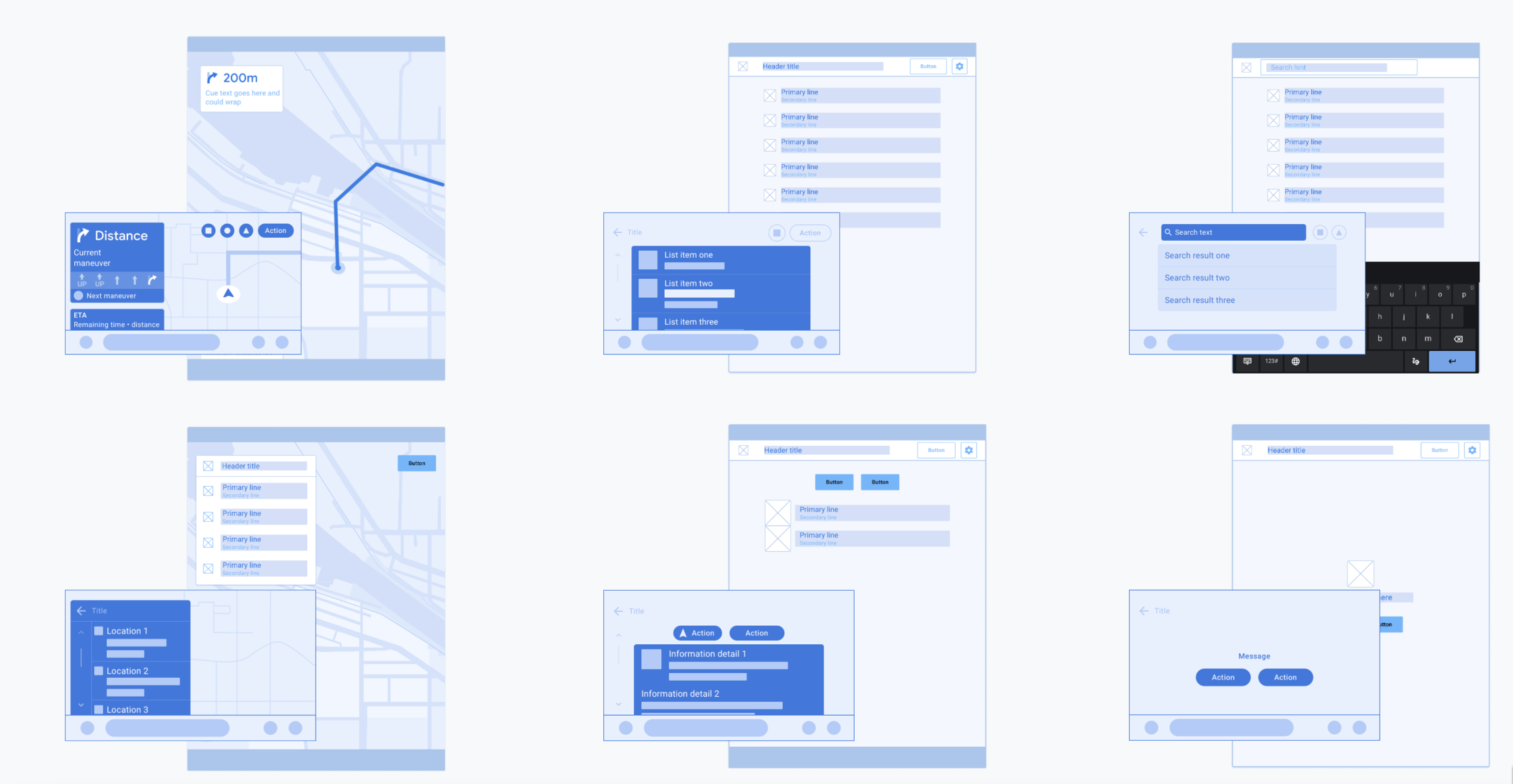
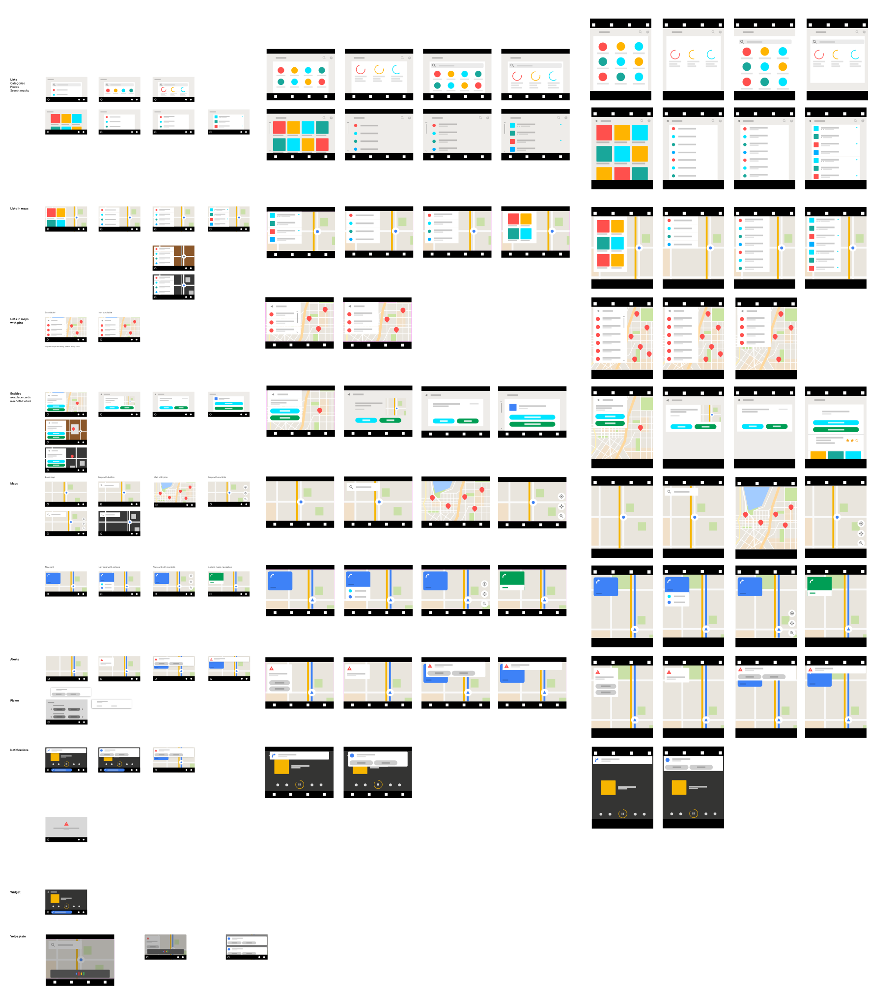
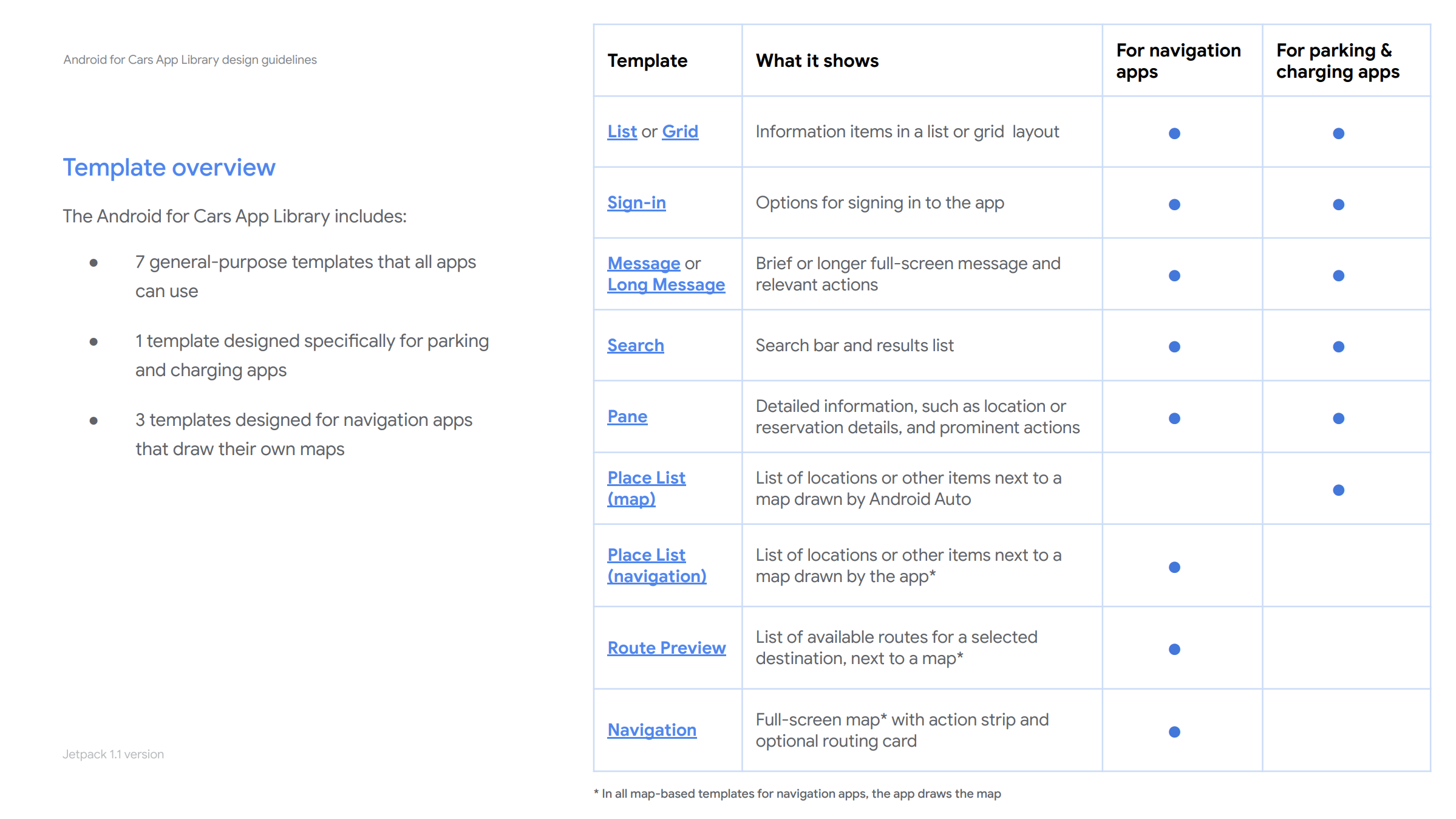
I audited mobile apps from the 3 targeted categories to understand the breath of user needs and features. Created sample architecture user flows for potential apps. During the audit, I observed a high number of common patterns between apps in all 3 categories. using that knowledge, I proposed a middle ground: Create a set of templates, each with a flexible set of rules that would let developers pick and choose what and how many UI elements they want on the screen. Idea was to start here and open up the rules as needed. This approach meant:
We had a finite set of UI features to build that were based on known user needs and tasks, which enabled us to move fast.
It meant less work for developers as they’d not need to start from scratch as they would on a ui toolkit.
We were able to create a driver distraction framework with our safety team, as the bounds of the experience a developer may create was known and could be evaluated (next highlight).
From there on, I developed an initial set of templates and component rules for each template. Then, the product manager and I worked with early access partners to get their input on this set of designs via weekly meetings. This tight collaboration enabled us to get deep insights on developer and end-user needs, constantly validate our hypothesis and iterate fast.
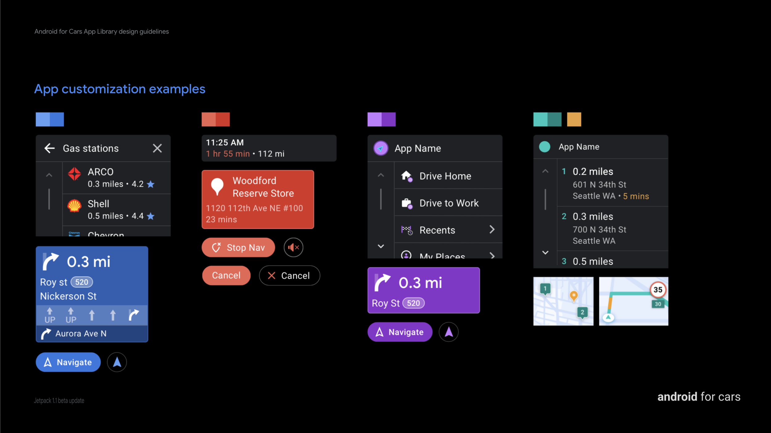
2. Design for flexibility that meet global user and developer needs
When we ran designs by partners from different parts of the world, we often realized how the different driving conditions and user behaviors affected the app needs and experiences. All throughout design & development phases, we strived to enable as much flexibility for developers as we could.
One important part of the design exercise was designing components. Generalizing components (so we can build and test for usability and safety) while enabling flexibility for app requirements was challenging to say the least.
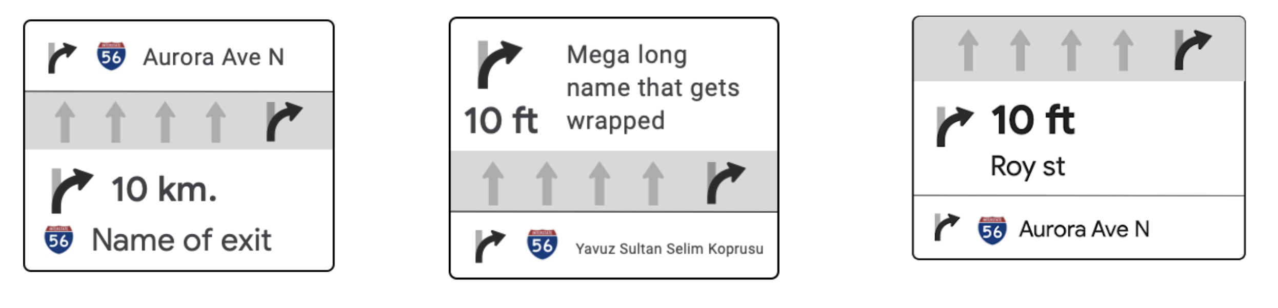
Routing card examples of possible app layout variety. Some apps have lane guidance on the top, some in the middle. Some favor distance and some cue text.
Example above shows routing card component, an app could create the information architecture in many different ways. When generalizing the component, i depended on user needs and most common use cases we learned from developers. From research we knew that users first and foremost looked for the immediate step (distance and road/exit name). This seemed to be the most common implementation by developers as well. I placed that information as the first section.
Some apps did not have lane guidance but when present, it was relevant to the current step. So I made it the second section while keeping it optional.
Then we learned about various needs from developers and incorporated them into the design as well:
In Korea, drivers needed to see large images on complex junctions. This became our additional complex lane guidance option.
Some apps did not have a current maneuver, as at times street/road names were not present on minor roads in Europe. We made only turn iconography and distance mandatory.
A partner needed to dynamically change background colors based on type of road and country in Europe. We loosened the initial limited set of colors allowed on the components’ background. Enabling a better app differentiation story for all devs.
Example variations of routing component
All our learnings and iterations resulted in a fairly flexible component that developers could use to alter their user needs.
3. building a safety framework for a flexible system
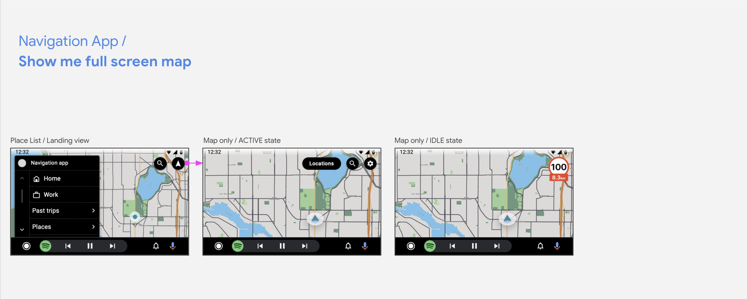
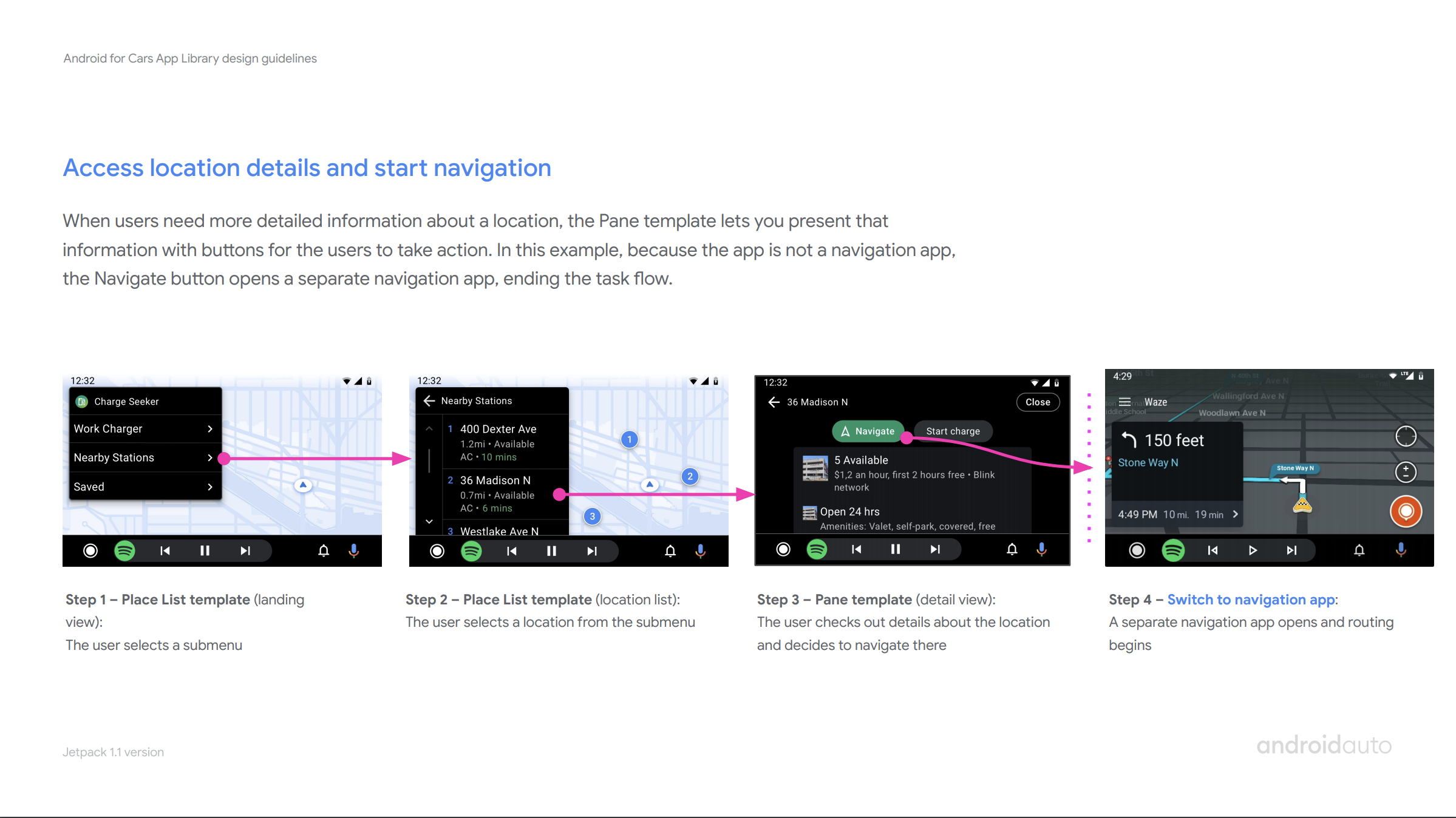
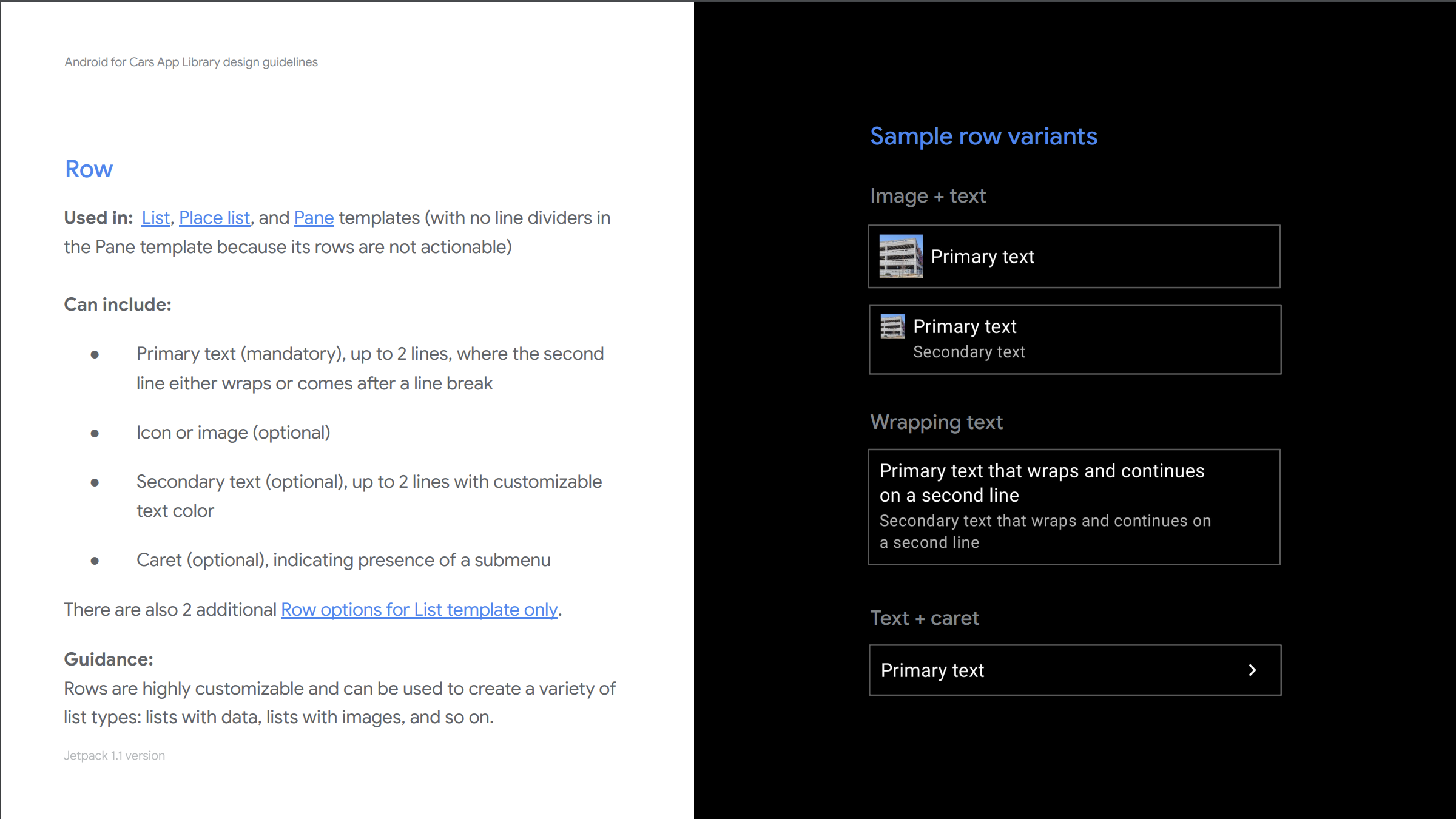
Following the flexibility principle, we wanted to enable developers to create their own app architecture and user flows. Which meant that any template could be used for the start or end of a task; and the same task flow could be created via many different template sequences. Shown above is 3 different templates (List, Place list and Navigation templates) all used as an app landing view to start the experience.
The pre-defined, known task flows has traditionally been how safety tests are done on auto. The need for flexibility meant we had to explore new ways to create safe apps. As our main goal was to ensure that all apps using the library were safety optimized, and no work for developers or auto team needed to test/evaluate apps.
We explored various models and ways to measure potential of distraction. Compared visual and cognitive load of distraction tested tasks to new tasks library introduced. In tight collaboration with another designer, engineer and safety expert, we defined a generalizable UX-restriction framework.
I realized this was quite a hard challenge that we could discuss for basically forever. To bring structure and an actionable path forward, I proposed to start with the principle of providing a set of rules for developers that are easy to understand and follow. We decided on a constrained system that was designed to be compliant around the world, that we could build, validate and open up as we learned.
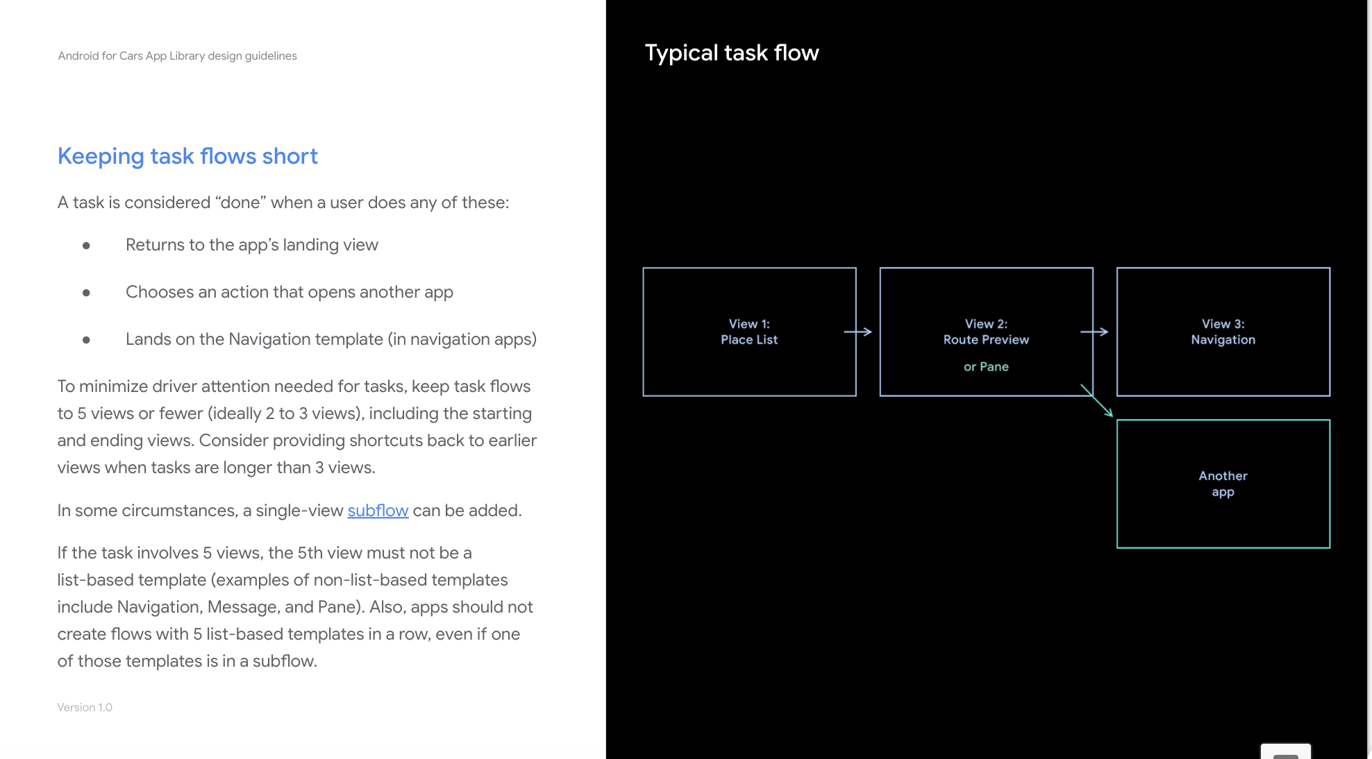
However this initial framework had to enable meaningful car app experiences. Based on safety guidelines, our framework enabled up to 5 screens in a row. We worked with partners to see if any known primary use cases would be blocked. Once developers saw the benefits of making flows shorter, they were able to make most their tasks work within the bounds.
When we conducted additional testing we realized that if a user browsed 5 lists in a row, there was a significant increase in distraction. We iterated quickly to disallow certain list-based templates from being consumed as the 5th view.
This framework worked fairly well in enabling developers and multiple use cases. As it was built to be iterated, team is currently busy exploring it further based on user and developer feedback.
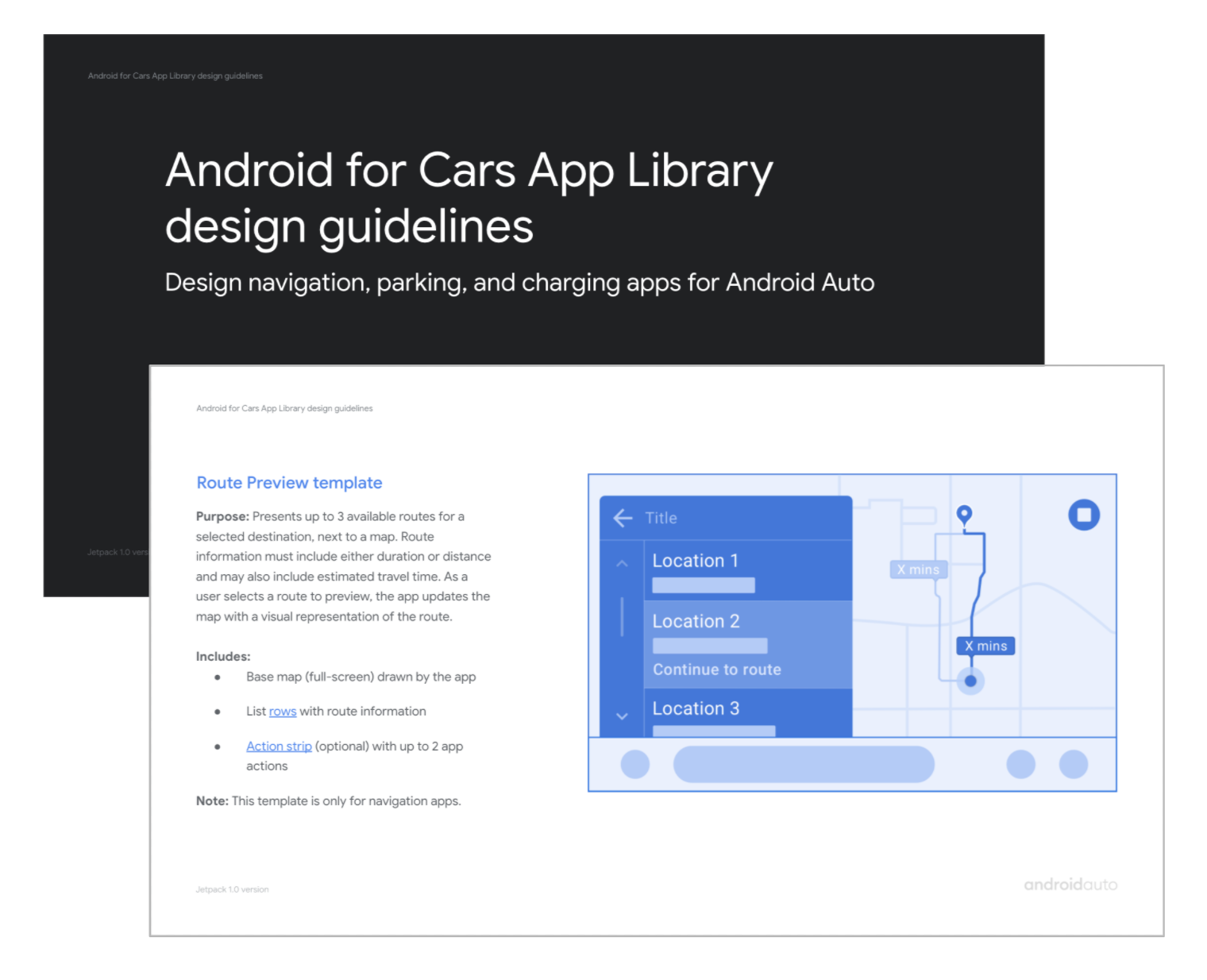
4. developer facing design guidelines
I worked closely with a UX writer and visual designer to create our developer facing Design guidelines. These guidelines aim to help developers/designers understand library interaction and visual capabilities, rules around enforcements and various best practices Google recommends for car apps.
This document is modeled after the materials I originally created while I partnered with developers during the early stages of development. It is an ever-evolving resource I own and iterate on as we develop the product further; and as we get questions, feedback from the developer community.
ADD QUOTES AS A SLIDE
impact and developer feedback
developer feedback is positive “efficient to develop. easy to use”….
Partners and internal teams can build with minor hand-holding.
SpotHero built an app 3 weeks after first drop. Sygic within a week.
System team created Settings app within hours, commented on ease.
we learn form usage: cover many usecases… it is growing without us having to look at all usecases,
200+ apps, with steady growth
2,5 million monthly active users. ???
WHAT DO USERS SAY? REDDIT, PRESS ETC???
What’s next?
aaos :) see IO talk at
Announced at Google I/O by my product manager and me, Car app library coming over to Android Automotive OS.
I advocated for a unified foundational design across in the library across platforms. User and developers needs rarely differ in car interfaces according to platform. With this vision, developer/designers can create a single car app design and deploy it across platforms.
2. enhance enhance enhance
we have a healthy backlog of features from developers and oems, prioritize and keep developing for needs