Messaging apps: Enabling drivers to communicate safely
for Android Auto
user research
product definition
sketching
wireframing
prototyping
functional documentation
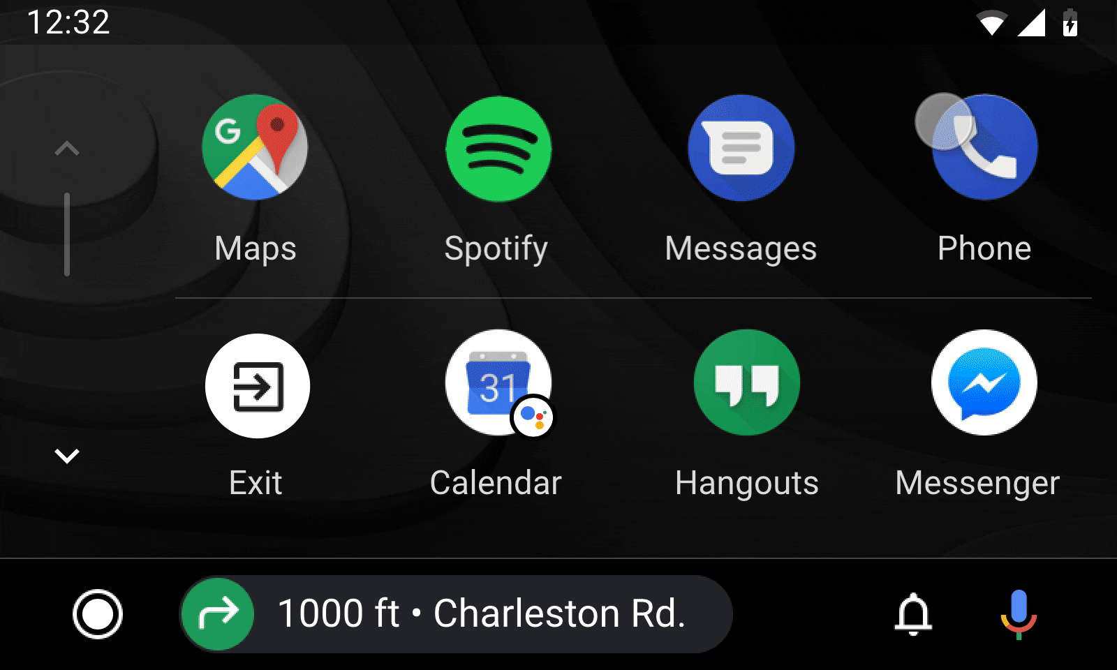
Project and problem statement: Android Auto integration with messaging apps has been through notifications only. This meant users interacting with all their messages from various messaging apps in notification center and having no prompt to initiate a new one. Program was to create app support users could launch from app launcher.
Press link ?????
Process: As Android auto team we did not have much expertise on the messaging apps. Me and program manager conducted audits and gathered insights from internal teams at Google. I designed and prototyped several designs with our early hypothesis. Usability testing helped team understand user needs and resolve conflicts we had on the architecture.
—-Through various stages of develpmetn, alpha/beta etc. user feeedback, our understanding got deper
—- and new design patterns through user testing. Deciding on a new optimized list pattern as a result, which is being used on many other Auto UI.
My role and responsibilities: I led the design track, working closely with product manager on definition; and with other designers, researchers on design direction and execution.
——
Lack of calendar integration has been a pain point. However, understanding where to start, which features to bring over and oprimize for car usage was a huge unknown. I helped the team gather knowledge, form hypothesis, test with users and learn. Resulting in a well accepted product that is still grwoing to include
Starting small, tetsing and adding was key. Especially in an area we were not experts at.
Positive press, user feedback and numbers…
project highlight
usability testing that uncovered need for simplicity and reduced scope
—— Main advice for creating car apps is that safety and distraction have to be top of mind. Your car app should not mirror all features from your mobile app.
2 top insights from research that we included in the product:
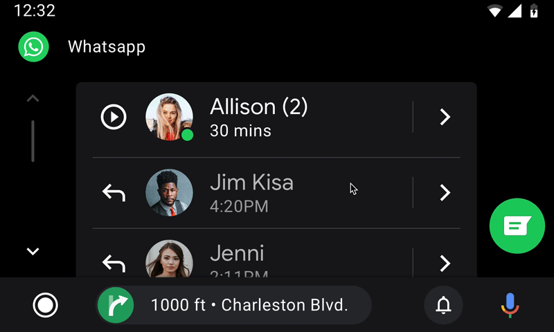
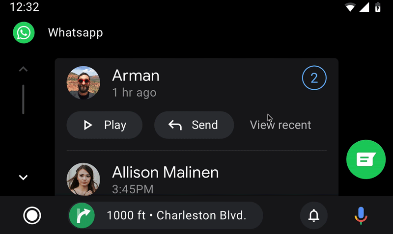
Auditing capabilities of mobile messaging apps, I realized we’d need to support multiple actions per line item (individual or group message). However, this obviously would make each line item more complex and potentially take more space. Having too many actions, and needing to scroll up and down is known to cause users distraction. I protoyped two patterns: (left) an optimized pattern with flat icons/actions and another pattern using the existing large buttons we have on the system.
Furthermore, as a team we were divided on the arhitecture. Do we need a secondary view with details of inidivual contact or group message? Would users want to acccess past messages as they do on mobile apps?
During testing we noticed users did not need a detail view and wanted us to optimize the patern for frequent use. Overall, we simplified the pattern and actions, bringing more consistent actions athat drives can easily develop muscle memory.